Unlock a world of possibilities! Login now and discover the exclusive benefits awaiting you.
- Qlik Community
- :
- Forums
- :
- Analytics
- :
- New to Qlik Analytics
- :
- Re: need help in making a Bar chart that looks lik...
- Subscribe to RSS Feed
- Mark Topic as New
- Mark Topic as Read
- Float this Topic for Current User
- Bookmark
- Subscribe
- Mute
- Printer Friendly Page
- Mark as New
- Bookmark
- Subscribe
- Mute
- Subscribe to RSS Feed
- Permalink
- Report Inappropriate Content
need help in making a Bar chart that looks like funnel
Hi Experts,
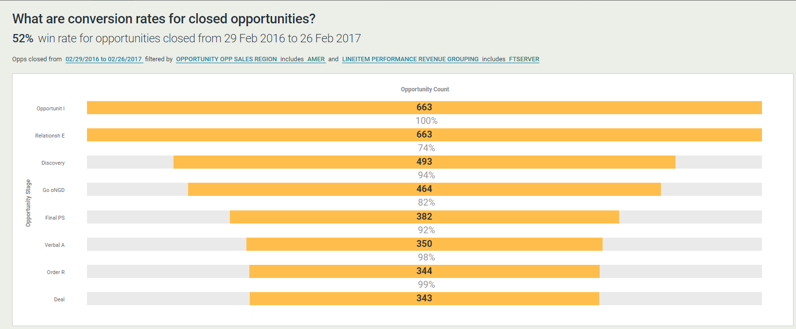
I have a unique requirement like i want to show the bar chart which looks like funnel.
please see attached image below. 
I want only orange colored bars. lets forget about the percentages that are coming after bar vale in white colored.
If you closely observe the above image , the bar size is same for all vales but based on the value the orange color highlights it.
Can any one help in achieving this ?
- « Previous Replies
-
- 1
- 2
- Next Replies »
- Mark as New
- Bookmark
- Subscribe
- Mute
- Subscribe to RSS Feed
- Permalink
- Report Inappropriate Content
See attached
If a post helps to resolve your issue, please accept it as a Solution.
- Mark as New
- Bookmark
- Subscribe
- Mute
- Subscribe to RSS Feed
- Permalink
- Report Inappropriate Content
Hi Vivek
if my understanding is not wrong. You want just the orange(blue here) color to show up so that it will look like a funnel. In the previous example you can just change the back ground color in 1st and 3rd expression from light gray to =ARGB(0,0,0,0) which is transparent.
let me know if you need the file i will post it. I will share the screenshot here.
regards
Pradosh
- Mark as New
- Bookmark
- Subscribe
- Mute
- Subscribe to RSS Feed
- Permalink
- Report Inappropriate Content
- Mark as New
- Bookmark
- Subscribe
- Mute
- Subscribe to RSS Feed
- Permalink
- Report Inappropriate Content
Hi how to show only main values (blue)
- « Previous Replies
-
- 1
- 2
- Next Replies »