Unlock a world of possibilities! Login now and discover the exclusive benefits awaiting you.
- Qlik Community
- :
- Forums
- :
- Analytics
- :
- App Development
- :
- Re: Histogram - what is the goal?
- Subscribe to RSS Feed
- Mark Topic as New
- Mark Topic as Read
- Float this Topic for Current User
- Bookmark
- Subscribe
- Mute
- Printer Friendly Page
- Mark as New
- Bookmark
- Subscribe
- Mute
- Subscribe to RSS Feed
- Permalink
- Report Inappropriate Content
Histogram - what is the goal?
Hello,
Right now I was not able to find a use case for the "Histogram" object released with June 2017 version.
Can anyone help me to imagine or better to create a simple use case where this visualization could became useful for end user ?
Thanks
Andrea
- « Previous Replies
-
- 1
- 2
- Next Replies »
- Mark as New
- Bookmark
- Subscribe
- Mute
- Subscribe to RSS Feed
- Permalink
- Report Inappropriate Content
Hello guys,
The difference between histogram and bar chart is that bar chart uses the real number of the dimension, where histogram is used to measure the frequency of each number, and histogram separates the numbers into frequency buckets.
I am using right now to measure the moisture of samples out of production. So, let's say I perform 7 tests in a week. I will get numbers like 71%, 71%, 71%, 73%, 76%, 77%, 79%, and so on. I want to know the frequency in buckets of 3. So, the results are.
Buckets:
71-73 = 4
74-76= 1
77-79= 2
So, instead of using the percentage numbers, the chart uses the frequency (4,1,2). Bar chart does have the logic to build certain chart. It serves to measure frequency of large sets of results for one specific field as measure.
I hope it helps.
LD
- Mark as New
- Bookmark
- Subscribe
- Mute
- Subscribe to RSS Feed
- Permalink
- Report Inappropriate Content
could you please provide a sample qvf using an Histogram chart ?
- Mark as New
- Bookmark
- Subscribe
- Mute
- Subscribe to RSS Feed
- Permalink
- Report Inappropriate Content
Sure Andrea,
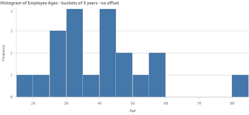
For example, I created a table with 20 employees and their ages. I want to know how spread out the ages are, in buckets of 5 years. So, the only dimension I use is Age, and nothing else. I know that the numbers in this dimension are the ages of the employees. Find table below and an image of the histogram. Also I attached the QVF. I hope it helps.
[Employee_Age]:
load * inline [
Employee_ID,Age
1,27
2,33
3,56
4,41
5,22
6,44
7,58
8,26
9,36
10,45
11,80
12,18
13,43
14,31
15,32
16,28
17,34
18,46
19,51
20,40
];
LD
- Mark as New
- Bookmark
- Subscribe
- Mute
- Subscribe to RSS Feed
- Permalink
- Report Inappropriate Content
I would see a business case in any possible occasion when you would like to see distribution of something per some "measure".
Histogram allows you to create groups out of the numerical data based on "increasing logic" and then see the distribution of something else that is in your interest within those groups. For example, a Bell shaped histogram will indicated a normal distribution, etc..
- Mark as New
- Bookmark
- Subscribe
- Mute
- Subscribe to RSS Feed
- Permalink
- Report Inappropriate Content
yes but i think you can do the same using bar chart.
- Mark as New
- Bookmark
- Subscribe
- Mute
- Subscribe to RSS Feed
- Permalink
- Report Inappropriate Content
Yes, but that is not really the best practise from a statistical point of view. Simply said:
Bar charts: Group defined by a categorical variable (here is likely what we are looking for the total amount and usually the order is not important, sometimes we group it from Highest to Lowest.., sometimes alphabetically, but it is not necessary)
Histograms: Group defined by a numerical variable (Here what we are looking for is rather the skewness of the chart to see what kind of data distribution it is, Basically commenting on skewness on a bar chart is nonsense and every statistication would get mad if he saw that happen  , data is usually ordinally because of a reason, also the groups are created to be equal based on math)
Histogram will automatically create the dimensions for you all you need to set up is for example the total number that you would like to see. (5 groups or 10.etc...)
There is no space between the barts so the distribution is easier to detect.
I mean... if you really wish, you can achieve basically the same with Bar Chart, yes, but you will have to work harder to do so and it will never be so neat due to the gaps between the bars.
- « Previous Replies
-
- 1
- 2
- Next Replies »