Unlock a world of possibilities! Login now and discover the exclusive benefits awaiting you.
- Qlik Community
- :
- Forums
- :
- Analytics
- :
- New to Qlik Analytics
- :
- Re: Qlik Sense bar chart legend sort required
- Subscribe to RSS Feed
- Mark Topic as New
- Mark Topic as Read
- Float this Topic for Current User
- Bookmark
- Subscribe
- Mute
- Printer Friendly Page
- Mark as New
- Bookmark
- Subscribe
- Mute
- Subscribe to RSS Feed
- Permalink
- Report Inappropriate Content
Qlik Sense bar chart legend sort required
I'm having trouble getting the legend to sort in the same way the data is for a chart:
my load script includes dual function as below:
IF("Est Vehicle speed during incident"='0-25 km',dual('0-25km/h',1),
IF("Est Vehicle speed during incident"='25-50 km',dual('25-50km/h',2),
IF("Est Vehicle speed during incident"='50-75 km',dual('50-75km/h',3),
IF("Est Vehicle speed during incident"='75-100 km',dual('75-100km/h',4),
IF("Est Vehicle speed during incident"='100-130 km',dual('100-130km/h',5))))))
however the legend always shows with '75-100km/h' and '50-75km/h' in the wrong order i.e. I want ascending and the other values do show correctly in ascending order - I have it set under sorting to numerical/ascending.
The chart has a month dimension, and then the dimension above. The only measure is a count of ID's to get number of instances..
Please advise on options to try for this. Thanks.
- « Previous Replies
-
- 1
- 2
- Next Replies »
- Mark as New
- Bookmark
- Subscribe
- Mute
- Subscribe to RSS Feed
- Permalink
- Report Inappropriate Content
Thanks Deva,
apologies as I meant qvf file was attached, there is no qvd file for this app.
I replaced my load script with your reply but it produces the charts in attached doc - which is still not sorting the legend.
Note that 2 charts pics are attached, one with ["Est Vehicle speed during incident"] as dim, the other with speed from the
load script which give legend values of 1 to 5?
Gus
- Mark as New
- Bookmark
- Subscribe
- Mute
- Subscribe to RSS Feed
- Permalink
- Report Inappropriate Content
Look at the attached. It is your original file with the additional graph. Same as the top one, but using the Speed field as is, not like
=[...]
- Mark as New
- Bookmark
- Subscribe
- Mute
- Subscribe to RSS Feed
- Permalink
- Report Inappropriate Content
Thanks Michael. I have imported your attached qvd but still see that the legend order is incorrect.
All the solutions kindly offered appear to have addressed the data (order of actual chart bars), but not the legend order.
I apologise if I have missed something here!
If someone can please send a qvd that shows the legend in the correct ascending order I would be most grateful.
The only way I have managed so far to order the legend as required, was by placing dummy data rows in the excel file, and ensuring these are in the order 0-25, 25-50, 50-75 etc
The problem then is that they count as actual data on the bar chart and are displayed!
Thanks
Gus
- Mark as New
- Bookmark
- Subscribe
- Mute
- Subscribe to RSS Feed
- Permalink
- Report Inappropriate Content
It is strange... I sent it to you exactly because it shows in the correct order.
Notice that the dimension definition on the bottom chart is
Est Vehicle speed during incident2
See if it is not changed after import
not the same as on the top chart
=[Est Vehicle speed during incident2]
- Mark as New
- Bookmark
- Subscribe
- Mute
- Subscribe to RSS Feed
- Permalink
- Report Inappropriate Content
Hi Michael,
Strange indeed. I have taken a screen shot myself of your import, and the bottom chart does show with Est Vehicle speed during incident2, as you mention.
I’ve included the sorting selection in the screen shot, maybe the issue is there?
This is the load script, should be no changes but thought it was worth checking with your version:
LOAD
ID,
"Incident Date and Time",
"Est Vehicle speed during incident",
IF("Est Vehicle speed during incident"='0-25 km',dual('0-25km/h',1),
IF("Est Vehicle speed during incident"='25-50 km',dual('25-50km/h',2),
IF("Est Vehicle speed during incident"='50-75 km',dual('50-75km/h',3),
IF("Est Vehicle speed during incident"='75-100 km',dual('75-100km/h',4),
IF("Est Vehicle speed during incident"='100-130 km',dual('100-130km/h',5))))))
as "Est Vehicle speed during incident2",
"Month",
"At Fault"
Thanks.
- Mark as New
- Bookmark
- Subscribe
- Mute
- Subscribe to RSS Feed
- Permalink
- Report Inappropriate Content
Script looks fine to me.
Last attempt - can you use "As Speed" in the script instead of
as "Est Vehicle speed during incident2"
If doesn't help, you need to contact Qlik support, sorry
- Mark as New
- Bookmark
- Subscribe
- Mute
- Subscribe to RSS Feed
- Permalink
- Report Inappropriate Content
I will contact support, but many thanks for your assistance Michael, very much appreciated ☺
Gus Feltham
Senior Data Analyst | Corporate Services
+64 4 912 0352
- Mark as New
- Bookmark
- Subscribe
- Mute
- Subscribe to RSS Feed
- Permalink
- Report Inappropriate Content
I have seen many people (including myself) that had this problem. So in the bar / line charts, if there are two dimensions, the first dimension can be sorted correctly but for the second dimension, sometimes it does not work right! My previous workaround is always try to avoid using two dimensions, try to make the second dimension to the expression.
For example, in your case, remove the second dimension and make five expressions for each speed category.
For the original app you have attached, if I opened it using the latest Sense version (June 2017 Patch one), I could see the "75-100km/h" was in front of 50-75, which was not right. However if I go to the "Colour and Legend" in the Appearance, uncheck the "Show Legend Title" box, then 50-75 jump into the front of 75-100.
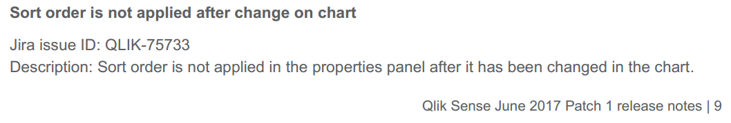
It looks to me that the problem is solved in June 2017 Patch 1. I then went back to the released notes and found the following bug fixed at page 9:
Can you try the same thing again using June 2017 Patch one? I hope that Qlik has fixed this because it is annoy and when client asks why this happens, I don't know how to reply.
Cheers
Fei
- Mark as New
- Bookmark
- Subscribe
- Mute
- Subscribe to RSS Feed
- Permalink
- Report Inappropriate Content
Hi Gus,
please set up the Colours and legend by your "Speed" dimension then the legend will sort as you expect.
Regards
Jacek
- Mark as New
- Bookmark
- Subscribe
- Mute
- Subscribe to RSS Feed
- Permalink
- Report Inappropriate Content
Thanks Fei.
Yes, we have just now completed the June 2017 upgrade and the legend does now seem to order the same way as the data has been sorted using dual function.
Cheers
Gus
- « Previous Replies
-
- 1
- 2
- Next Replies »