Unlock a world of possibilities! Login now and discover the exclusive benefits awaiting you.
- Qlik Community
- :
- Forums
- :
- Analytics
- :
- App Development
- :
- Re: Combine selection from two filters into a new ...
- Subscribe to RSS Feed
- Mark Topic as New
- Mark Topic as Read
- Float this Topic for Current User
- Bookmark
- Subscribe
- Mute
- Printer Friendly Page
- Mark as New
- Bookmark
- Subscribe
- Mute
- Subscribe to RSS Feed
- Permalink
- Report Inappropriate Content
Combine selection from two filters into a new chart dimension?
Hi all,
I'm trying to explore the possibilities in Qlik sense with the use of as many standard components and functions as possible. Currently I try to make a comparison sheet. In my load script I generate my two identical dimensions by:
Comparison_1:
Load comparison as comparison1
Resident Source;
Comparison_2:
Load comparison as comparison2
Resident Source;
This allows me to set up to filters controlling each their charts, which is all good.
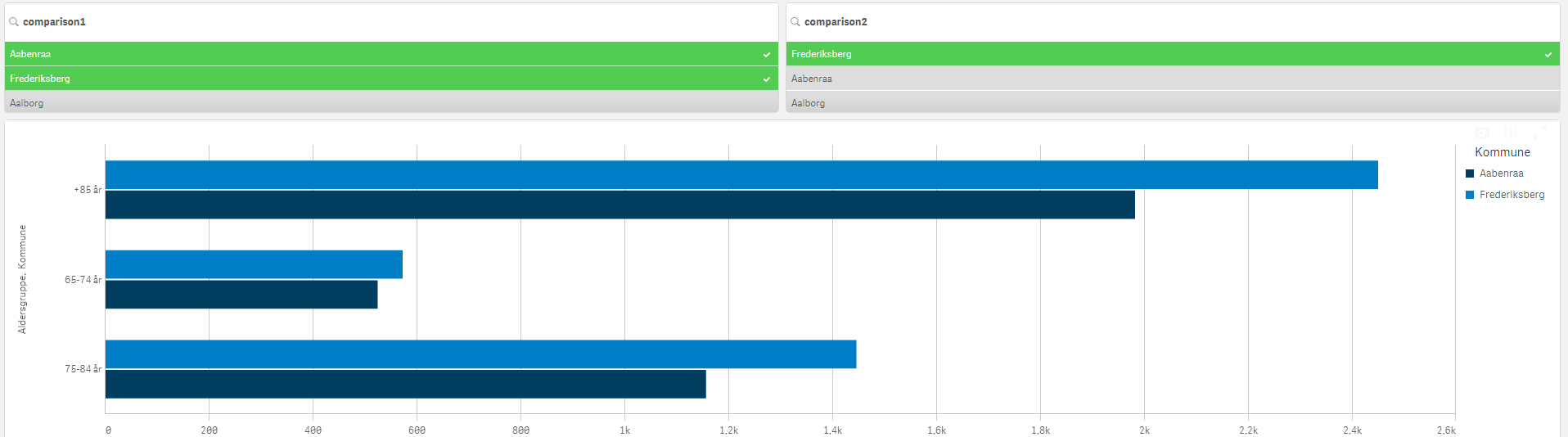
Now I'm wondering if it's possible to combine the selections from comparison1 and comparison2 into a new dynamic dimension for my graph. The result should be to select Aabenraa from the comparison1 and Frederiksberg from comparison2, getting the shown chart.
I tried looking into these functions:
Aggr()
GetFieldSelections()
Pick()
Match()
ValueList()
But I can't figure out how, or if, its possible to obtain this. Hope someone can point me in the right direction 
Accepted Solutions
- Mark as New
- Bookmark
- Subscribe
- Mute
- Subscribe to RSS Feed
- Permalink
- Report Inappropriate Content
A temporary solution ended up being:
Avg({$<Source={"$(=GetFieldSelections(comparison1))", "$(=GetFieldSelections(comparison2))"}>} measure)
- Mark as New
- Bookmark
- Subscribe
- Mute
- Subscribe to RSS Feed
- Permalink
- Report Inappropriate Content
A temporary solution ended up being:
Avg({$<Source={"$(=GetFieldSelections(comparison1))", "$(=GetFieldSelections(comparison2))"}>} measure)