Unlock a world of possibilities! Login now and discover the exclusive benefits awaiting you.
- Qlik Community
- :
- All Forums
- :
- QlikView App Dev
- :
- Re: In Scatter Chart, is there a way to display bu...
- Subscribe to RSS Feed
- Mark Topic as New
- Mark Topic as Read
- Float this Topic for Current User
- Bookmark
- Subscribe
- Mute
- Printer Friendly Page
- Mark as New
- Bookmark
- Subscribe
- Mute
- Subscribe to RSS Feed
- Permalink
- Report Inappropriate Content
In Scatter Chart, is there a way to display bubbles randomly?
Please see the attached pic. I have unit on X-axis with numerous related values to be projected on Y-axis. When I create a scatter chart all bubbles are comming in single line. But I want them to scatter on the entire chart. How can i do that?
- « Previous Replies
-
- 1
- 2
- Next Replies »
- Mark as New
- Bookmark
- Subscribe
- Mute
- Subscribe to RSS Feed
- Permalink
- Report Inappropriate Content
Hi John,
first of all, I think that this is a really cool example on how you can extend QlikViews possibilites to generate new kinds of data visualization.
I really learned a lot, thanks for sharing.
Leaving all technical stuff behind, I remember two of your statements:
"But I think the patterns are less apparent that way, and that it is harder to then explore any patterns that you DO see."
I think this is a really interesting questions and would like to ask you if you could share any more insight into your belief.
As I understood, you have used that kind of visualization quite often, and I assume that your users are quite happy with that solution.
Though I've only spent only a short time with your demo app, I am personally (I emphasize this, it's just my subjective temporary point of view) not quite convinced that the scatter chart solution
is superior to the spark line / line chart with classes.
I think one problem of the scatter chart is that the randomly distributed data points across the swimming lane produce also random visual cluster.
Then you mentioned yourself that you might see different patterns depending on transparency (already set points are covered by new ones), while the spark line is quite clear about the count of data points within the cluster.
I think the spark line maybe has some disadvantages if you don't choose an appropriate class width, so you might not see a pattern if the pattern scale is smaller than /range of the class width.
Also you said using the spark lines makes it harder to further explore the patterns, I assume by selecting a range of points?
Is this not more depending on the real estate you spend both visualizations?
I think we often focus too much on pure technical solutions or problems, so I would really appreciate if you could share some of your thoughts from a usability point of view pro/con the scatter solution or may be even an example when a scatter plot enabled you to detect a pattern while a spark line had not.
Best regards,
Stefan
- Mark as New
- Bookmark
- Subscribe
- Mute
- Subscribe to RSS Feed
- Permalink
- Report Inappropriate Content
Just my take on this, being a scatter chart enthusiast myself (that is a great example John, thanks, will certaintly "borrow" it) I see one very superior advantage in using a scatter chart, in QlikView, over sparklines, bar charts, box plots, etc. It's that you can take advantage of QlikView's interactivity and actually go and select the oldest stocks in the graph, the not so old, etc.
You can then list them in detail and show all extra information that will help someone make a decision over each of those stocks. It makes a real impact in demos and presentations also.
Also, something else that you could be showing in a scatter chart is stock value, using bubble size for example.
- Mark as New
- Bookmark
- Subscribe
- Mute
- Subscribe to RSS Feed
- Permalink
- Report Inappropriate Content
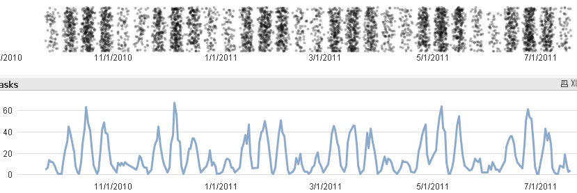
Attached is an example of the difference between a random scatter and a line chart using about the same screen real-estate. To me, the scatter chart is much more visceral. I comprehend it immediately, intuitively. The pattern is obvious. The repetitiveness of the pattern, even though it's not entirely repetitive, is obvious. For me, it takes a more thorough study of the line chart to perceive the same patterns in it.
Other information, though, is only available in the line chart. I can't even imagine the total numbers per day looking at the scatter chart, and the line chart gives an easy approximation, and you can mouse over for the exact totals. There are some small scale variances that I can ONLY detect in the line chart, and they're OBVIOUS in the line chart. For example, the dip on 1/16/2011 is invisible in the scatter chart but impossible to miss in the line chart. I'm sure there are other things.
As always, it's a matter of what sort of information you're trying to display, what you're trying to get your users to comprehend, to explore. I'd say that line charts are most appropriate most of the time. But I do think a random scatter has its place.
I've probably only done the random scatter a few times in live applications. And now that I'm thinking about the scatter chart with the variable transparency, I remember that it is NOT randomized, but rather a normal scatter chart with two continuous dimensions.
I suppose I should just include a picture of the charts. Faster than downloading, and personal edition friendly. The application is still attached for people who want to see more details.
As far as the spark line approach and further exploration, you can't pick a dimension value on the spark line. But I bet with some work you could get an actual line chart to do something similar, and thus allow you to select points. It's probably no worse than getting a scatter chart to do what it's doing in the earlier example.
- « Previous Replies
-
- 1
- 2
- Next Replies »