Unlock a world of possibilities! Login now and discover the exclusive benefits awaiting you.
Announcements
Live today at 11 AM ET. Get your questions about Qlik Connect answered, or just listen in.
SIGN UP NOW
- Qlik Community
- :
- Forums
- :
- Analytics
- :
- New to Qlik Analytics
- :
- Make label values nice on combo chart
Options
- Subscribe to RSS Feed
- Mark Topic as New
- Mark Topic as Read
- Float this Topic for Current User
- Bookmark
- Subscribe
- Mute
- Printer Friendly Page
Turn on suggestions
Auto-suggest helps you quickly narrow down your search results by suggesting possible matches as you type.
Showing results for
Anonymous
Not applicable
2017-09-29
07:43 AM
- Mark as New
- Bookmark
- Subscribe
- Mute
- Subscribe to RSS Feed
- Permalink
- Report Inappropriate Content
Make label values nice on combo chart
I am trying to make labels look nicely use friendly on a combo chart.
I have set the Y-axis like this
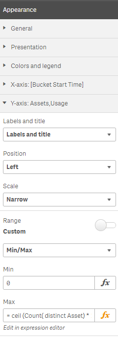
Where the full Max expression is
= ceil (
Count( distinct Asset) * 1.1 ,
num ( '1' & repeat ( 0 , if ( len(Count( distinct Asset) ) = 1 , 1 ,len(Count( distinct Asset) ) -1 ) ) )
)
This generally works quite nicely, but when (Count( distinct Asset) ) resolves to 62 then the labels show at non uniform intervals as 0, 20 , 40 & 70.

Ideally I would like the labels at uniform intervals, as in 0, 20 , 40, 60 & 80.
Anybody got any cunning suggestions ?
208 Views
0 Replies
Community Browser