Unlock a world of possibilities! Login now and discover the exclusive benefits awaiting you.
- Qlik Community
- :
- Forums
- :
- Analytics
- :
- New to Qlik Analytics
- :
- Re: Dashboarding Survey Analysis 101
- Subscribe to RSS Feed
- Mark Topic as New
- Mark Topic as Read
- Float this Topic for Current User
- Bookmark
- Subscribe
- Mute
- Printer Friendly Page
- Mark as New
- Bookmark
- Subscribe
- Mute
- Subscribe to RSS Feed
- Permalink
- Report Inappropriate Content
Dashboarding Survey Analysis 101
Greetings to QSense users & Master Sifu,
I just baby stepping to build my first cut of surveys analysis in QSense.
The context & genesis of this threads & surveys as follows:
- Higher Education Institution (University & Vocational Studies)
- Student to evaluate teacher & subject periodically each trimester.
- Have historical data built in datawarehouse (e.g.: datamart). MsExcel can't handle the dashboard
 process.
 - I am subject matter expert of survey, dashboard project has been assigned to me to build over Excel.
As I am walking away from my comfort zone (Excel) to QSense I need guidance & advise from QSense users & master sifu's
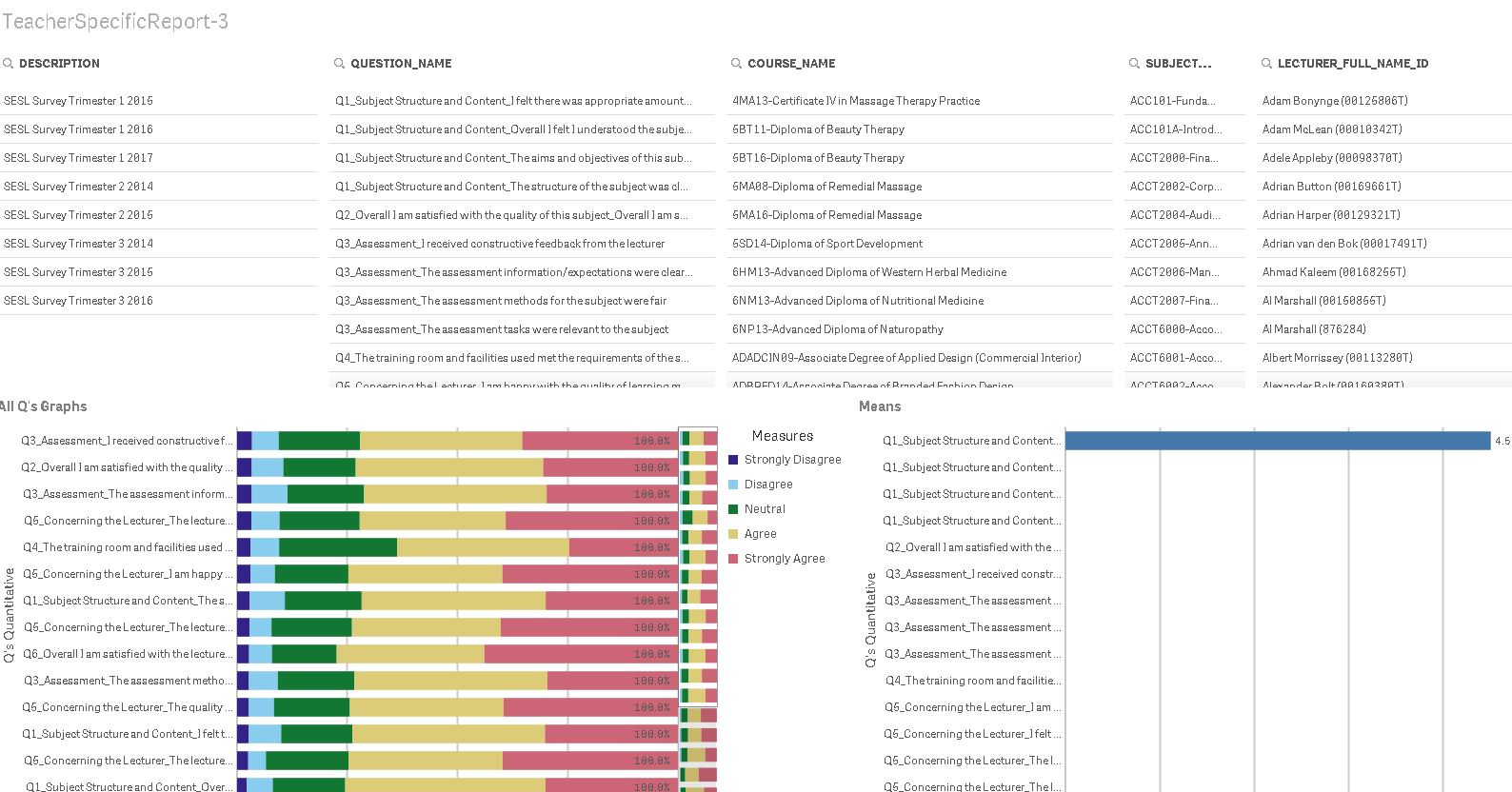
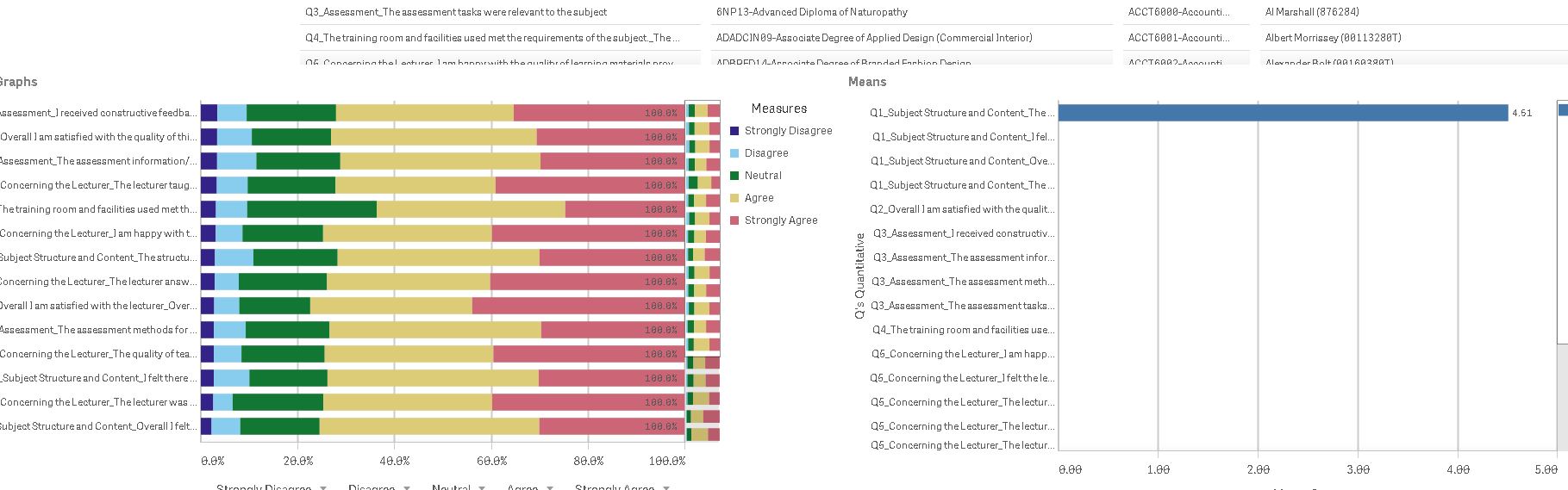
Herewith screen shot of basic/crude baby-step dashboard that I built:
I understand mastering QSense syntax (e.g.: slice/dice data & dimension with expression) is a learning curve journey.
Just to build simple measurement, I have to trial & error with Google & Youtube which sometime I feel unlucky trying thousands answers from Google ...
As trial & error, my QSense confident level start to climb up (e.g.: playing with basics graphs, etc's).
But not sure where the place to start learn expressions with very specific requirement related with project.
Appreciate all your time and suggestions if any.
Thanks in advance.
Andrias
- Mark as New
- Bookmark
- Subscribe
- Mute
- Subscribe to RSS Feed
- Permalink
- Report Inappropriate Content
Was there a specific issue you needed help with?
- Mark as New
- Bookmark
- Subscribe
- Mute
- Subscribe to RSS Feed
- Permalink
- Report Inappropriate Content
Hi Chris,
Thanks for your reply.
Yes have specific question as follows:
- Replicate graph (page-5 pdf).
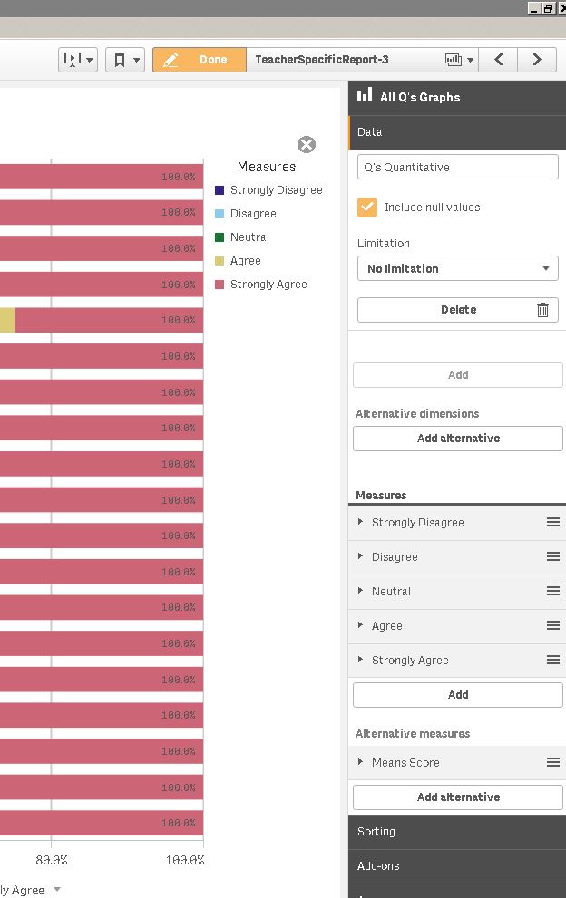
- I am stuck when it comes to the core (e.g.: build syntax/formula/measurement) to produce the number (refer screen shot):
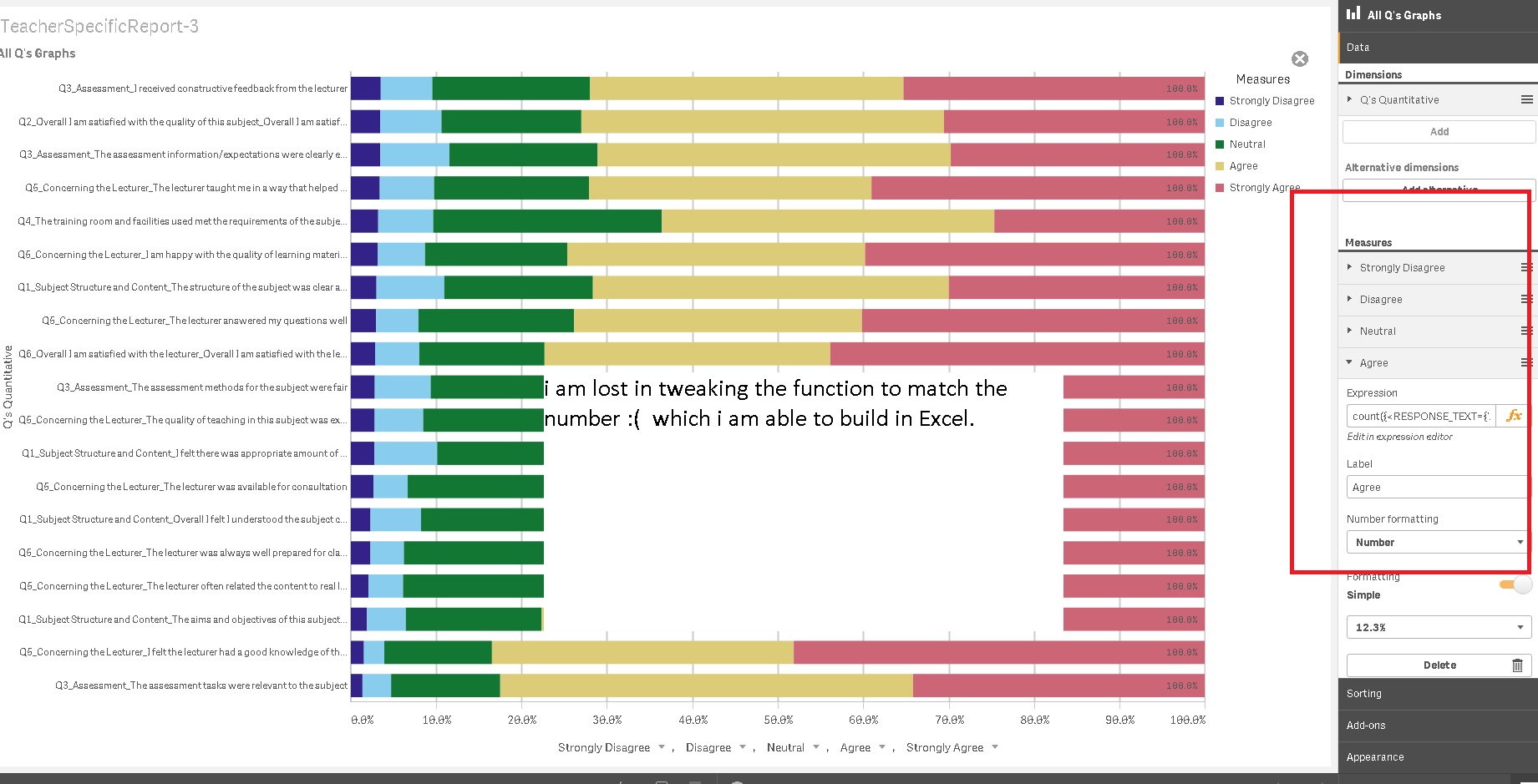
I have de-identifed the report (pdf) above, but due to privacy issue I can't upload/shared QSense file in this forum as it's using live datamart data from Datawarehouse.
There's no easy way to explain my problem in written, I will take sometime to create video/screen recording and share the file once it's done. Luckily this forum has function to upload video upload.
Hopefully by sharing real issue & solution visually might benefit other users.
- Mark as New
- Bookmark
- Subscribe
- Mute
- Subscribe to RSS Feed
- Permalink
- Report Inappropriate Content
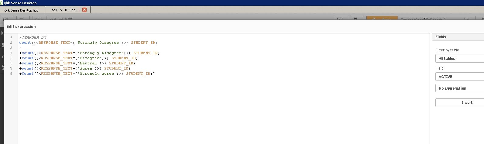
Can you show me the full expression that you are currently using in the expression box (the lower image, in the properties panel)? Likely just a syntax error. Also, the image on the right (Means) graph looks skewed as well, correct?
- Mark as New
- Bookmark
- Subscribe
- Mute
- Subscribe to RSS Feed
- Permalink
- Report Inappropriate Content
Hi Chris,
We found out that the issues lies in the datawarehouse (e.g.: datamart) that caused figures is not matched.
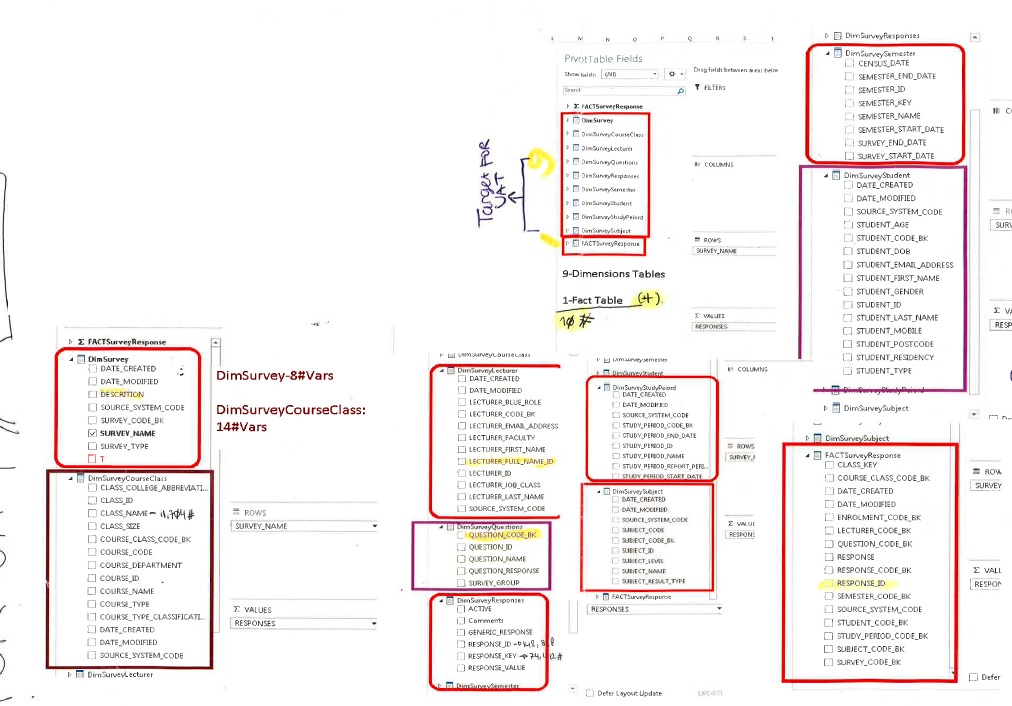
Herewith some screen shot of datamart structure for your information (not sure whether its useful).
I also shared screen recording.
I am happy to set-up private meet & greet session and shared recorded session with QSense learning community.
Sometimes internet meeting (e.g.: screen sharing) is much quicker way than screen shots with written description.
Once again thanks for your reply.
- Mark as New
- Bookmark
- Subscribe
- Mute
- Subscribe to RSS Feed
- Permalink
- Report Inappropriate Content
Hi Andrias,
Thank you for the video and screenshot.
As far as I can tell, the expression in the stacked bar chart in question has a set analysis statement that's referencing a field name 'RESPONSE_TEXT' that I do not see in the screenshot of the tables. Is 'RESPONSE_TEXT' a field that is present in the data model you sent me a screenshot of and I cannot see it? If not, what field corresponds to the 'Strongly Disagree' to 'Strongly Agree' values?
Also, once you've determined the field that corresponds with the 'Strongly Disagree' - 'Strongly Agree' values, try setting up your graph as such:
In this example I've set up a chart where I used a stacked bar chart to show me the number of sales each of my sales team made each year.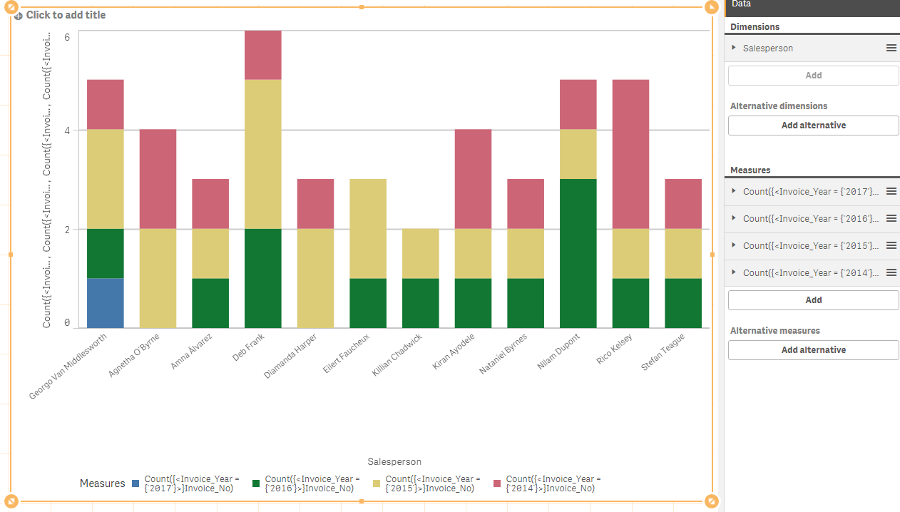
I gave each set analysis expression it's own measure. In my example, I wanted to show yearly sales by Salesperson, so I used a set analysis statement for each year and gave it a separate measure. Similarly, you want to use a set analysis expression for the student response and give each it's own measure.
See if this helps. I think there may be some data model issues, as you stated. Again, first find the field that corresponds to the values you are looking for, then generate a separate measure using a set analysis statement for each, similarly to how I did above.
- Mark as New
- Bookmark
- Subscribe
- Mute
- Subscribe to RSS Feed
- Permalink
- Report Inappropriate Content
My apologies, I see you wanted the graph set up to represent portion of the whole. I will revisit my response. In the meantime, please reference the other part of my response regarding data model and field name.
- Mark as New
- Bookmark
- Subscribe
- Mute
- Subscribe to RSS Feed
- Permalink
- Report Inappropriate Content
Hi Andrias,
My apologies. I was able to revisit your question and found this. Perhaps it is helpful to your current challenge?