Unlock a world of possibilities! Login now and discover the exclusive benefits awaiting you.
- Qlik Community
- :
- Forums
- :
- Analytics
- :
- New to Qlik Analytics
- :
- Re: Bar chart with unique fields
- Subscribe to RSS Feed
- Mark Topic as New
- Mark Topic as Read
- Float this Topic for Current User
- Bookmark
- Subscribe
- Mute
- Printer Friendly Page
- Mark as New
- Bookmark
- Subscribe
- Mute
- Subscribe to RSS Feed
- Permalink
- Report Inappropriate Content
Bar chart with unique fields
I am very new to Qlik and need help creating a bar graph with the below fields.
1. Prior year revenue
2. Year to date revenue
3. Year to go revenue
4, Year to date forecast
5. Year to go forecast
I can do this in Excel very easily but now I am trying to find the right (and most straightforward) way to do this with Qlik Sense.I want to be able to stack fields 2 and 4, and 3 and 5 in the bar graph as well.
I am familiar with creating charts just not sure how to tackle this use case which has five unrelated fields.
Any help is appreciated.
- Mark as New
- Bookmark
- Subscribe
- Mute
- Subscribe to RSS Feed
- Permalink
- Report Inappropriate Content
So each of these would be measures in your bar chart.
You could display each as separate bar for each Dimension. Or you can stack them for each Dimension.
You could also set them up as Alternative measures so that the user would pick one at a time.
I don't know of a way to pick which ones stack on each other out of the box. You could possibly use a button extension and create buttons for each of these measures. Then the user could pick whatever combination of the 5 that they want to see stacked together.
- Mark as New
- Bookmark
- Subscribe
- Mute
- Subscribe to RSS Feed
- Permalink
- Report Inappropriate Content
Thanks Mark.
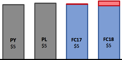
I have created the five unique fields as measures using expressions to limit the value to the required value. Now when I go to add a dimension, I realised it wouldn't work because they do not share the same dimension. As an example, I expect the X axis to contain the label for each of the unique fields, and the Y-axis to contain the actual numerical value of each measure. See below.
I am trying to create something similar to this bar graph.