Unlock a world of possibilities! Login now and discover the exclusive benefits awaiting you.
- Qlik Community
- :
- Forums
- :
- Analytics
- :
- New to Qlik Analytics
- :
- Re: Assistance needed in re-creating Chart (Donut?...
- Subscribe to RSS Feed
- Mark Topic as New
- Mark Topic as Read
- Float this Topic for Current User
- Bookmark
- Subscribe
- Mute
- Printer Friendly Page
- Mark as New
- Bookmark
- Subscribe
- Mute
- Subscribe to RSS Feed
- Permalink
- Report Inappropriate Content
Assistance needed in re-creating Chart (Donut?)
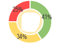
Hello all,
I am trying to create a chart that looks like this in QlikSense. It would just need the measure and basically showing a percentage of scores. So like 41% is above 4, 34% is between 3 and 4 and 25% is below 3. I am kind of lost on which chart or graphic I should be using to recreate this.
Any guidance would be appreciated.
Thanks,
Jordan
- « Previous Replies
-
- 1
- 2
- Next Replies »
Accepted Solutions
- Mark as New
- Bookmark
- Subscribe
- Mute
- Subscribe to RSS Feed
- Permalink
- Report Inappropriate Content
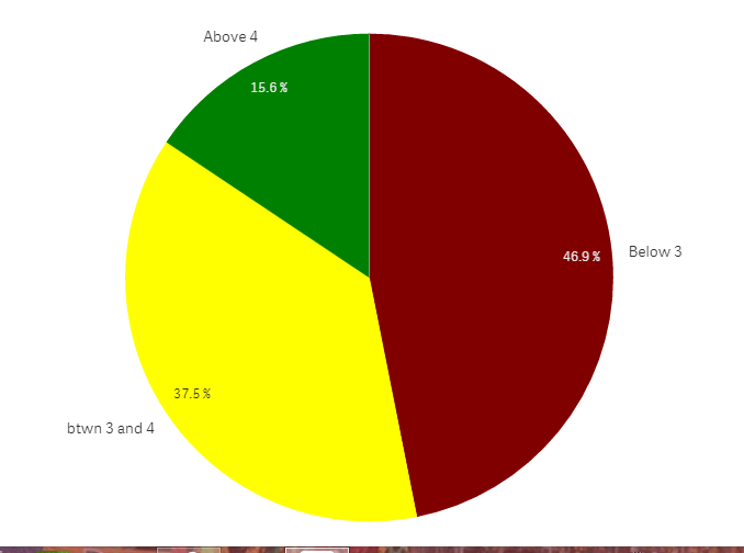
Dimension:
ValueList('Above 4', 'btwn 3 and 4','Below 3')
Measure::
if(ValueList('Above 4', 'btwn 3 and 4','Below 3')='Above 4',count({<[Test Score]={">4"}>}[Test Score]),
if(ValueList('Above 4', 'btwn 3 and 4','Below 3')='btwn 3 and 4',count({<[Test Score]={">3 <=4"}>}[Test Score]),
if(ValueList('Above 4', 'btwn 3 and 4','Below 3')='Below 3',count({<[Test Score]={"<3"}>}[Test Score])
)))
color by expression:
if(ValueList('Above 4', 'btwn 3 and 4','Below 3')='Above 4',green(),
if(ValueList('Above 4', 'btwn 3 and 4','Below 3')='btwn 3 and 4',yellow(),
if(ValueList('Above 4', 'btwn 3 and 4','Below 3')='Below 3',red()
)))
result:
- Mark as New
- Bookmark
- Subscribe
- Mute
- Subscribe to RSS Feed
- Permalink
- Report Inappropriate Content
Not sure if I understood this...
Do you have sample data or sample Dimension(s) / expression in place?
- Mark as New
- Bookmark
- Subscribe
- Mute
- Subscribe to RSS Feed
- Permalink
- Report Inappropriate Content
Basically it would just be one measure. The score on this test. I just wanted to show the breakdown of the percentages of scores in that "Donut" fashion.
So like green section is the good score, yellow is the ok score and red is the bad score.
Would it be possible to create something like this on just this test score or do I need to create a Dimension in order to make a chart?
- Mark as New
- Bookmark
- Subscribe
- Mute
- Subscribe to RSS Feed
- Permalink
- Report Inappropriate Content
If I fuly understand you, you have 3 expression; each for different calculation:
1) above 4: sum({<score={">4"}>}measure) : let's call it ExpressionAbove4
2)btwn 3 and 4: sum({<score={">3 <=4"}>}measure) : let's call it Expressionbtwn3and4
3)below 3: sum({<score={"<3"}>}measure) : let's called ExpressionBelow3
In your Pie chart:
as a dimension:
ValueList('Above 4', 'Between 3 and 4','Below 3')
as a measure :
if(ValueList('Above 4', 'Between 3 and 4','Below 3')='Above 4', ExpressionAbove4,
if(ValueList('Above 4', 'Between 3 and 4','Below 3')='Between 3 and 4', Expressionbtwn3and4,
if(ValueList('Above 4', 'Between 3 and 4','Below 3')=''Below 3', ExpressionBelow3)))
- Mark as New
- Bookmark
- Subscribe
- Mute
- Subscribe to RSS Feed
- Permalink
- Report Inappropriate Content
and use the same logic for coloring :
color by expression :
if(ValueList('Above 4', 'Between 3 and 4','Below 3')='Above 4', green(),
if(ValueList('Above 4', 'Between 3 and 4','Below 3')='Between 3 and 4',yellow(),
if(ValueList('Above 4', 'Between 3 and 4','Below 3')=''Below 3', red())))
- Mark as New
- Bookmark
- Subscribe
- Mute
- Subscribe to RSS Feed
- Permalink
- Report Inappropriate Content
Having a dimension would only help you.
You have scores but you are comparing it against what?
Like students fields is dimensions
then your expression.
It would need a criteria to break it down into different zones...
Good, ok and bad are being compared with?
While you can have have no dimension and just use expression but not sure if the same result can be achieved or not.
- Mark as New
- Bookmark
- Subscribe
- Mute
- Subscribe to RSS Feed
- Permalink
- Report Inappropriate Content
Basically the criteria would just be a range of the score.
Like any score below 3 is a "Bad score"
Any score between 3 and 4 is a "OK score"
Any score above 4 is a "good score"
I was just hoping for a chart that looked like the one I posted above to display the percentages of scores that fall in those ranges that is all.
Maybe I am misunderstanding something along the way though.
- Mark as New
- Bookmark
- Subscribe
- Mute
- Subscribe to RSS Feed
- Permalink
- Report Inappropriate Content
can you share a sample of your excel file?
- Mark as New
- Bookmark
- Subscribe
- Mute
- Subscribe to RSS Feed
- Permalink
- Report Inappropriate Content
| Test Score |
| 2.00 |
| 4.00 |
| 2.00 |
| 4.67 |
| 4.00 |
| 3.67 |
| . |
| 5.00 |
| 4.00 |
| 5.00 |
| 2.00 |
| 3.67 |
| 2.00 |
| 1.00 |
| 2.33 |
| . |
| 1.00 |
| 4.00 |
| 2.00 |
| . |
| 3.00 |
| 2.67 |
| 1.67 |
| 5.00 |
| 3.00 |
| 1.00 |
| 3.00 |
| 3.33 |
| 4.00 |
| 4.33 |
| 1.00 |
| 3.33 |
| 4.00 |
| 4.00 |
| . |
| 1.00 |
| 2.33 |
| 4.00 |
| 2.67 |
- Mark as New
- Bookmark
- Subscribe
- Mute
- Subscribe to RSS Feed
- Permalink
- Report Inappropriate Content
Dimension:
ValueList('Above 4', 'btwn 3 and 4','Below 3')
Measure::
if(ValueList('Above 4', 'btwn 3 and 4','Below 3')='Above 4',count({<[Test Score]={">4"}>}[Test Score]),
if(ValueList('Above 4', 'btwn 3 and 4','Below 3')='btwn 3 and 4',count({<[Test Score]={">3 <=4"}>}[Test Score]),
if(ValueList('Above 4', 'btwn 3 and 4','Below 3')='Below 3',count({<[Test Score]={"<3"}>}[Test Score])
)))
color by expression:
if(ValueList('Above 4', 'btwn 3 and 4','Below 3')='Above 4',green(),
if(ValueList('Above 4', 'btwn 3 and 4','Below 3')='btwn 3 and 4',yellow(),
if(ValueList('Above 4', 'btwn 3 and 4','Below 3')='Below 3',red()
)))
result:
- « Previous Replies
-
- 1
- 2
- Next Replies »