Unlock a world of possibilities! Login now and discover the exclusive benefits awaiting you.
- Qlik Community
- :
- Forums
- :
- Analytics
- :
- New to Qlik Analytics
- :
- Re: Full accumulation - showing a period
- Subscribe to RSS Feed
- Mark Topic as New
- Mark Topic as Read
- Float this Topic for Current User
- Bookmark
- Subscribe
- Mute
- Printer Friendly Page
- Mark as New
- Bookmark
- Subscribe
- Mute
- Subscribe to RSS Feed
- Permalink
- Report Inappropriate Content
Full accumulation - showing a period
Hi guys,
I'm facing a problem in my line chart.
I want to show the accumulated sum of a bank balance, but only for this year.
To do so, I'm using the following script with MonthYear as dimension:
rangesum(above(sum([GL Amount USD]),0,rowno()))
This script is working fine when I'm showing the bank balance as a line chart over all the years in our database.
When I'm selecting to show only the current year, the script above is starting to accumulate with the first month of the current year as starting point.
How could I make a chart where the bank balance is fully accumulated over all the years, but where only the current year is displayed?
Thanks a lot in advance!:)
Cheers,
Mike
- Mark as New
- Bookmark
- Subscribe
- Mute
- Subscribe to RSS Feed
- Permalink
- Report Inappropriate Content
Perhaps this document helps: Calculating rolling n-period totals, averages or other aggregations
talk is cheap, supply exceeds demand
- Mark as New
- Bookmark
- Subscribe
- Mute
- Subscribe to RSS Feed
- Permalink
- Report Inappropriate Content
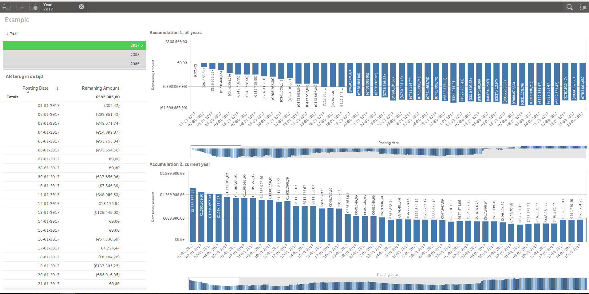
Hi Sunny (stalwar1),
attached you'll find a qvf file with example data.
As you can see in the data, I have an amount per date.
This amount should be accumulated since the first available date.
I was able to do that with the following expression:
rangesum(above(sum([GL Amount USD]),0,rowno()))
As you can see in the first bar chart in the example qvf, this works perfectly when I'm showing the amount ever since the first available date.
Now, I only want to show the amount in 2017. When using the expression you gave me, the accumulation starts on the first date in 2017 and shows therefore not the numbers that I expect.
How can we make sure that the accumulation starts on the first available date, but only the current year is shown?
Kind regards,
Mike
- Mark as New
- Bookmark
- Subscribe
- Mute
- Subscribe to RSS Feed
- Permalink
- Report Inappropriate Content
You are using calculated dimension, why? Try with Date and select Year = 2017
But if you want to look at only 2017, regardless of selection, then try this
RangeSum(Above(Sum({<Year, Date, MonthYear, Month>}[GL Amount USD]), 0, RowNo())) * Avg({<Year = {2017}>}1)
- Mark as New
- Bookmark
- Subscribe
- Mute
- Subscribe to RSS Feed
- Permalink
- Report Inappropriate Content
I used a calculation dimension to exclude the years before the current year, but this clearly was not what I should've done.
The example you've shown me is exactly what I was looking for, so many many many thanks for your help!
You're my hero of the day:)
Cheers,
Mike
- Mark as New
- Bookmark
- Subscribe
- Mute
- Subscribe to RSS Feed
- Permalink
- Report Inappropriate Content
Hi Sunny (stalwar1),
still one question left..
Is it possible to make a line chart with month/week as dimension (x-axis) and 3 measures/lines (2017, 2016 & 2015) shown in the chart?
When I'm changing the dimension from date to month/week, I'm facing the old problem..
Mike
- Mark as New
- Bookmark
- Subscribe
- Mute
- Subscribe to RSS Feed
- Permalink
- Report Inappropriate Content
You should be able to do this... can you update the sample to show the issue?
- Mark as New
- Bookmark
- Subscribe
- Mute
- Subscribe to RSS Feed
- Permalink
- Report Inappropriate Content
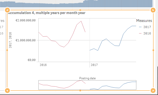
Hi Sunny (stalwar1),
see the third chart in the attached and updated qvf file..
The third chart has month as dimension and 2017 en 2016 as measure. Unfortunately, these lines are equal.
The fourth chart has monthyear as dimension and work, but not as I wanted..
These lines should be shown separately in one chart with month as dimension on the x-axis.
Please let me know if anything is unclear..
Mike
- Mark as New
- Bookmark
- Subscribe
- Mute
- Subscribe to RSS Feed
- Permalink
- Report Inappropriate Content
Hi Gysbert,
thanks for your reply.
The document you recommended was indeed really helpful to understand how accumulations and rolling periods work!
Mike
- Mark as New
- Bookmark
- Subscribe
- Mute
- Subscribe to RSS Feed
- Permalink
- Report Inappropriate Content
Can you explain as to what doesn't look right?
- Mark as New
- Bookmark
- Subscribe
- Mute
- Subscribe to RSS Feed
- Permalink
- Report Inappropriate Content
Hi Sunny (stalwar1),
I want to show these lines together in a chart..
So I want a x-axis with 12 months and the lines who represent the amount per year.
See below an example (other fictive data set) of what I mean.
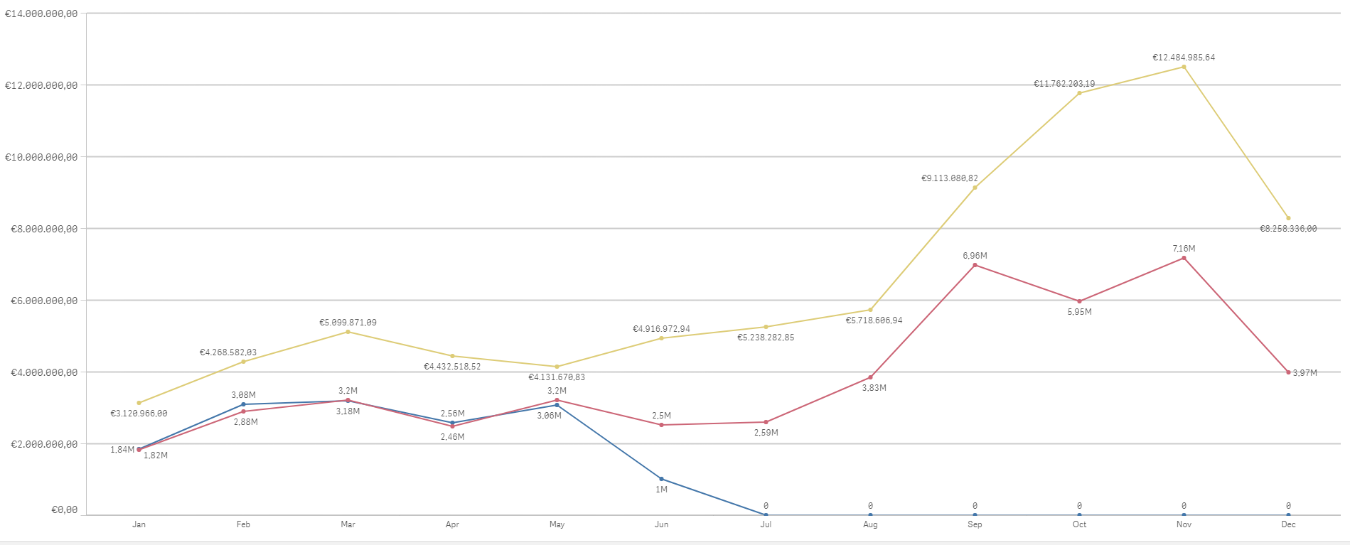
Hopefully this screenshot clarifies the case!