Unlock a world of possibilities! Login now and discover the exclusive benefits awaiting you.
- Qlik Community
- :
- Forums
- :
- Analytics
- :
- New to Qlik Analytics
- :
- Re: Qlik Sense Color in Line Chart
- Subscribe to RSS Feed
- Mark Topic as New
- Mark Topic as Read
- Float this Topic for Current User
- Bookmark
- Subscribe
- Mute
- Printer Friendly Page
- Mark as New
- Bookmark
- Subscribe
- Mute
- Subscribe to RSS Feed
- Permalink
- Report Inappropriate Content
Qlik Sense Color in Line Chart
Hi I want to color the line chart: above avg (reference line) as yellow, below avg as green. How can I do it? I tried color by measure with palette but was stuck with limited choices, I tried color by expression but get the whole line as green. Thanks in advance.
- « Previous Replies
-
- 1
- 2
- Next Replies »
- Mark as New
- Bookmark
- Subscribe
- Mute
- Subscribe to RSS Feed
- Permalink
- Report Inappropriate Content
What was the expression you used for color by expression?
- Mark as New
- Bookmark
- Subscribe
- Mute
- Subscribe to RSS Feed
- Permalink
- Report Inappropriate Content
Hi Jessica,
Just do something like this for the expression in the Color by expression:
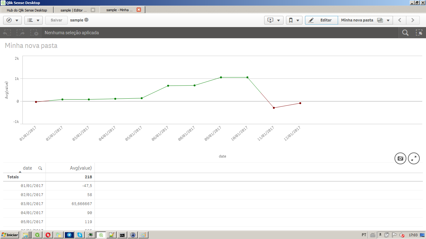
if(avg(Value)<0,red(),green()))
For some sample data i've put together, it gets me
- Mark as New
- Bookmark
- Subscribe
- Mute
- Subscribe to RSS Feed
- Permalink
- Report Inappropriate Content
There is color section separate for "Reference Lines" you can pick any one from there
- Mark as New
- Bookmark
- Subscribe
- Mute
- Subscribe to RSS Feed
- Permalink
- Report Inappropriate Content
Hi Jessica,
In Appearance property, you will find Color and legend section. In that select custom color and choose 'By expression' option from the dropdown list.
Then write below expression in expression space.
=if(Avg([Field Name)>133,Yellow(),Green()) .
Maybe this will solve your issue.
- Mark as New
- Bookmark
- Subscribe
- Mute
- Subscribe to RSS Feed
- Permalink
- Report Inappropriate Content
Hi Anil I see the feature in available in Nov 2017. But this color setting is for reference line, I am looking for a way to color the measure. Thanks.
- Mark as New
- Bookmark
- Subscribe
- Mute
- Subscribe to RSS Feed
- Permalink
- Report Inappropriate Content
Hi Ishan, this worked for static value. But if I replaced 133 with dynamic reference line expression it didn't work. Thanks.
- Mark as New
- Bookmark
- Subscribe
- Mute
- Subscribe to RSS Feed
- Permalink
- Report Inappropriate Content
Hi Felip, this worked for static value. But if I replaced 133 with dynamic reference line expression it didn't work.
- Mark as New
- Bookmark
- Subscribe
- Mute
- Subscribe to RSS Feed
- Permalink
- Report Inappropriate Content
well:
do
=if(Avg([Field Name)>YourExpressionForTheReferenceLine,Yellow(),Green()) .
- Mark as New
- Bookmark
- Subscribe
- Mute
- Subscribe to RSS Feed
- Permalink
- Report Inappropriate Content
I added "all" in the dynamic reference line calculation and it worked. The reference line expression was to sum up the measure across the months and divide by month count. The reference line took the calculation without "all" because it was not impacted by dimension. Coloring condition was impacted by dimension though. So adding "all" would remove dimension impact. Thank you all for the input!
- « Previous Replies
-
- 1
- 2
- Next Replies »