Unlock a world of possibilities! Login now and discover the exclusive benefits awaiting you.
- Qlik Community
- :
- Forums
- :
- Analytics
- :
- New to Qlik Analytics
- :
- Re: Colored conditional line-charts in dimensions ...
- Subscribe to RSS Feed
- Mark Topic as New
- Mark Topic as Read
- Float this Topic for Current User
- Bookmark
- Subscribe
- Mute
- Printer Friendly Page
- Mark as New
- Bookmark
- Subscribe
- Mute
- Subscribe to RSS Feed
- Permalink
- Report Inappropriate Content
Colored conditional line-charts in dimensions with high number of categories
It is well explained by Steve Street on color by expression - QlikSense, and Kaan Erisen in Change color in charts with conditional dimensions and aggregations how to create conditional colored line charts. Nevertheless, this option is perfect to be applied on Line Charts cases were you have few-categories dimensions (e.g. Sales Sum by Continent), as this solution uses the function ValueList and each category of a dimension should be entered manually. In the case of many-categories dimensions (e.g. Sales Sum by City_ID or Customer_ID) it does not work well, as it is not practical to enter manually the ID´s of all the cities.
My question is: is it possible to create this condition-colored Line Charts over many-categories dimensions without entering them manually with the ValueList approach?
I explain a reproducible file example attached:
Variable extensions values in the app attached:
BeginPromoA = 01.05.17
EndPromoA = 03.05.17
BeginPromoB = 04.05.17
EndPromoB = 06.05.17
BeginPromoC = 07.05.17
EndPromoC = 08.05.17
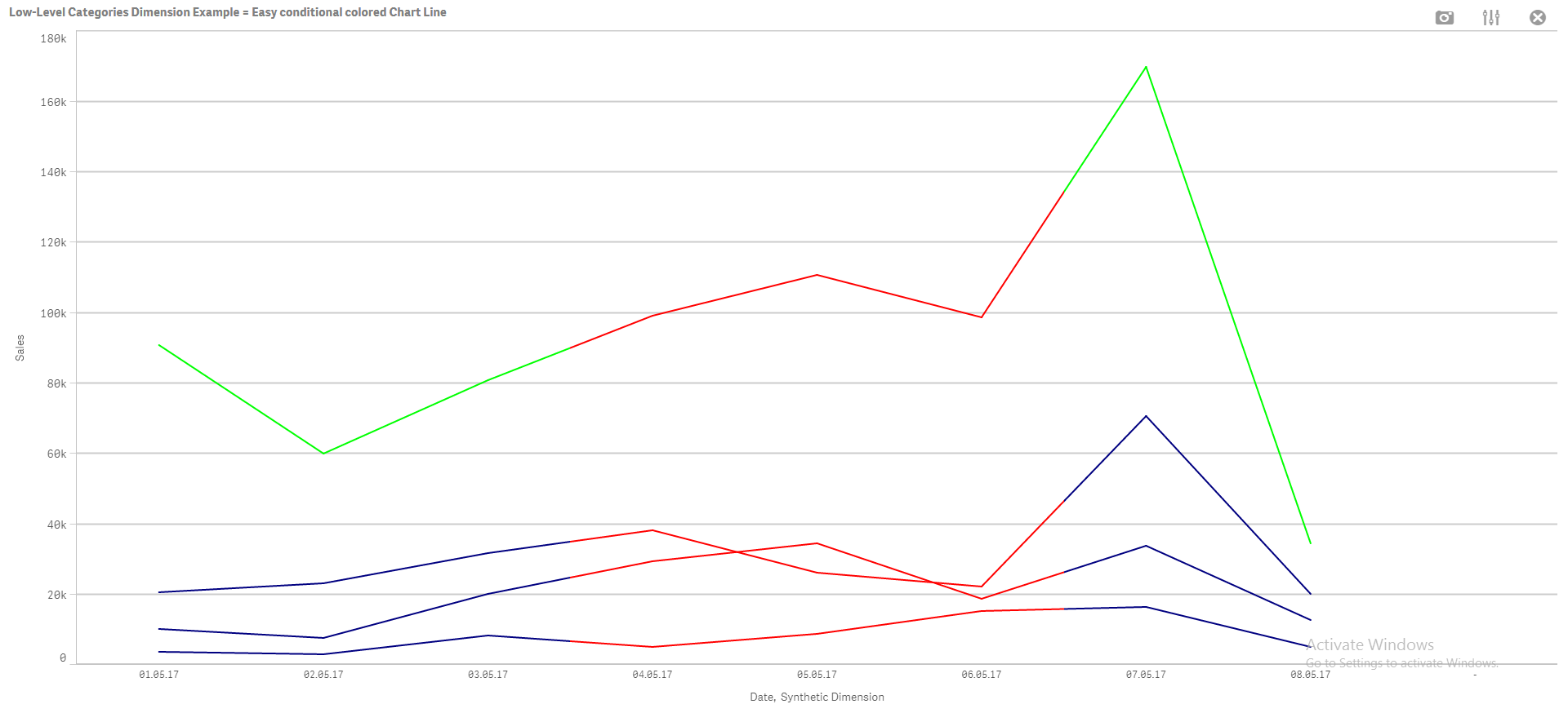
First I create a conditional colored line chart for an example where I only have 4 categories. It works well:
Data
Dimensions:
Date
Synthetic Dimension -> Fx expression:
ValueList('First Class', 'Second Class', 'Standard Class', 'Same Day')
Measures:
Sales -> Fx expression:
if( ValueList('First Class', 'Second Class', 'Standard Class', 'Same Day')='First Class', SUM({<[Ship Mode]={'First Class'}>}Sales),
if( ValueList('First Class', 'Second Class', 'Standard Class', 'Same Day')='Second Class', SUM({<[Ship Mode]={'Second Class'}>}Sales),
if( ValueList('First Class', 'Second Class', 'Standard Class', 'Same Day')='Standard Class', SUM({<[Ship Mode]={'Standard Class'}>}Sales),
if( ValueList('First Class', 'Second Class', 'Standard Class', 'Same Day')='Same Day', SUM({<[Ship Mode]={'Same Day'}>}Sales)
))))
Appearance
Colors and Legend -> Fx expression:
if((Date>=date(date#('$(vBDA_3)','DD.MM.YY'),'DD.MM.YY')) and (Date<=date(date#('$(vBDA_4)','DD.MM.YY'),'DD.MM.YY')),LightRed(),
IF(MATCH(ValueList('First Class', 'Second Class', 'Standard Class', 'Same Day'),'First Class','Same Day','Second Class'),Blue(),LightGreen()))
The resulting graph is perfect:
Now, what I want to create is an analogous example with more categories, with error results. I.e.
Data
Dimensions:
Date
City
Measures:
UABs (Unique Active Buyers )-> Fx expression:
num(Count(Distinct [Customer ID]),'#,##0',',' )
Cities to be coloured in green:
- New York City
- Los Angeles
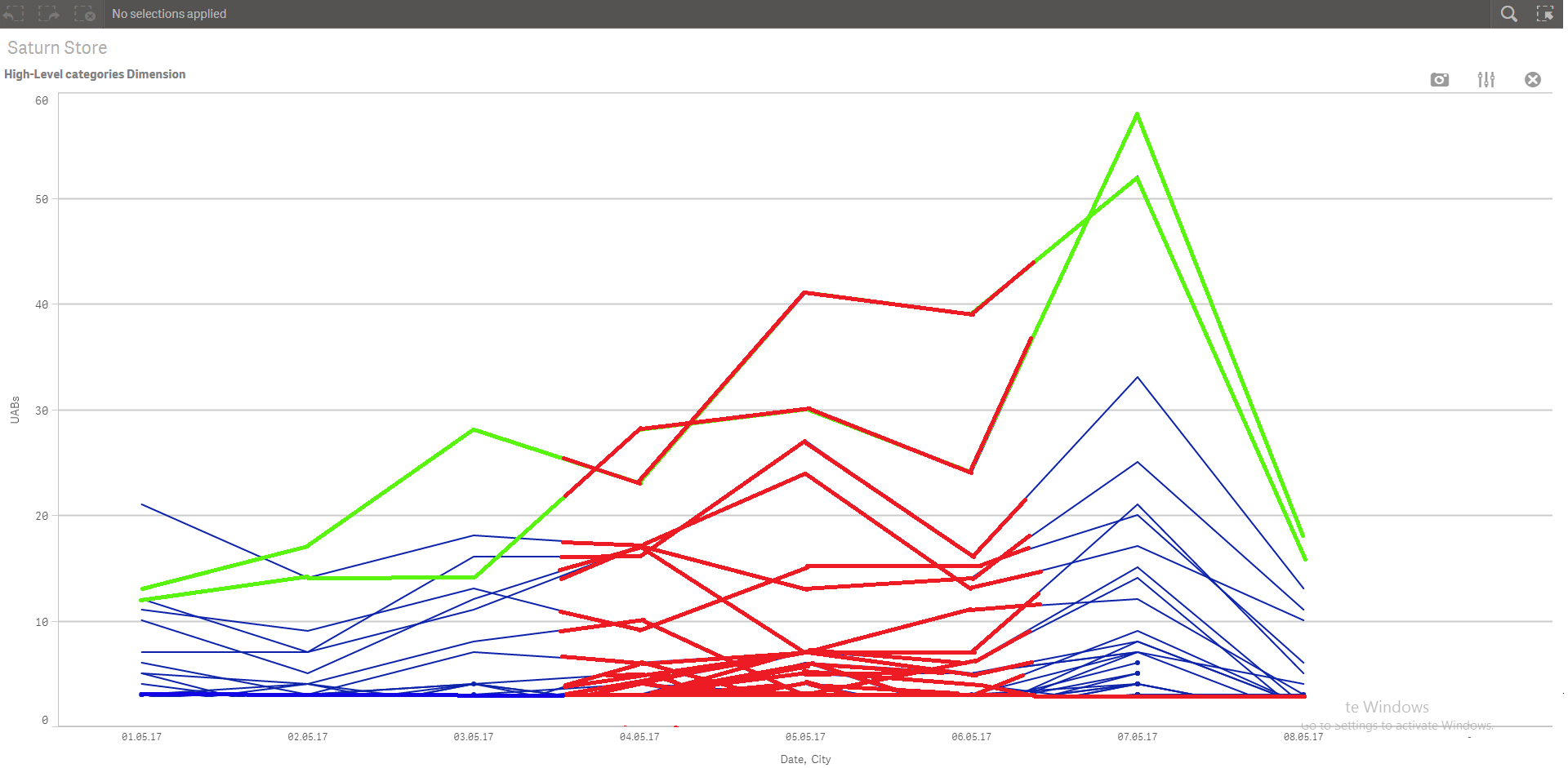
Thanks in advance for all your answers. Anibal
Accepted Solutions
- Mark as New
- Bookmark
- Subscribe
- Mute
- Subscribe to RSS Feed
- Permalink
- Report Inappropriate Content
Hi Anibal,
"My question is: is it possible to create this condition-colored Line Charts over many-categories dimensions without entering them manually with the ValueList approach?"
Actually you don't need to use 'valuelist' method to get this chart you desired with this data.
Dimensions:
Date
[Ship Mode]
Measures:
Sum(Sales)
Appearance
Colors and Legend -> Fx expression:
IF((Date>=date(date#('$(vBDA_3)','DD.MM.YY'),'DD.MM.YY')) and (Date<=date(date#('$(vBDA_4)','DD.MM.YY'),'DD.MM.YY')),LightRed(),
IF(MATCH([Ship Mode],'First Class','Same Day','Second Class'),Blue(),LightGreen()))
For second graph,
Data
Dimensions:
Date
City
Measures:
UABs (Unique Active Buyers )-> Fx expression:
num(Count(Distinct [Customer ID]),'#,##0',',' )
Appearance
Colors and Legend -> Fx expression:
if((Date>=date(date#('$(vBDA_3)','DD.MM.YY'),'DD.MM.YY')) and (Date<=date(date#('$(vBDA_4)','DD.MM.YY'),'DD.MM.YY')),LightRed(),
IF(MATCH(City,'New York City','Los','Los Angeles'),LightGreen(),Blue()))
Cities to be coloured in green:
- New York City
- Los Angeles
İf you have to many categories maybe you can define it in script level.
Hope it helps,
- Mark as New
- Bookmark
- Subscribe
- Mute
- Subscribe to RSS Feed
- Permalink
- Report Inappropriate Content
Thank you Kaan Erisen for your response. Works perfect your solution. Regards, Anibal.