Unlock a world of possibilities! Login now and discover the exclusive benefits awaiting you.
- Qlik Community
- :
- All Forums
- :
- QlikView App Dev
- :
- Re: Bad image and object quality when using Qlikvi...
- Subscribe to RSS Feed
- Mark Topic as New
- Mark Topic as Read
- Float this Topic for Current User
- Bookmark
- Subscribe
- Mute
- Printer Friendly Page
- Mark as New
- Bookmark
- Subscribe
- Mute
- Subscribe to RSS Feed
- Permalink
- Report Inappropriate Content
Bad image and object quality when using Qlikview in web
Hello everybody,
I am having the problem of low resolution charts and images on my qv apps in the web client (accessed through Access point).
Even worse when I'm exporting the the chart as images. The images would turn out very blurry and pixelated.
This wont be a problem using the desktop client, but the web application.
This screenshot is an example:
The list box has good image quality, however the charts have very low resolution bad image quality.
Is there any way to make some settings, perhaps on the server side eg. the QV Management console or some config files, to make the app render more high quality images for the charts? also when exporting these?

Any help would be appreciated!
//Simon
- Mark as New
- Bookmark
- Subscribe
- Mute
- Subscribe to RSS Feed
- Permalink
- Report Inappropriate Content
Maybe this will help:
- Mark as New
- Bookmark
- Subscribe
- Mute
- Subscribe to RSS Feed
- Permalink
- Report Inappropriate Content
Thank you, that would help using the desktop client.
My remaining challenge is also to be able to both display and export high quality images from the Qv web application (web server). Our charts have very low image quality when using the web application.
Do you know more about this?
- Mark as New
- Bookmark
- Subscribe
- Mute
- Subscribe to RSS Feed
- Permalink
- Report Inappropriate Content
I can't help answer this but I've also got the exact same problem. Text objects seem to be fine (and possibly some other object types) but charts degrade in quality significantly, just like in Simon's screenshots.
Turning on WebView in the QlikView desktop client does not reduce the image quality. It's only when the QVW is opened via Accesspoint in a web browser that the quality degrades - the exact same QVW file that Accesspoint uses, but opened in desktop client, is fine.
This doesn't appear to be browser-specific; it certainly happens equally using Chrome and IE 11.
It isn't a new problem, but seeing Simon's post prompted me to corroborate.
Edit: I've done some more investigation into this and have some more detail about exactly what is happening, although still not why.
Let's say I use the Qlikview Desktop client to place a chart in a QVW. The exact nature of the chart is totally unimportant. I care about precise layout, so after defining my dimensions, expressions, etc, I go to the Chart Properties, 'Caption' tab, and specify an exact Width and Height for the chart object. Let's say I specify width 600 and height 300 (pixels).
I use the Qlikview Management Console to run a task that reloads and distributes this QVW to the AccessPoint directory. I refresh AccessPoint in my browser (hard refresh for the sake of thoroughness, Ctrl+F5), and open the QVW. Hard refresh again once it's opened.
I can now see my new chart here in the browser - I'm on 100%/normal zoom by the way. Using Microsoft Snipping Tool I can take a screenshot of it, as a way to approximately measure the dimensions of the image as I'm seeing it. (I'm sure there are other ways to do the same thing.) It is definitely 600 pixels wide and 300 high. But noticeably fuzzy!
Now here's the interesting part: using my browser's Developer Tools (F12 in Chrome) I identify the actual image file and download the PNG file to my desktop. Looking at its properties, the image's native dimensions are now 480x240 pixels! This is a scale factor of exactly 1.25 - that factor seems to be consistent for all images I've tested this on in my QVW, on our server set-up. Because of rounding to nearest whole pixels, the factor might come out slightly above or below 1.25 but never significantly.
So (TL;DR): the images have become fuzzy / blurry / low quality / low resolution (whatever we want to call it) because they've been scaled down by a quarter somehow, then displayed at the original size again.
- Mark as New
- Bookmark
- Subscribe
- Mute
- Subscribe to RSS Feed
- Permalink
- Report Inappropriate Content
Thank you for a very interesting post!
From reading it, it seems to me that there is somewhere qlikview web/accesspoint actively resizes the charts with a fixed value in its settings.
If that is the case there is perhaps also a way to change or hack it somewhere in one of the qlikview web files located on the server.
- Mark as New
- Bookmark
- Subscribe
- Mute
- Subscribe to RSS Feed
- Permalink
- Report Inappropriate Content
I think I can explain this fully now! simonhaist Going to write a fairly lengthy explanation to hopefully document this for anyone else reading too.
Background
Firstly, something that's generally helpful to understand: the difference between "vector" and "raster" images. The internet can explain this far better than me, e.g. this page. From layman's perspective (which is all I am) in the context of QlikView apps viewed via web browser:
- text in text boxes is vector
- most elements of list boxes, multiboxes, search boxes etc are vector
- tables (table box / straight table / pivot table) are vector
- graphical charts (bar, pie, etc) all appear to be raster
- buttons, and some elements of multiboxes, search boxes etc are raster
The difference being that if you increase your browser zoom significantly (try 200% or greater), you'll see vector things remain sharp no matter what, while raster things get fuzzier. So for example the little magnifying glass icon in a search box gets fuzzy (raster), while the outline of the search box and hint text ('Search') remain crisp (vector). This is not Qlikview's 'fault', it's largely unavoidable: some things can be represented on a HTML webpage in a vector-like way (using HTML + CSS + possibly JavaScript - things a browser understands); others cannot so need to be turned into raster image files. (Vector image files do exist - svg - but I've no idea how feasible it would be to use these for QlikView charts... not my area of expertise.)
By contrast, in a QVW viewed via QlikView desktop, everything is effectively a vector. The QVW stores the raw information necessary to make a bar chart look sharp at any size, and it's rendered on-the-fly for whatever size is required.
OK, got that, so what is going on here?
Turns out it's all to do with Windows' Display settings and how browsers interpret this - not QlikView's web server. I'm 95% sure of this because it all just ties up perfectly - but I have only my own machine as evidence, so would appreciate anyone else confirming it.
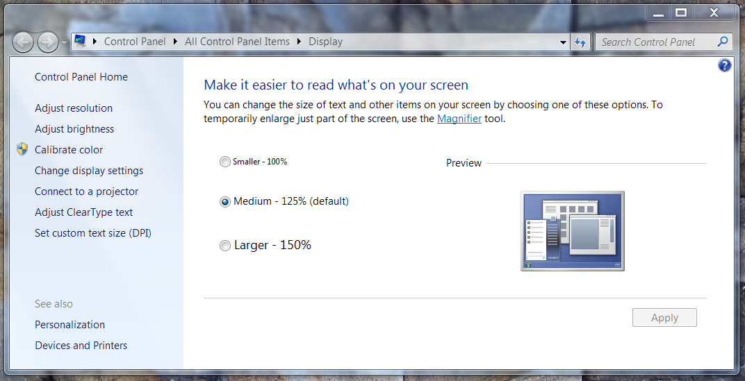
This is how it looks on Windows 7 - I believe the option still exists through to Windows 10. You can get to it by searching in the Start menu for 'Display'. I believe Windows had chosen the 125% default for me based on my monitors' native resolution/size (1920x1080, 22") and may choose different defaults for different monitors. 125% is definitely the Goldilocks setting for me, having tried the other two briefly.
If you read my previous comment where I found a scale factor of exactly 1.25 going on, you may - rightly - be connecting that to this 125% factor here!
It's mainly that simple - with the 125% magnification setting in Windows, what you see in a web browser is being scaled up by 25% relative to what it "should" be ("should" in quite a loose, hypothetical sense). This is actually happening all over the internet I think - not just QlikView: for example, Google's doodle today actually looks a bit fuzzy now I look at it with this in mind. If I scale Google's main page (or a QlikView) app down in my web browser to a one-fifth (inverse of 1.25) lower zoom, then suddenly the Google doodle or QlikView charts seem magically much sharper - as if this is the scale they're meant to be viewed at.
This effect isn't visible for literally every image on the internet because some image files are actually bigger than they're being shown. E.g. I can take a 1000x1000px native image file and put it in a webpage with CSS that instructs browsers to show it in a 500x500px space; the browser scales it down, and then if I have my Windows setting at 125%, it's getting closer to the original 1000x1000 but still smaller than that, so it'll still look sharp. Google Image Search is a good example of that.
So I think Qlik maybe could do something to improve on this, by being clever about at what size it makes the raster image versions of charts for web - since in the original QVW, everything is vector. If it made raster images at 1.5x or 2x what is simplistically needed, they'd be a little bigger in filesize, but would look great.
Extra complication - Chrome vs IE
There's one more piece to the puzzle - as we hopefully all know, browsers are not all alike. Chrome (I'm on v67.0) and IE (v11.0 for me) do something quite different with the Windows 125% display setting. YMMV if you're on a drastically different version
I said in my previous comment that I did all my testing at 100%/normal zoom. Turns out that wasn't entirely accurate. Chrome (my main go-to browser) was set to 100% zoom - so at 100% zoom, it's showing everything 1.25 times originally-intended size, because of the Windows display setting. On Chrome, if I want to see everything as crisp and sharp as the designer intended, I have to set my browser zoom to 80%.
However, on IE, I was on normal zoom but not 100% zoom. IE looks at the 125% setting at the Windows level, and decides "OK then, I'm going to make your default zoom level be 125%". I don't use IE regularly so hadn't noticed this.
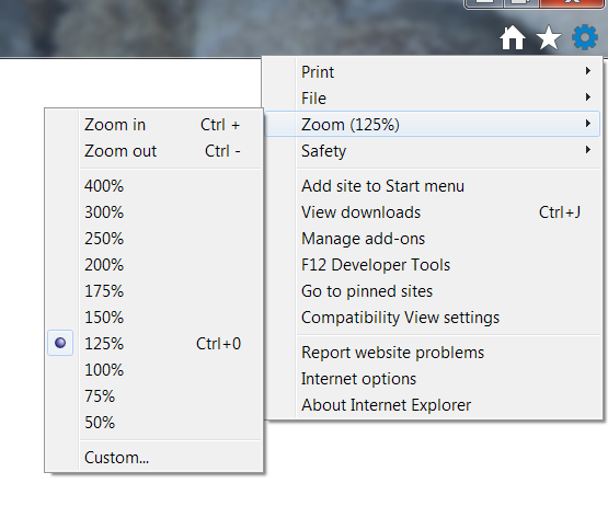
IE's 125% zoom looks more or less identical to Chrome's 100% zoom. IE's 100% = Chrome 80% and so on. So on IE, if I explicitly ask for 100% zoom, I'll get the nice crisp versions of images.
Takeaway
The main thing I'm taking away from this is a reminder that I have less control than I'd like over how my QlikView apps will look to end users. Some of them may have Windows on the 100% or 150% display magnification setting rather than 125%. I guess maybe there's some way to detect the setting per-user and adjust for it, but that's probably a lot of work for little gain.
I probably shouldn't worry too much about the crispness, therefore - and conversely, I also can't and shouldn't worry too much about designing QlikView dashboards to fit nicely on one screenful - with all the possible variation in physical screen size, resolution, and this magnification setting, it's not possible to achieve this for everyone. (Many of our users alternate between decent-sized monitors at-desk, and a 15" or 13" laptop screen when mobile.) This particular aspect is, after all, one of the big things that Qlik Sense brings to the game - responsive design that should look great on any screen size. (My organization has valid reasons, however, for sticking with QlikView over Qlik Sense right now.)
If a user particularly cares about the crispness, I just have to tell them to zoom out their browser a bit.
This also explains a related problem I'd had when building an NPrinting PowerPoint report that pulled in charts as images, where I had to make the QlikView charts much bigger than expected in order to make the final PowerPoint look crisp. I think PowerPoint doesn't respond to the Windows display setting in quite the same way as browsers do. From now on, I'll take account of this 1.25% setting in what I'm personally seeing, when designing QlikView content for NPrinting reports.
- Mark as New
- Bookmark
- Subscribe
- Mute
- Subscribe to RSS Feed
- Permalink
- Report Inappropriate Content
Thanks again for another great post and the effort you've put into this!
Although it doesn't seem there is much to do about the problem, you've definitely got us closer to the truth.
- Mark as New
- Bookmark
- Subscribe
- Mute
- Subscribe to RSS Feed
- Permalink
- Report Inappropriate Content
Since a number of people seem to be landing on this discussion: I've not tried it yet, but I have a hunch that QlikView November 2018 release may resolve this problem, since there's been a massive overhaul to graphics/rendering tech under the hood.
If anyone is already on Nov 2018 and can verify, please do let us know below!
- Mark as New
- Bookmark
- Subscribe
- Mute
- Subscribe to RSS Feed
- Permalink
- Report Inappropriate Content