Unlock a world of possibilities! Login now and discover the exclusive benefits awaiting you.
- Qlik Community
- :
- All Forums
- :
- Qlik NPrinting
- :
- Re: PixelPerfect: Dynamic constant line in bar cha...
- Subscribe to RSS Feed
- Mark Topic as New
- Mark Topic as Read
- Float this Topic for Current User
- Bookmark
- Subscribe
- Mute
- Printer Friendly Page
- Mark as New
- Bookmark
- Subscribe
- Mute
- Subscribe to RSS Feed
- Permalink
- Report Inappropriate Content
PixelPerfect: Dynamic constant line in bar chart
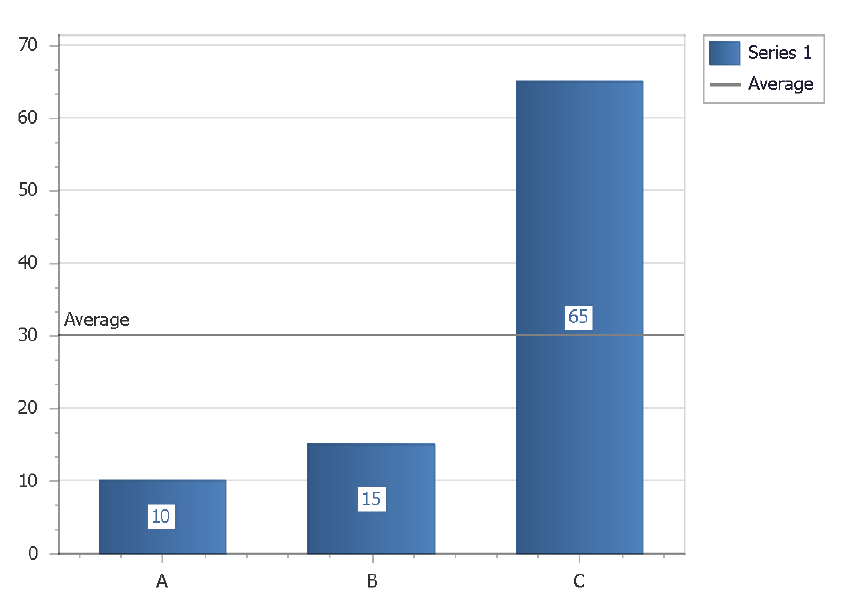
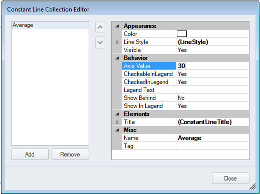
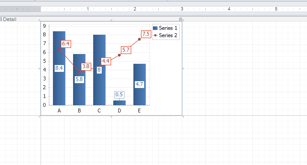
I'd like to create a dynamic constant line in a bar chart in PixelPerfect mode. Has anyone been able to accomplish this? I can only enter a number in the properties box. Variables are ignored. Below is just an example - I'm not looking to create an average, but to have a dynamic target line depending on the filter applied.
Best regards,
Jakob
Accepted Solutions
- Mark as New
- Bookmark
- Subscribe
- Mute
- Subscribe to RSS Feed
- Permalink
- Report Inappropriate Content
I don't think this is possible from my experience.
- Mark as New
- Bookmark
- Subscribe
- Mute
- Subscribe to RSS Feed
- Permalink
- Report Inappropriate Content
I don't think this is possible from my experience.
- Mark as New
- Bookmark
- Subscribe
- Mute
- Subscribe to RSS Feed
- Permalink
- Report Inappropriate Content
Hi,
What does it mean dynamic constant?
My approach would be to use Combo chart with one series for bar and one series represented by line. Line would be your average. Therefore you would be able to create value for it in your source table in Qlik.
explain little bit more where the value needs to come from and i may be able to provide you with guidlines.
regards
Lech
- Mark as New
- Bookmark
- Subscribe
- Mute
- Subscribe to RSS Feed
- Permalink
- Report Inappropriate Content
Hi Lech,
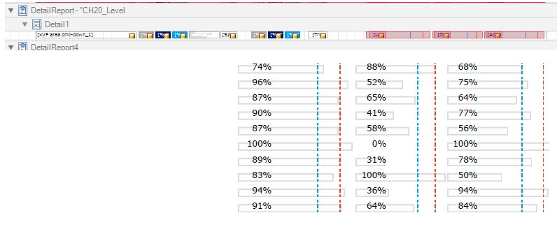
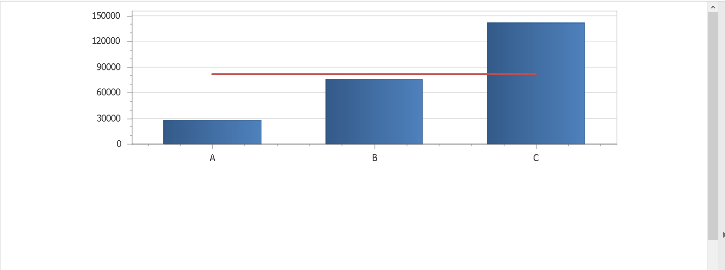
Thanks for reverting. I'm using the bar chart as part of a level that outputs a table. The output "table" shows both bars and numbers which is working fine. But the bar charts I'm using do only have one bar each (see design and output below). So your suggestion with another series will not work in this case because output will only be a dot instead of a line connecting several points. A combo chart only offers to option of have dots, circles, squares, diamonds, but not a vertical line. That looks a little clumsy.
So I'm hoping for a solution where I can create something like below, but make it dynamic so the constant lines get their values from a Qlik expression instead of a hard coded value.
Best regards,
Jakob
- Mark as New
- Bookmark
- Subscribe
- Mute
- Subscribe to RSS Feed
- Permalink
- Report Inappropriate Content
Hi Jakob.
I refered to Pixel Perfect Combo chart which has Line as well .
I will show you example in few minutes
- Mark as New
- Bookmark
- Subscribe
- Mute
- Subscribe to RSS Feed
- Permalink
- Report Inappropriate Content
Sorry for my poor explanation above. The combo chart does have a line. But I only have one bar => one point for the line, so it will not be able to draw the line.
- Mark as New
- Bookmark
- Subscribe
- Mute
- Subscribe to RSS Feed
- Permalink
- Report Inappropriate Content
ok,
so here are my steps:
- create table in Qlik (I used QlikView)
- dimension
- series to represent bar
- series to represent your static/dynamic referenece line
- pull it to NPrinitng (I pulled it as a table)
- create pixel perfect bar chart with 2 series
- chose bar representation for series 1
- chose line representation for series 2
- tweak look of the line chart by removing datapoints and markers
- preview
that's it
- Mark as New
- Bookmark
- Subscribe
- Mute
- Subscribe to RSS Feed
- Permalink
- Report Inappropriate Content
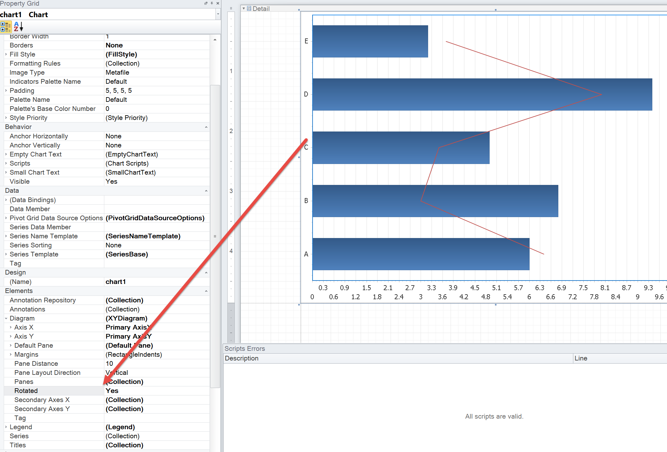
one more settings - to rotate chart you need to use this option (see image below)
- Mark as New
- Bookmark
- Subscribe
- Mute
- Subscribe to RSS Feed
- Permalink
- Report Inappropriate Content
Thanks for the suggestion, which will unfortunately not work in my case. If you reduce your QlikView data to just one category and reload, then the red line will be reduced to a dot.
- Mark as New
- Bookmark
- Subscribe
- Mute
- Subscribe to RSS Feed
- Permalink
- Report Inappropriate Content
Hi,
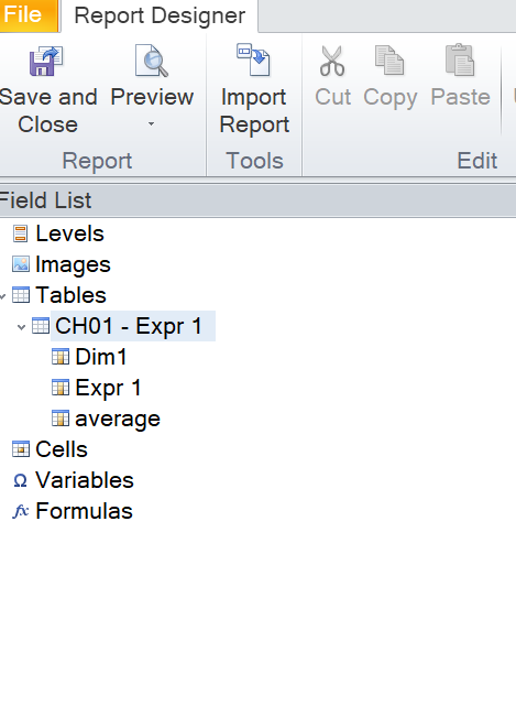
- Create a new column in the original QlikView or Qlik Sense chart used as source. In the new column insert a formula that calculates the value you need. It could be necessary to use some advanced formula features.
- Save and refresh the connection cache
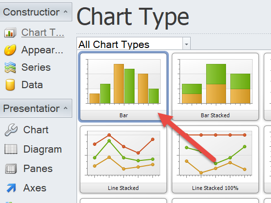
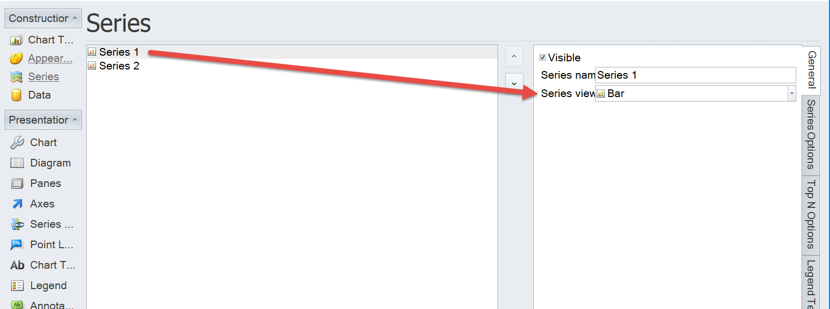
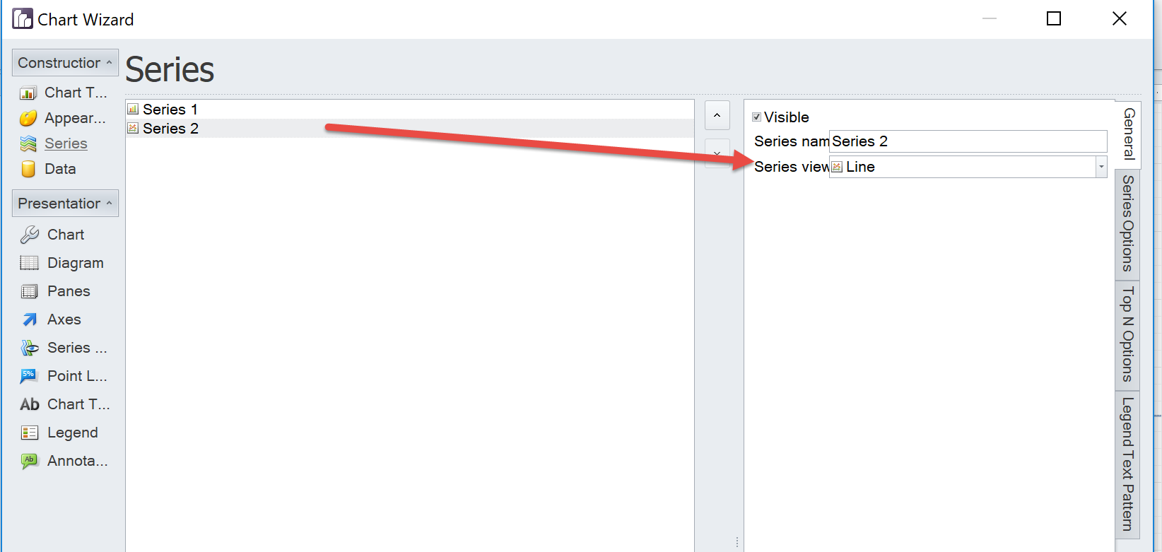
- Create the PixelPerfect chart with two series: one for the data and one for the dynamic horizontal line. In the "Series" tab, select the Series 2 then open the "Series view type" drop down menu and select Line. The added column is populated by the same value for each row so it will be represented as an horizontal line.
- Customize the other chart parameters. For example remove the Marker in the Series View
- Run a preview
Best Regards,
Ruggero
---------------------------------------------
When applicable please mark the appropriate replies as CORRECT https://community.qlik.com/docs/DOC-14806. This will help community members and Qlik Employees know which discussions have already been addressed and have a possible known solution. Please mark threads as HELPFUL if the provided solution is helpful to the problem, but does not necessarily solve the indicated problem. You can mark multiple threads as HELPFUL if you feel additional info is useful to others.
Best Regards,
Ruggero
---------------------------------------------
When applicable please mark the appropriate replies as CORRECT. This will help community members and Qlik Employees know which discussions have already been addressed and have a possible known solution. Please mark threads with a LIKE if the provided solution is helpful to the problem, but does not necessarily solve the indicated problem. You can mark multiple threads with LIKEs if you feel additional info is useful to others.