Unlock a world of possibilities! Login now and discover the exclusive benefits awaiting you.
- Qlik Community
- :
- Forums
- :
- Analytics
- :
- New to Qlik Analytics
- :
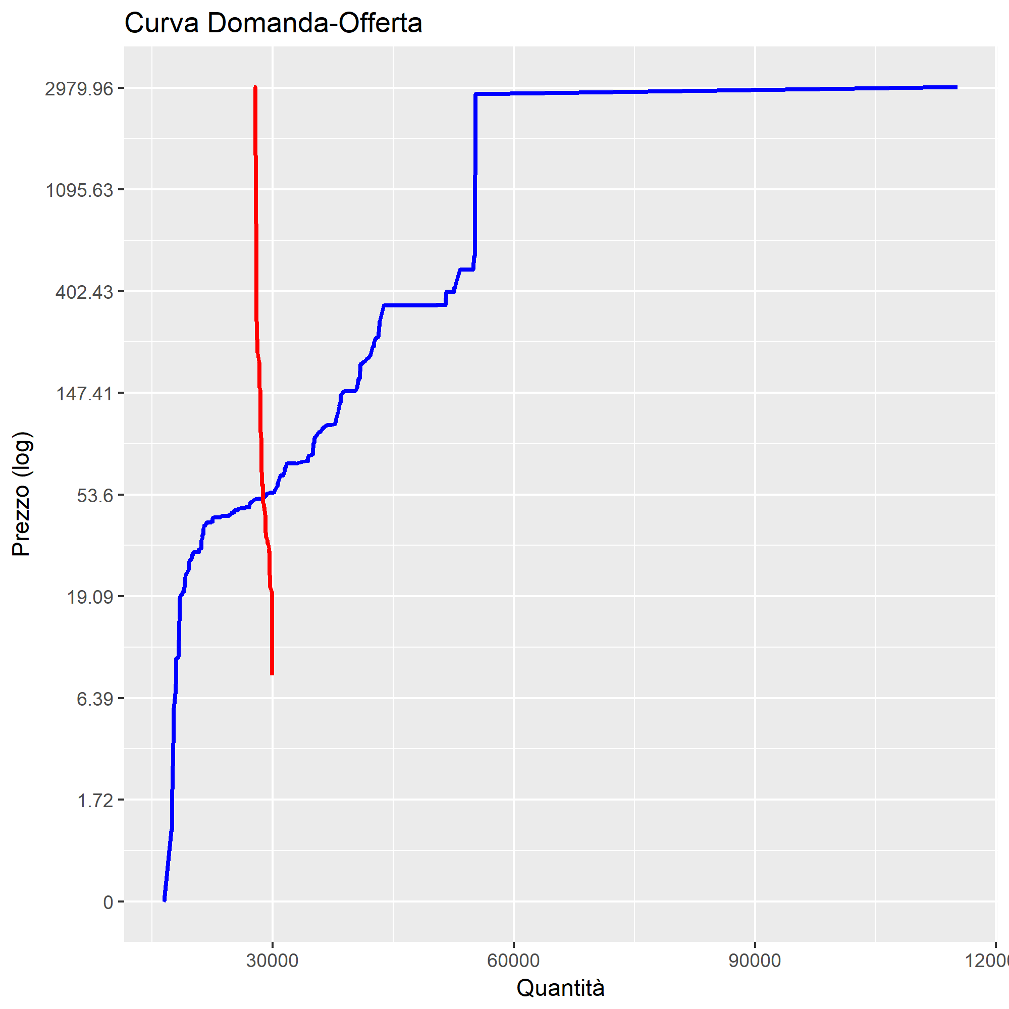
- DEMAND/SUPPLY CURVE ON QLIK SENSE
- Subscribe to RSS Feed
- Mark Topic as New
- Mark Topic as Read
- Float this Topic for Current User
- Bookmark
- Subscribe
- Mute
- Printer Friendly Page
- Mark as New
- Bookmark
- Subscribe
- Mute
- Subscribe to RSS Feed
- Permalink
- Report Inappropriate Content
DEMAND/SUPPLY CURVE ON QLIK SENSE
Hi,
I need to represent a demand/supply curve on qlik sense using a linear chart or another one.
I have a fact table with : quantity, price, date , hour and purpose (buy or sell).
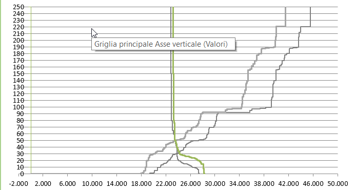
I have to obtain a chart like this:
Can Someone help me?
Thanks
- Mark as New
- Bookmark
- Subscribe
- Mute
- Subscribe to RSS Feed
- Permalink
- Report Inappropriate Content
Try scatter chart as it has two measures, the more dimension data you have, closer the dots you will get but not sure if it exactly will look like the image you shared.
- Mark as New
- Bookmark
- Subscribe
- Mute
- Subscribe to RSS Feed
- Permalink
- Report Inappropriate Content
i need 2 mesures:
1- rangesum(above(sum(quantity)) with purpose=buy
2-rangesum(below(sum(quantity)) with purpose=sell
on y-axis i want price.
- Mark as New
- Bookmark
- Subscribe
- Mute
- Subscribe to RSS Feed
- Permalink
- Report Inappropriate Content
Can you share sample data and expected output, as I said you can have one measure at X axis and another one at Y axis to compare measure's dots for different dimension values.
It appears somehow you would need to combine your listed Quantity measures, but cannot say further without seeing the sample data and expected output.
- Mark as New
- Bookmark
- Subscribe
- Mute
- Subscribe to RSS Feed
- Permalink
- Report Inappropriate Content
here some rows:
| DDATE_AGGR | HOUR_AGGR | QUANTITA_AGGR | PURPOSE_AGGR | PRICE_AGGR | ID_FAMIGLIA_ZONA |
| 12-01-2018 | 1 | 0,001 | Buy | 0,01 | 96 |
| 12-01-2018 | 1 | 0,001 | Buy | 8,23 | 50 |
| 12-01-2018 | 1 | 0,001 | Buy | 23,72 | 50 |
| 12-01-2018 | 1 | 0,001 | Buy | 27,95 | 50 |
i want to obtain a char like this :
thanks