Unlock a world of possibilities! Login now and discover the exclusive benefits awaiting you.
- Qlik Community
- :
- Forums
- :
- Analytics
- :
- New to Qlik Analytics
- :
- Re: Organize columns in datasheets for best use in...
- Subscribe to RSS Feed
- Mark Topic as New
- Mark Topic as Read
- Float this Topic for Current User
- Bookmark
- Subscribe
- Mute
- Printer Friendly Page
- Mark as New
- Bookmark
- Subscribe
- Mute
- Subscribe to RSS Feed
- Permalink
- Report Inappropriate Content
Organize columns in datasheets for best use in Qlik sense?
Hi, Qlik experrts!
I need help to organize the tables in my database for use in Qlik sense. The data is stored in MS SQL and contains a lot of data. When I try to make dashoboards where data from several sheets are used in the script, I get some problems where I believe that Qlik reads (sum) data wrong. (The sheets are linked correctly). My question is, how should the data be organized in the tables.
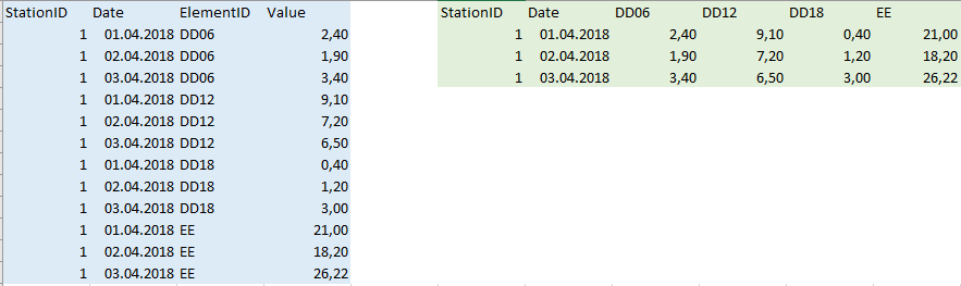
I have organized the tables like the picture below, columns shown in blue. The elementID is made of 74 different elemets, and the date goes back to 01.01.1900.. Perhaps there is better to organize the data like in the columns marked with green in the same picture?
Thanks
Helge
Accepted Solutions
- Mark as New
- Bookmark
- Subscribe
- Mute
- Subscribe to RSS Feed
- Permalink
- Report Inappropriate Content
It is in general more common to have fewer columns like you have in your blue table. But it depends on the nature of the Value. Is it in some instances necessary to sum or calculate across the various ElementIDs? If not the green layout could be easier to use since you won't need to always or often filter for the ElementID.
With the blue layout a sum of one ElementID would be done like this:
Sum( {<ElementID={'DD06'}>} Value) unless you already have the ElementID as a dimension in your chart.
With the green layout a sum is simply:
Sum( DD06 )
Usually the blue layout is to prefer because it is easier to create any kind of calculation. But the snag is that you will have to filter depending on which dimensions you have included in your visualization so you don't mix values in calculations that doesn't make sense.
The number of rows shouldn't be a problem
- Mark as New
- Bookmark
- Subscribe
- Mute
- Subscribe to RSS Feed
- Permalink
- Report Inappropriate Content
Thanks Petter!
It will not be necessary to calculate across elemtsID. So I will follow your suggestion and have few columns.