Unlock a world of possibilities! Login now and discover the exclusive benefits awaiting you.
- Qlik Community
- :
- Forums
- :
- Analytics
- :
- New to Qlik Analytics
- :
- Re: Dual Line Graph based on selection
- Subscribe to RSS Feed
- Mark Topic as New
- Mark Topic as Read
- Float this Topic for Current User
- Bookmark
- Subscribe
- Mute
- Printer Friendly Page
- Mark as New
- Bookmark
- Subscribe
- Mute
- Subscribe to RSS Feed
- Permalink
- Report Inappropriate Content
Dual Line Graph based on selection
Hello,
I want to make a line graph that has two lines. The dimension will be the Year. When you click on a specific unit, one line will show that units total Type B value for each year, and a second line will show the average county type B value for each year. Below is a small sample of the data. There are more units, and counties that just this.

I would appreciate any help.
- « Previous Replies
-
- 1
- 2
- Next Replies »
Accepted Solutions
- Mark as New
- Bookmark
- Subscribe
- Mute
- Subscribe to RSS Feed
- Permalink
- Report Inappropriate Content
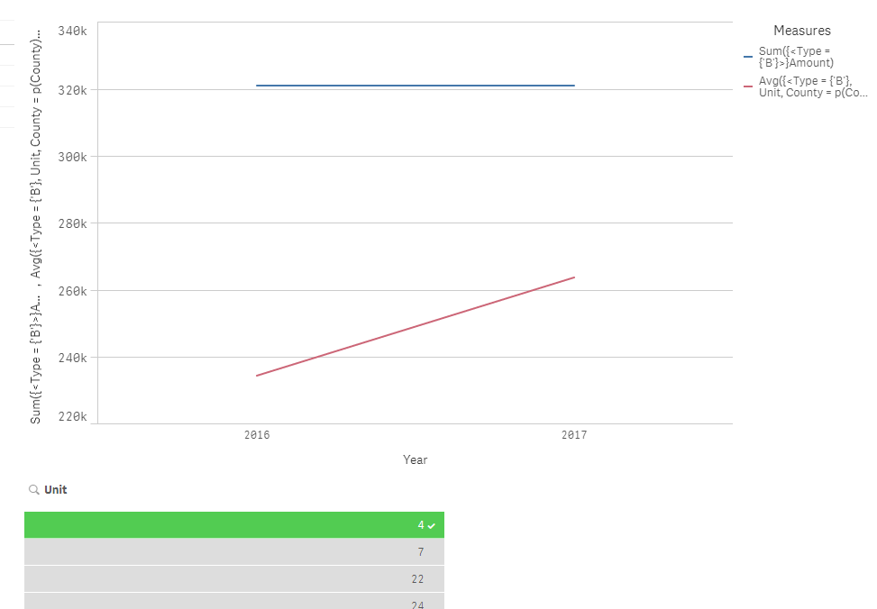
I used these two expressions
1) Sum({<Type = {'B'}>}Amount)
2) Avg({<Type = {'B'}, Unit, County = p(County)>}Amount)
- Mark as New
- Bookmark
- Subscribe
- Mute
- Subscribe to RSS Feed
- Permalink
- Report Inappropriate Content
Can you provide the data in an Excel file? Also, what would you see when nothing is selected?
- Mark as New
- Bookmark
- Subscribe
- Mute
- Subscribe to RSS Feed
- Permalink
- Report Inappropriate Content
Sunny,
It is coming from a server, so I can only get some of the data. There is a lot more, but this sample size shows everything I am dealing with. I would love for the graph to show the total unit average per year for type B before I select a unit. Then split into county and unit lines once selected. If that isn't possible i can always just put in a formula into the data handling part of the graph to require the user to select a unit, and then two lines populate.
- Mark as New
- Bookmark
- Subscribe
- Mute
- Subscribe to RSS Feed
- Permalink
- Report Inappropriate Content
Actually there are not units with zero, so this sample is correct. Sorry about that.
- Mark as New
- Bookmark
- Subscribe
- Mute
- Subscribe to RSS Feed
- Permalink
- Report Inappropriate Content
What is the expected output based on the sample provided?
- Mark as New
- Bookmark
- Subscribe
- Mute
- Subscribe to RSS Feed
- Permalink
- Report Inappropriate Content
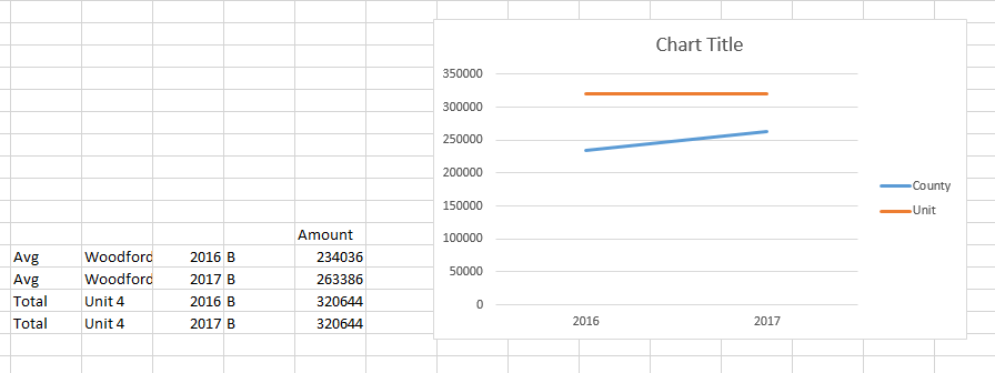
Sunny,
This would be the desired outcome if you selected unit 4. County would show the average for each year, while the unit would show their totals per year.
- Mark as New
- Bookmark
- Subscribe
- Mute
- Subscribe to RSS Feed
- Permalink
- Report Inappropriate Content
Like this
- Mark as New
- Bookmark
- Subscribe
- Mute
- Subscribe to RSS Feed
- Permalink
- Report Inappropriate Content
Yes! I cannot open your .qvf file to see how you did it though.
- Mark as New
- Bookmark
- Subscribe
- Mute
- Subscribe to RSS Feed
- Permalink
- Report Inappropriate Content
Why not?
- Mark as New
- Bookmark
- Subscribe
- Mute
- Subscribe to RSS Feed
- Permalink
- Report Inappropriate Content
I am not the admin on Qlik and cannot save it in the appropriate location to view it.
- « Previous Replies
-
- 1
- 2
- Next Replies »