Unlock a world of possibilities! Login now and discover the exclusive benefits awaiting you.
- Qlik Community
- :
- Forums
- :
- Analytics
- :
- New to Qlik Analytics
- :
- Re: Restrict Line Chart Till the Month where value...
- Subscribe to RSS Feed
- Mark Topic as New
- Mark Topic as Read
- Float this Topic for Current User
- Bookmark
- Subscribe
- Mute
- Printer Friendly Page
- Mark as New
- Bookmark
- Subscribe
- Mute
- Subscribe to RSS Feed
- Permalink
- Report Inappropriate Content
Restrict Line Chart Till the Month where value is available
Hello!
I have used a combo chart showing Budget, Last year and current year values. I don't want to show values for months that haven't happened yet and want the line chart to stop at March. Attached is an image (Chart 1) showing the same. Please let me know how this can achieved and if there is an expression that can be added to the specific measure in order to get the desired result.
Secondly, I have a bar chart where I have added the following expression =if([Year]='2017'or [Year]='2018',[Year]) in dimensions, so that values for only these 2 years and 2018 Budget are shown. However, I see 0 values which keep showing up in between the bars. Attached is the image (Chart 2).
Please let me know how I can fix these issues.
Thanks,
Rony
- Mark as New
- Bookmark
- Subscribe
- Mute
- Subscribe to RSS Feed
- Permalink
- Report Inappropriate Content
You can put anything as plain text and hide the axe title :
for instance a space will do it ==> =' '
- Mark as New
- Bookmark
- Subscribe
- Mute
- Subscribe to RSS Feed
- Permalink
- Report Inappropriate Content
Hi Thomas,
Please find attached qvf file. In the second chart, I want the (Red) line for Actual 2018 to stop at April. In graph 3, you will not be able to see any 0 values between the bars as I have taken only 2 years, 2017 and 2018 with year as dimension, as sample. However, in my original file, I have data from 2015 on wards, the reason why zeros were being shown between the bars. Please let me know if this information will suffice.
Regards,
Rony
- Mark as New
- Bookmark
- Subscribe
- Mute
- Subscribe to RSS Feed
- Permalink
- Report Inappropriate Content
Hi,
For the Red line (2018) expression to stop at March, just add an if expression which evaluates to null().
if (expr = 0, null(), expr)
Null values usually don't show up in the chart, unless you have turned off "suppress null values". Try it out and let me know if it works 
Rgds,
Benazir
- Mark as New
- Bookmark
- Subscribe
- Mute
- Subscribe to RSS Feed
- Permalink
- Report Inappropriate Content
Check this out -
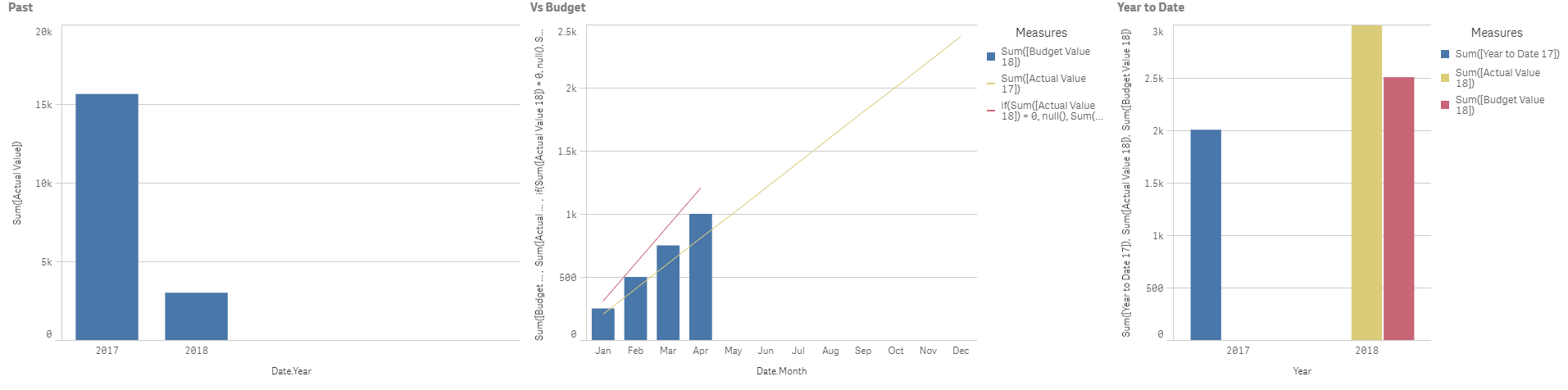
Can't spot the zero values - like you've mentioned. I've used your 2018 Budget column.
For the red line to stop - I just changed your expression:
if(Sum([Actual Value 18]) = 0, null(), Sum([Actual Value 18]))
Rgds,
Benazir
- Mark as New
- Bookmark
- Subscribe
- Mute
- Subscribe to RSS Feed
- Permalink
- Report Inappropriate Content
HI Benazir,
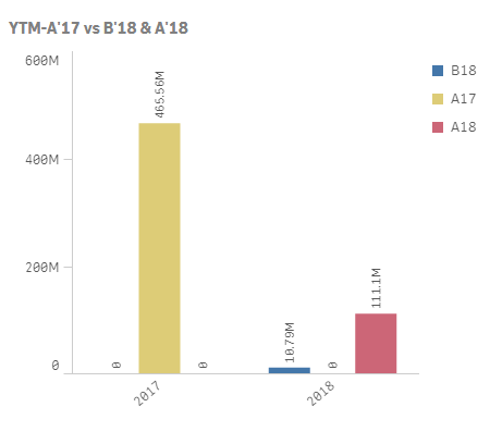
Your expression worked perfectly. The line did stop at April. However, if you see attached image, you will be able to see the zero values. The moment I remove bar labels, the zeros disappear (for both charts). Is there any way to display the bar labels without the zeros? In Chart 2, I have there is this space between 2017 and 2018 columns(even when the zeros are removed). Is there a way to remove this? My data source contains data from 2015 onwards, probably the reason for the gaps. Please let me know. 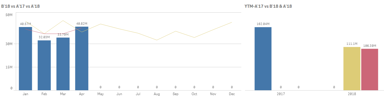 Thanks a lot for your help.
Regards,
Rony
- Mark as New
- Bookmark
- Subscribe
- Mute
- Subscribe to RSS Feed
- Permalink
- Report Inappropriate Content
Hi Ron,
Here you go : find attached the .qvf file.
Regards,
Thomas
- Mark as New
- Bookmark
- Subscribe
- Mute
- Subscribe to RSS Feed
- Permalink
- Report Inappropriate Content
Hi Benazir,
If you see the second chart, for the year 2018, 1 column should be names as A2018 and the second column as B2018 (Actual and Budget respectively). Is there a way to get this done too?
Regards,
Rony
- Mark as New
- Bookmark
- Subscribe
- Mute
- Subscribe to RSS Feed
- Permalink
- Report Inappropriate Content
Thomas,
I don't see any attachment.
Rony
- Mark as New
- Bookmark
- Subscribe
- Mute
- Subscribe to RSS Feed
- Permalink
- Report Inappropriate Content
Are you sure ? I can see it :
- Mark as New
- Bookmark
- Subscribe
- Mute
- Subscribe to RSS Feed
- Permalink
- Report Inappropriate Content
Got it. Thanks Thomas.
Regards,
Rony