Unlock a world of possibilities! Login now and discover the exclusive benefits awaiting you.
- Qlik Community
- :
- Forums
- :
- Analytics
- :
- New to Qlik Analytics
- :
- Re: I am very new to Qlik Sense. I have this data ...
- Subscribe to RSS Feed
- Mark Topic as New
- Mark Topic as Read
- Float this Topic for Current User
- Bookmark
- Subscribe
- Mute
- Printer Friendly Page
- Mark as New
- Bookmark
- Subscribe
- Mute
- Subscribe to RSS Feed
- Permalink
- Report Inappropriate Content
I am very new to Qlik Sense. I have this data where I need to group each of the fields and measures (columns) into common categories and then present the data.
Base Data (Uploaded in my App) Calculated Data from Base Data (How to calculate this using Qliksense?)
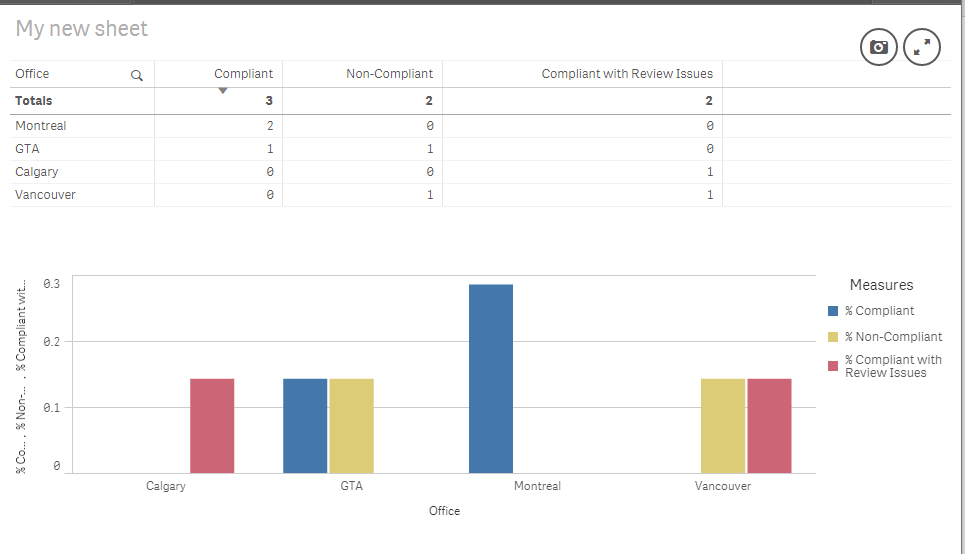
Office Rating Office Compliant Non-Compliant Compliant with Review Issues
GTA Compliant GTA 1 1 0
GTA Non-Compliant Montreal 2 0 0
Montreal Compliant Vancouver 0 1 1
Vancouver Non-Compliant Calgary 0 0 0
Calgary Compliant with Review Issues
Vancouver Compliant with Review Issues
Montreal Compliant
Then I want to present the Calculated data in as a percentage in Qlik Sense Bar Chart.
Can someone please explain me if this is even possible and how to go about it?
Thanks,
- Mark as New
- Bookmark
- Subscribe
- Mute
- Subscribe to RSS Feed
- Permalink
- Report Inappropriate Content
!
If this is your data:
Data:
Load * Inline [
Office,Rating
GTA,'Compliant'
GTA,'Non-Compliant'
Montreal,'Compliant'
Vancouver,'Non-Compliant'
Calgary,'Compliant with Review Issues'
Vancouver,'Compliant with Review Issues'
Montreal,'Compliant'
];
You can use a formula like Count({$<Rating={'Compliant'}>}Rating) to get a count and display in a chart.
- Mark as New
- Bookmark
- Subscribe
- Mute
- Subscribe to RSS Feed
- Permalink
- Report Inappropriate Content
May be something like this -
Dimension - Office
Measure 1(Compliant) - Count({<Rating={'Compliant'}>}Rating)
Measure 2(Non-Compliant) - Count({<Rating={'Non-Compliant'}>}Rating)
To calculate %, you would need to divide the above measure value with total rating values like this -
Count({<Rating={'Compliant'}>}Rating)/Count(TOTAL Rating)
- Mark as New
- Bookmark
- Subscribe
- Mute
- Subscribe to RSS Feed
- Permalink
- Report Inappropriate Content
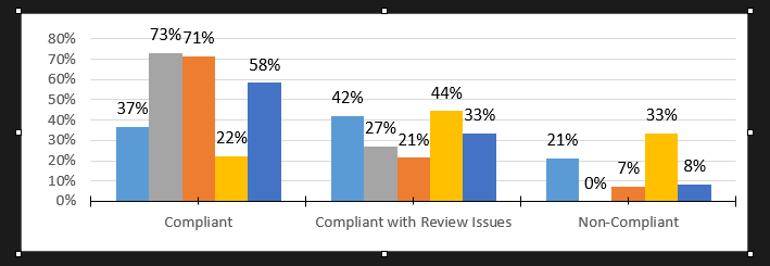
Thank you for your reply. How do I present the data in grouped bar charts with ratings measures (compliant, Non-compliant etc.) in X axis and different offices under different bars? The bar chart option in Qlick Sense dosen't give me this kind of chart. Please see the example below for what I want.
- Mark as New
- Bookmark
- Subscribe
- Mute
- Subscribe to RSS Feed
- Permalink
- Report Inappropriate Content
Thank you for your reply. How do I present the data in grouped bar charts with ratings measures (compliant, Non-compliant etc.) in X axis and different offices under different bars? The bar chart option in Qlick Sense dosen't give me this kind of chart. Please see the example below for what I want.

- Mark as New
- Bookmark
- Subscribe
- Mute
- Subscribe to RSS Feed
- Permalink
- Report Inappropriate Content