Unlock a world of possibilities! Login now and discover the exclusive benefits awaiting you.
- Qlik Community
- :
- All Forums
- :
- QlikView App Dev
- :
- Optimize layout Mekko Chart
- Subscribe to RSS Feed
- Mark Topic as New
- Mark Topic as Read
- Float this Topic for Current User
- Bookmark
- Subscribe
- Mute
- Printer Friendly Page
- Mark as New
- Bookmark
- Subscribe
- Mute
- Subscribe to RSS Feed
- Permalink
- Report Inappropriate Content
Optimize layout Mekko Chart
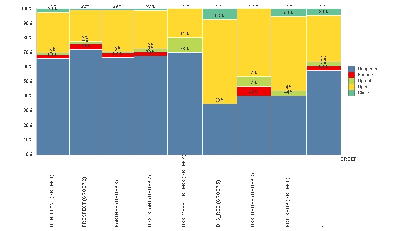
I have created a very nice Mekko chart, however, the top values are deleted because of the space
and the group labels are very long and not in 2 lines.
So, who can give me advice how to improve the layout of this mekko chart.
Thanks!
Accepted Solutions
- Mark as New
- Bookmark
- Subscribe
- Mute
- Subscribe to RSS Feed
- Permalink
- Report Inappropriate Content
Don't take this the wrong way but your mekko chart looks too much like a bar chart, no difference between the bars widths. Have you tried just using that?
- Mark as New
- Bookmark
- Subscribe
- Mute
- Subscribe to RSS Feed
- Permalink
- Report Inappropriate Content
Don't take this the wrong way but your mekko chart looks too much like a bar chart, no difference between the bars widths. Have you tried just using that?
- Mark as New
- Bookmark
- Subscribe
- Mute
- Subscribe to RSS Feed
- Permalink
- Report Inappropriate Content
I am glad with your response. Because of it I looked at it a different way and choose for a bar chart, but still with a relative perspective. So, thanks. Of course I wouldn't take a response the wrong way. I am just glad people try to help (and do!)