Unlock a world of possibilities! Login now and discover the exclusive benefits awaiting you.
- Qlik Community
- :
- Forums
- :
- Analytics
- :
- New to Qlik Analytics
- :
- Chart Display of Items in Column Individually Show...
- Subscribe to RSS Feed
- Mark Topic as New
- Mark Topic as Read
- Float this Topic for Current User
- Bookmark
- Subscribe
- Mute
- Printer Friendly Page
- Mark as New
- Bookmark
- Subscribe
- Mute
- Subscribe to RSS Feed
- Permalink
- Report Inappropriate Content
Chart Display of Items in Column Individually Shown Each Day
Hi,
I'm new to Qlik and trying to find my way around. I am having some difficulties with the following:
I am trying to create a chart that will look at my "Prob. grp text" column and display the daily trend for each item in the list based on a count of the Breakdown dur. for the day.
(basically I'm looking at the number of issues per type of issues to see where we are having are most problems. All look at when did the trend for the issue change. This will allow me to correlate what outside factor could have been a effect in the change and get a root cause.)
This is what it would look like in excel.
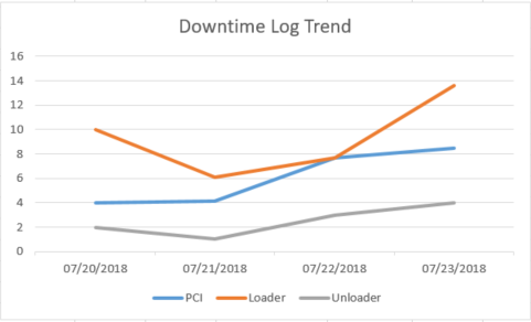
To get this I do a sum if of the Breakdown dur. with the PCI Loader and Unloader for each day.
I assume I can plug something like this as a formula in the function when creating the chart. However, I am having a hard time finding the right syntax.
I would like to use my columns
Malfunct. start.Date: for Horizontal (Category) X Axis Labels
Prob. grp. text: for legend Entries (Series)
then count the column Breakdown dur. get the data (Y Axis)
Thank you for your help!
- Mark as New
- Bookmark
- Subscribe
- Mute
- Subscribe to RSS Feed
- Permalink
- Report Inappropriate Content
Hi Kayla,
Assuming you are trying to do this in Qlik Sense, the steps you would take are:
- Drag a line chart on to sheet
- Add your Malfunct. start.Date dimension
- Add your Prob. grp. text as a second dimension
- Then Count([Breakdown dur]) as a measure if you are counting incidents or Sum([Breakdown dur]) if you are working out the outage times
- Mark as New
- Bookmark
- Subscribe
- Mute
- Subscribe to RSS Feed
- Permalink
- Report Inappropriate Content
Thank you, Lisa, I was making that entirely way to complicated. I appreciate the help!