Unlock a world of possibilities! Login now and discover the exclusive benefits awaiting you.
- Qlik Community
- :
- Forums
- :
- Analytics
- :
- New to Qlik Analytics
- :
- Re: Combo Chart - Setting Custom Colours
- Subscribe to RSS Feed
- Mark Topic as New
- Mark Topic as Read
- Float this Topic for Current User
- Bookmark
- Subscribe
- Mute
- Printer Friendly Page
- Mark as New
- Bookmark
- Subscribe
- Mute
- Subscribe to RSS Feed
- Permalink
- Report Inappropriate Content
Combo Chart - Setting Custom Colours
Having gone through the rigors of trying to pin down a simple method whereby I can set the colours in a combo chart to values, I thought it best to show the way I found and to help any others having to go through the deluge of misleading threads and posts that I've had to wade through.
Scenario:
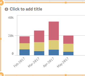
I have a combo chart with 3 measures (sums of 3 separate values) grouped up by Month-Year period:
Now I want to change these colours to anything I want. You'd think that by going into the expression editor for colour I'd be able to change this in a straightforward way but it's not. The IF statements I used:
if(SUM([AMBER-CASH])>0, RGB (255,162,0), if(SUM([RED-CASH])>0, red(), green()))
This fails of course as the first argument will always be true so it doesn't matter. After doing a good bit of searching for solutions, I was directed to use Dummy dimensions or created value lists and add these as Dimensions with hard coded values, remove the existing calculations in my measures and create a measure based on an expression, summing the totals per each of these hardcoded values. In the colour expression, I would use peek match or if statements to determine what the colour setting.
Although this worked for bar charts, this wasn't possible in a Combo Chart as it would appear you can only use one dimension.
Thankfully, there is a much more straightforward solution. Create the calculated measures in Master Items, in here you can set the colour property to anything you want:
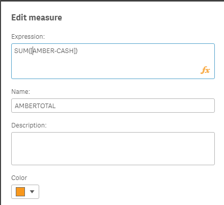
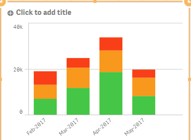
Once this is completed for each of the 3 calculations, you simply add these as the measures to use in the combo chart, no need to touch the colour expression of the combo chart at all.:
Perhaps this is a case of an ex-SSRS guy just expecting all configurable properties to be in the one place (and a lack of knowledge on some of the things I might have ignored when creating my Hello World dashboard at training) but I was expecting both the Qlik Forum and Google to have some pretty straightforward examples of doing such.
In any case, if I'll be glad if this is any help to any other newbies for future developments
- Mark as New
- Bookmark
- Subscribe
- Mute
- Subscribe to RSS Feed
- Permalink
- Report Inappropriate Content
Thanks Sean for this excellent explanation.
Like you, I was having a terrible time doing something that would seem, on its face, to be pretty simple (i.e. change bar/line colors for Measures on a chart). I hope others find it as helpful as I did.