Unlock a world of possibilities! Login now and discover the exclusive benefits awaiting you.
- Qlik Community
- :
- Forums
- :
- Analytics
- :
- New to Qlik Analytics
- :
- Re: Clik Sense Dynamic Map Symbols
- Subscribe to RSS Feed
- Mark Topic as New
- Mark Topic as Read
- Float this Topic for Current User
- Bookmark
- Subscribe
- Mute
- Printer Friendly Page
- Mark as New
- Bookmark
- Subscribe
- Mute
- Subscribe to RSS Feed
- Permalink
- Report Inappropriate Content
Clik Sense Dynamic Map Symbols
All, I'm just getting started with Qlik so I hope I'm not asking an obvious question here. I've looked at the documentation and can't find what I'm looking for related to dynamic map symbols
I'm trying to work with Qlik Sense Desktop June 2018 and its related base mapping capability. I have a question regarding custom symbols. It's possible that I might need one of the mapping extensions but I'm trying to figure out if I can do what I need to do in the updated base mapping capability.
I have a group of hotels that I'd like to display on a map of the city of San Francisco. These hotels are used by corporate travelers as part of a negotiated program. I have hotel names, addresses and geocoding. Each hotel has three attributes:
- Property Preferred Status (Preferred or Non-Preferred)
- Property Spend Size (the total amount spent by travelers for a corporation at the hotel over a year)
- Property type (A classification of the property's overall quality, e.g. Luxury, Upper Upscale, Mid-scale, Economy, etc.)
I have Qlik set up to display the properties and have the size of the symbol related to the amount of spend. Preferred properties are colored in blue and non-preferred properties in red.
What I'd like to do is to add a further element of customization and have the symbols be different for each property type.
Is there a way to tell Qlik that if the property type is Upper Upscale, display it on the map with a Box and if the property type is Economy, display it with a Star?
Or do I accomplish this with layering somehow and have different layers for each property type with different symbols? I've experimented with layers but haven't found a way to do this. I've attached an image to give everyone an idea of what I'm trying to do.
Basically, I'm trying to capture all three attributes on a map and I've got 2 out of 3. Any help would be much appreciated.
- Tags:
- dynamic map symbols
- Mark as New
- Bookmark
- Subscribe
- Mute
- Subscribe to RSS Feed
- Permalink
- Report Inappropriate Content
Check this:
Conditional Performance Indicators in Tables using HTML Unicode Chr() Values
Add the character code value in different combination areas.
Check this: to add indicators in charts.
How can put upper and lower arrow indicators in... | Qlik Community
- Mark as New
- Bookmark
- Subscribe
- Mute
- Subscribe to RSS Feed
- Permalink
- Report Inappropriate Content
Hi,
I think Bala made some good suggestions. Another one I've used is that you can add several point layers to the map and using an IF statement you can set one point to be one category and give that a certain type of icon and another type another type of icon.
So in the example below I can put in the Dimension for the map:
=IF(ProductType = 'Socks',CityName,Null())
And for that Pointlayer I can choose a color and a type of icon.
Then I do the same for next Dimension type until I have a different Pointlayer for each product type.
Drawback is that the legend doesn't show the icon with the corresponding color. You could create one yourself as an image and put in a text box?
See example below:
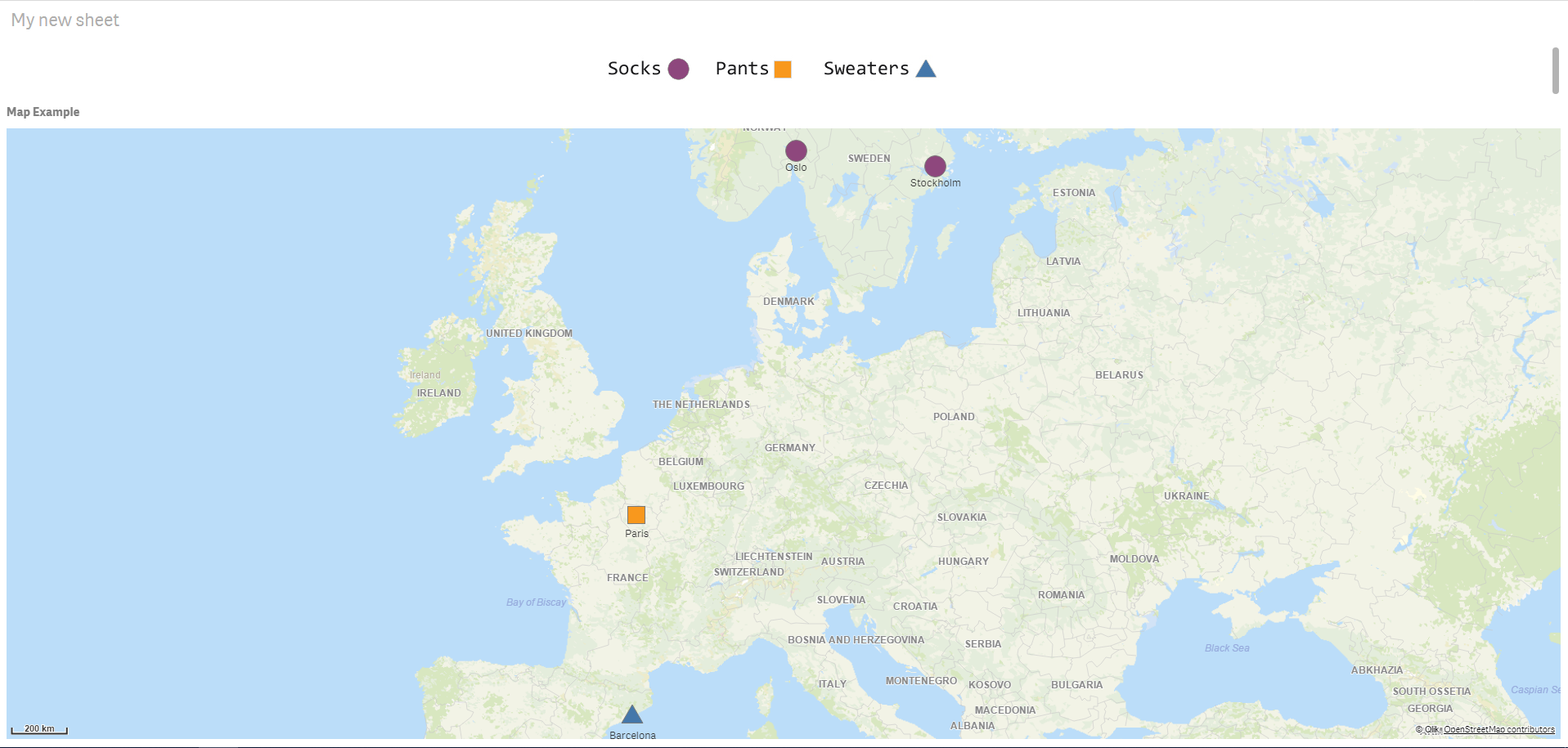
That's how I would solve it without using an extension.
Added the app as an exmaple.
Best,
Ali A
- Mark as New
- Bookmark
- Subscribe
- Mute
- Subscribe to RSS Feed
- Permalink
- Report Inappropriate Content
All, thank you very much for these helpful suggestions. I'll give both ideas a shot!
- Mark as New
- Bookmark
- Subscribe
- Mute
- Subscribe to RSS Feed
- Permalink
- Report Inappropriate Content
You are welcome.
Please mark the correct answer for you after you are done so that it's easier for others to find answers if they look up this kind of question.