Unlock a world of possibilities! Login now and discover the exclusive benefits awaiting you.
- Qlik Community
- :
- Forums
- :
- Analytics
- :
- New to Qlik Analytics
- :
- Re: Accumulation with dates
- Subscribe to RSS Feed
- Mark Topic as New
- Mark Topic as Read
- Float this Topic for Current User
- Bookmark
- Subscribe
- Mute
- Printer Friendly Page
- Mark as New
- Bookmark
- Subscribe
- Mute
- Subscribe to RSS Feed
- Permalink
- Report Inappropriate Content
Accumulation with dates
Hi, I'm quite new to Qlik Sense and I'm trying to do cumulative graph visualizing the status of our work orders of our project.
My data looks like this:
| Work order number | works start | works end |
| 3761857 | - | - |
| 3767467 | 6.8.2018 7:50 | - |
| 3767833 | 6.8.2018 7:48 | - |
| 3767860 | 6.8.2018 7:47 | - |
| 3767872 | 6.8.2018 7:51 | 8.8.2018 13:51 |
| 3767903 | 6.8.2018 7:20 | - |
| 3768732 | 16.4.2018 7:19 | - |
| 3768995 | 19.4.2018 13:26 | - |
| 3769743 | 30.7.2018 8:47 | - |
| 3774993 | - | - |
| 3779187 | - | - |
| 3779309 | 26.4.2018 7:05 | 20.6.2018 7:24 |
| 3789542 | - | - |
| 3789549 | - | - |
| 3789553 | - | - |
| 3789564 | - | - |
| 3789568 | - | - |
| 3789572 | - | - |
| 3789576 | - | - |
Ideally I'd like to have a combo chart, which has dates in the x-axis (from 1.8.2018 - 1.10.2018), and three measures: 1) bar for opened work orders for each day, 2) bar for closed work orders per day, 3) a cumulative line showing amount of open work orders.
I have been really stuck with this for a few weeks now, any help would be highly appreciated!
- Mark as New
- Bookmark
- Subscribe
- Mute
- Subscribe to RSS Feed
- Permalink
- Report Inappropriate Content
Hi,
check this formula.
rangesum( above( sum([Data]),0,rowno()))
Also some vid:
https://www.youtube.com/watch?v=AlT_jAMsiGU
Best,
Dan
- Mark as New
- Bookmark
- Subscribe
- Mute
- Subscribe to RSS Feed
- Permalink
- Report Inappropriate Content
Thanks for you reply!
I've tried with rangesum, but I'm not sure how to use it properly, as there is two dimensions (starting date and ending date).
- Mark as New
- Bookmark
- Subscribe
- Mute
- Subscribe to RSS Feed
- Permalink
- Report Inappropriate Content
- Mark as New
- Bookmark
- Subscribe
- Mute
- Subscribe to RSS Feed
- Permalink
- Report Inappropriate Content
Not sure, What is the business here. Would you able to share sample
- Mark as New
- Bookmark
- Subscribe
- Mute
- Subscribe to RSS Feed
- Permalink
- Report Inappropriate Content
Thanks for you answer. Sorry but due to sensitivity of my data, I'm not able to share a sample, other than what I've given in my first post.
We have work orders which have certain starting and ending date. I'm trying to do a chart which shows how many work orders we have open in each day. X-axis would be for the dates.
- Mark as New
- Bookmark
- Subscribe
- Mute
- Subscribe to RSS Feed
- Permalink
- Report Inappropriate Content
Look at this app:
-I create a simple calendar (from 1/4/2018 to 1/10/2018)
-load your data (null value are correct with date out from interval considered: start is 31/3/2018 and end is 2/10/2018)
-link the tables with IntervalMatch
I created a chart as you asked with 3 expression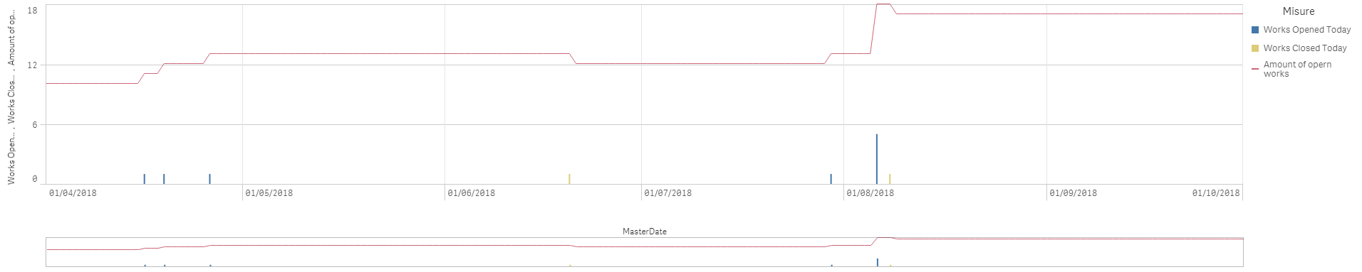
- Mark as New
- Bookmark
- Subscribe
- Mute
- Subscribe to RSS Feed
- Permalink
- Report Inappropriate Content
I still wonder, What the business is. May be
LET vStart = Min(DateField);
LET vEnd = Max(DateField);
Then, Set analysis could be using
Sum({<DateField = {">=$(=vStart)<=$(=vEnd)"}>} Sales)