Unlock a world of possibilities! Login now and discover the exclusive benefits awaiting you.
- Qlik Community
- :
- All Forums
- :
- QlikView App Dev
- :
- Re: stacked bars and accumulated lines
- Subscribe to RSS Feed
- Mark Topic as New
- Mark Topic as Read
- Float this Topic for Current User
- Bookmark
- Subscribe
- Mute
- Printer Friendly Page
- Mark as New
- Bookmark
- Subscribe
- Mute
- Subscribe to RSS Feed
- Permalink
- Report Inappropriate Content
stacked bars and accumulated lines
Hello,
I'm new to QlikView and want to know if it is possible to create a chart like this (Excel):
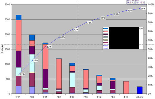
Without the stacked bars it is easy to create this diagramm, but it is impossible for me to show stacked bars too.
Any ideas?
Thanks.
- Tags:
- new_to_qlikview
- Mark as New
- Bookmark
- Subscribe
- Mute
- Subscribe to RSS Feed
- Permalink
- Report Inappropriate Content
This should be possible with a combo chart. If you have the 2 expressions as bars and it set to stacked, then the third expression set to line with full accumulation. However looking at your picture I am not sure if it would work using the line as a percent due to the fact the say 22% would be seen as 22 on the scale
- Mark as New
- Bookmark
- Subscribe
- Mute
- Subscribe to RSS Feed
- Permalink
- Report Inappropriate Content
Thank you marcsliving,
but if i set a expression as line and full accumulation the bars are not stacked anymore.
Attached you can find a very simple Example.
Thanks.
- Mark as New
- Bookmark
- Subscribe
- Mute
- Subscribe to RSS Feed
- Permalink
- Report Inappropriate Content
Alright, I am not sure if this is what you want, but if you remove the dimension CustomerBez, then add more expressions as set analysis like
sum({$<CustomerBez={'CustomerA'}>} QTY)
See attached sample. You can tweak the formula for the line to get what you want.
- Mark as New
- Bookmark
- Subscribe
- Mute
- Subscribe to RSS Feed
- Permalink
- Report Inappropriate Content
Ah cool, but how i can set the dimensions dynamically? Cause i dont know which customers are selected (there are about 1000 customers in the database).
Thanks!
- Mark as New
- Bookmark
- Subscribe
- Mute
- Subscribe to RSS Feed
- Permalink
- Report Inappropriate Content
Oh, Yeah I am not sure if this is possible with multiple dimensions. You would have to create an expression for each customer.
You could try creating 1 chart as you have it with the stacked dimensions, then making another chart with the accumulated line that has a transparent background, then just place the second line chart over the bar chart