Unlock a world of possibilities! Login now and discover the exclusive benefits awaiting you.
- Qlik Community
- :
- All Forums
- :
- QlikView App Dev
- :
- Re: Making an "artificial" dimension selectable
- Subscribe to RSS Feed
- Mark Topic as New
- Mark Topic as Read
- Float this Topic for Current User
- Bookmark
- Subscribe
- Mute
- Printer Friendly Page
- Mark as New
- Bookmark
- Subscribe
- Mute
- Subscribe to RSS Feed
- Permalink
- Report Inappropriate Content
Making an "artificial" dimension selectable
I have the need to show four bits of information which have flags in the data - Bold vs. Not Bold (in the BoldFlag field), Indented vs. Not Indented (ParentID exists or is null), and a couple of others.
I started with a trellised pie chart, but a stacked bar chart would work too - I'm trying to avoid four separate charts due to screen space limitations. I started with an "artificial" dimension - I enumerated the names of the four properties with a ValueList. Then, I wrote expressions for "used" and "not used" that test for each of the four properties. Unfortunately, this doesn't allow selections to be made by clicking on the chart.
I've thought through different ways of doing this with some assistance from others, but we haven't yet figured out a way to both have the four separate items in one chart AND make them click-selectable. Any ideas?
- « Previous Replies
-
- 1
- 2
- Next Replies »
- Mark as New
- Bookmark
- Subscribe
- Mute
- Subscribe to RSS Feed
- Permalink
- Report Inappropriate Content
Karl,
We're actually using QlikView 11 on this project - Part of the reason for the screen space limitation is that this chart is already inside a 3x3 grid container that's inside a regular container. However, maybe another 2x2 grid container with 4 separate charts and all of the captions/borders/shadows/etc. removed would display reasonably well - I'll give that a shot.
Thanks,
Kent
- Mark as New
- Bookmark
- Subscribe
- Mute
- Subscribe to RSS Feed
- Permalink
- Report Inappropriate Content
Kent,
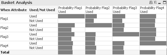
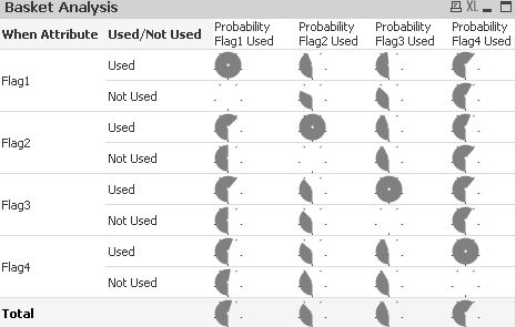
I liked the kind of analysis you were trying to do and I was motivated to think about different ways to show this type of binary basket analysis, so I've included a couple examples you can use to analysis this information in a tight space without the user even making one click.
The graph reads across that when Flag1 is used there is a 100% chance Flag1 is used, about a 45% chance Flag2 is used, about a 50% chance Flag3 is used and about a 60% chance Flag4 is used. Then when Flag1 is not used there is a 0% chance Flag1 is used, about a 30% chance Flag2 is used, about a 40% chance Flag3 is used and about a 58% chance Flag4 is used.
In general, in either of these 2 graphs below you can see that whether they use Flag1 has a higher influence if they are going to use or not use Flag2 or Flag3. On the other hand whether they use or not Flag4 has little influence whether they use or not all the other flags.
The QV app is attached if you are interested.
Karl
- Mark as New
- Bookmark
- Subscribe
- Mute
- Subscribe to RSS Feed
- Permalink
- Report Inappropriate Content
Thanks Karl, that's an interesting solution! We might have to make use of that.
There's also a "social engineering" aspect to this - With what the client initially asked for, it made more sense to group the four flags into sixteen buckets that were named appropriately. (Actually, it was somewhat fewer than sixteen, since when some of the flags are true, some of the others don't matter.) But I think they were wowed with the "qlikability" of things, and insisted they wanted it this way. I think that once this app is done and they start looking at things, they'll appreciate that it's better to have a good visualization that doesn't require clicking. At that point, what I'd really like to do is use the new Venn diagrams in QlikView 11. So, we'll see what happens.
Thanks for all your help!
Kent
- « Previous Replies
-
- 1
- 2
- Next Replies »