Unlock a world of possibilities! Login now and discover the exclusive benefits awaiting you.
- Qlik Community
- :
- All Forums
- :
- QlikView App Dev
- :
- Re: Multiple Series in Line Chart
- Subscribe to RSS Feed
- Mark Topic as New
- Mark Topic as Read
- Float this Topic for Current User
- Bookmark
- Subscribe
- Mute
- Printer Friendly Page
- Mark as New
- Bookmark
- Subscribe
- Mute
- Subscribe to RSS Feed
- Permalink
- Report Inappropriate Content
Multiple Series in Line Chart
Hi,
I appreciate all I have learned using the QlikView Community. I hope someone can help - my question may have a simple answer and I am just missing it - I have searched the Community and have not found a solution - we currently use QlikView 9 SR4.
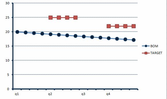
I am trying to create a line graph with 2 (or more) expressions. The expressions are at week level; however, we want the dimensional axis to display the quarter level. The sample data is in the table below and I am including a sample graph created in excel - I can't seem to make this work in QlikView:
| q1 | q2 | q3 | q4 | ||||||||||||
| CW1 | CW2 | CW3 | CW4 | CW5 | CW6 | CW7 | CW8 | CW9 | CW10 | CW11 | CW12 | CW13 | CW14 | CW15 | |
| BOM | 20 | 19.8 | 19.6 | 19.4 | 19.2 | 19 | 18.8 | 18.6 | 18.4 | 18.2 | 18 | 17.8 | 17.6 | 17.4 | 17.2 |
| TARGET | 25 | 25 | 25 | 25 | 22 | 22 | 22 | 22 |
Any ideas?
Thanks!
- Mark as New
- Bookmark
- Subscribe
- Mute
- Subscribe to RSS Feed
- Permalink
- Report Inappropriate Content
Hi,
Can you attach the sample file.
Regards,
Jagan.
- Mark as New
- Bookmark
- Subscribe
- Mute
- Subscribe to RSS Feed
- Permalink
- Report Inappropriate Content
Thank you - I have attached the sample file (from excel):
- Mark as New
- Bookmark
- Subscribe
- Mute
- Subscribe to RSS Feed
- Permalink
- Report Inappropriate Content
Hi,
Please check the attachment. Is it ok for you.
Regards,
Jagan.
- Mark as New
- Bookmark
- Subscribe
- Mute
- Subscribe to RSS Feed
- Permalink
- Report Inappropriate Content
Thank you Jagan. The chart you attached displays the week level on the x axis and I was looking to display the quarter level...the sample chart that I provided has the data points at the week level; however, it displays the x axis at using the quarter level labels - this is what I am trying to achieve in QlikView. Is this possible?
Thanks!
- Mark as New
- Bookmark
- Subscribe
- Mute
- Subscribe to RSS Feed
- Permalink
- Report Inappropriate Content
Hi,
In the chart try removing the week in dimension and check whether it is ok for you.
Regards,
Jagan.
- Mark as New
- Bookmark
- Subscribe
- Mute
- Subscribe to RSS Feed
- Permalink
- Report Inappropriate Content
Thank you Jagan. If I remove the week dimension then the data is displayed at the quarter level (and the weekly amounts are summed to the quarter). I am not sure how to show the data points at the week level and show the x axis label using the quarter level - similar to the sample graph I provided? Is there a way? maybe I somehow have to use a calculated dimension or some formatting of the label based on a calculation?
Thanks!
- Mark as New
- Bookmark
- Subscribe
- Mute
- Subscribe to RSS Feed
- Permalink
- Report Inappropriate Content
Hi,
Tried a lot, but I didn't got that.
Regards,
Jagan.