Unlock a world of possibilities! Login now and discover the exclusive benefits awaiting you.
- Qlik Community
- :
- All Forums
- :
- QlikView App Dev
- :
- How to show all data labels on graph and how to ch...
- Subscribe to RSS Feed
- Mark Topic as New
- Mark Topic as Read
- Float this Topic for Current User
- Bookmark
- Subscribe
- Mute
- Printer Friendly Page
- Mark as New
- Bookmark
- Subscribe
- Mute
- Subscribe to RSS Feed
- Permalink
- Report Inappropriate Content
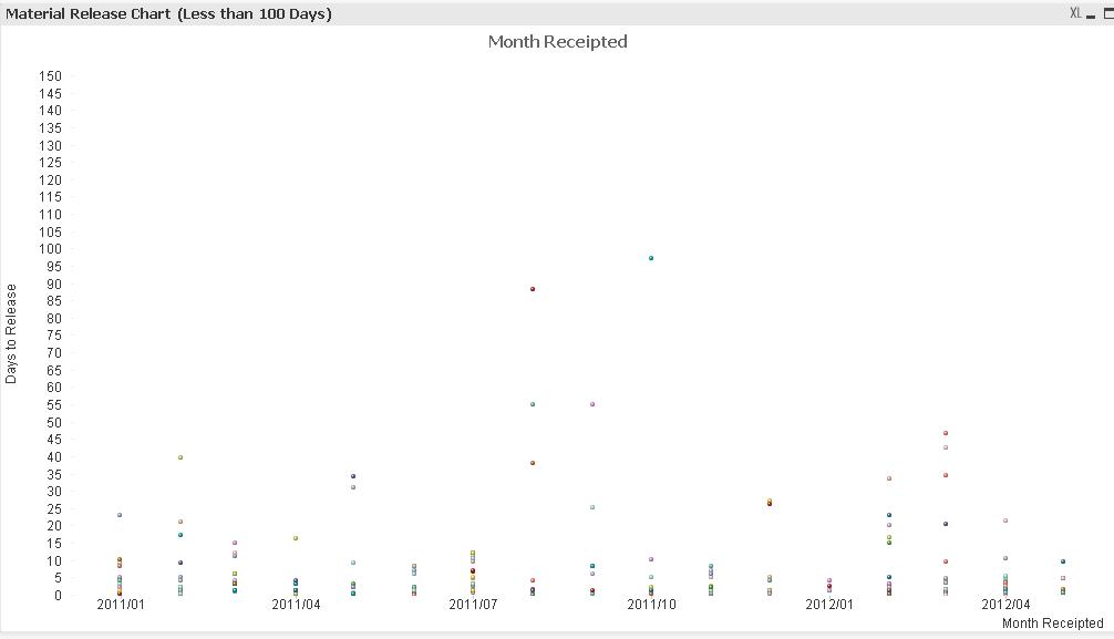
How to show all data labels on graph and how to change the alignment?
Hey,
I've created a scatter chart, but the labels along the X axis are only showing every fourth data label. I've looked through all of the chart properties but can't seem to figure out where the option is to show all the labels. Where can I find the option to display all?
Also is there an option to change the alignment of the labels? Just so it looks a bit tidier. I'd like to rotate them 90 degrees.
- Tags:
- new_to_qlikview
- Mark as New
- Bookmark
- Subscribe
- Mute
- Subscribe to RSS Feed
- Permalink
- Report Inappropriate Content
Hi ghpjohnr
As you mentioned above your dimension label showing in every fourth data label,It can be resolve
you can change chart orientation using this
Go to chart properties>>>Clik on Style tab>>>>>>>orientation
if u will select the orientation your data will display correctly
- Mark as New
- Bookmark
- Subscribe
- Mute
- Subscribe to RSS Feed
- Permalink
- Report Inappropriate Content
Hi ghpjohnr,
The reason some of the data points are not shown is that there are more data points which can be accomodated in the available axis area.
If you increase the width of your chart then you will see that more and more data points will start to show up.
Unfortuately, I believe that Scatter chart does not support scrollbar.
So as in other charts (say bar chart), you can enable the scroll bar on the x-axis and that way you can see all the data points as you scroll but this does not seem possible in scatter chart.
Also, as in other charts it is possible to change the text direction to vertical angled (/) on the dimension axis, which saves some space and more data points can be shown in lesser space, this also does not applies to scatter chart as in scatter chart expressions are drawn on the axis rather than the dimension.
But yes, one thing I noticed that when I defined the static step for the x-axis under the axis tab then in the same space more data points were visible, try to check if this helps in your case also?
If this does not then you need to make your chart wider, which may not be the solution you want but that only looks possible here. 
..
Ashutosh Paliwal
- Mark as New
- Bookmark
- Subscribe
- Mute
- Subscribe to RSS Feed
- Permalink
- Report Inappropriate Content
You are correct. I can't change the orientation for a scatter chart under the 'Style' tab. Making the chart wider isn't really an option either (I tried it and I need to make it REALLY wide to fit everything). It's a shame because if the data labels were 90degrees they would all display in the space allowed.