Unlock a world of possibilities! Login now and discover the exclusive benefits awaiting you.
- Qlik Community
- :
- All Forums
- :
- QlikView App Dev
- :
- Re: Line chart
- Subscribe to RSS Feed
- Mark Topic as New
- Mark Topic as Read
- Float this Topic for Current User
- Bookmark
- Subscribe
- Mute
- Printer Friendly Page
- Mark as New
- Bookmark
- Subscribe
- Mute
- Subscribe to RSS Feed
- Permalink
- Report Inappropriate Content
Line chart
Hi all.
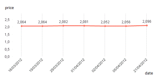
I have this line chart:
[http://localhostr.com/file/lf6Pm33M5QYV/Immagine.gif | http://localhostr.com/file/lf6Pm33M5QYV/Immagine.gif]
Is it possible to visualize in the chart values that rappresent the variation of price between each point?
Accepted Solutions
- Mark as New
- Bookmark
- Subscribe
- Mute
- Subscribe to RSS Feed
- Permalink
- Report Inappropriate Content
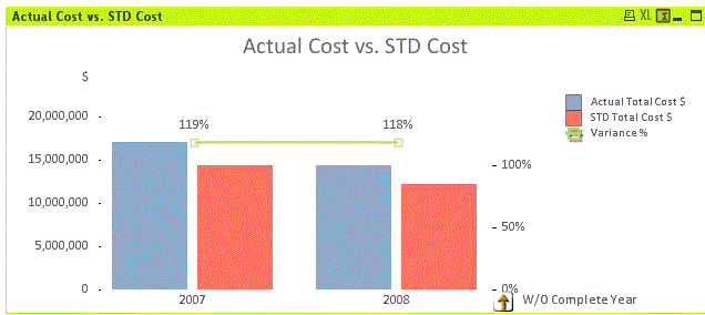
So I think my original solution is still the correct one...Actual-Above(Actual)
See attached. In the top chart both the values and the variations use the same scale, in the bottom chart there are different scales on left and right.
Hope this helps,
Jason
- Mark as New
- Bookmark
- Subscribe
- Mute
- Subscribe to RSS Feed
- Permalink
- Report Inappropriate Content
Sure - add another expression:
Sum(Price)-Above(Sum(Price))
Hope this helps,
Jason
- Mark as New
- Bookmark
- Subscribe
- Mute
- Subscribe to RSS Feed
- Permalink
- Report Inappropriate Content
Doesn't work. I need that the variation is rapresented like this example http://localhostr.com/file/X917v8MSBKE7/Immagine.gif but I use a line chart.
- Mark as New
- Bookmark
- Subscribe
- Mute
- Subscribe to RSS Feed
- Permalink
- Report Inappropriate Content
How's this?
- Mark as New
- Bookmark
- Subscribe
- Mute
- Subscribe to RSS Feed
- Permalink
- Report Inappropriate Content
aYes but I have a line chart with dimension "date" and expression "price" and I want to add the variation of price between each date. E.g. 0,040 between 05/04/2012 and 21/04/2012; 0,004 between 02/04/2012 and 05/04/2012 and so on.
- Mark as New
- Bookmark
- Subscribe
- Mute
- Subscribe to RSS Feed
- Permalink
- Report Inappropriate Content
Please post a sample of your app.
- Mark as New
- Bookmark
- Subscribe
- Mute
- Subscribe to RSS Feed
- Permalink
- Report Inappropriate Content
I have a situation like this demo app. Now I want to add in the line chart an expression that represents the variation of actual value between each data. E.g. it must indicate between the years 2006 and 2007 the difference of the actual values 12,622,185 and 14,906,127 and so on.
- Mark as New
- Bookmark
- Subscribe
- Mute
- Subscribe to RSS Feed
- Permalink
- Report Inappropriate Content
So I think my original solution is still the correct one...Actual-Above(Actual)
See attached. In the top chart both the values and the variations use the same scale, in the bottom chart there are different scales on left and right.
Hope this helps,
Jason
- Mark as New
- Bookmark
- Subscribe
- Mute
- Subscribe to RSS Feed
- Permalink
- Report Inappropriate Content
Thanks