Unlock a world of possibilities! Login now and discover the exclusive benefits awaiting you.
- Qlik Community
- :
- All Forums
- :
- QlikView App Dev
- :
- Re: Hide unused dimension values in chart
- Subscribe to RSS Feed
- Mark Topic as New
- Mark Topic as Read
- Float this Topic for Current User
- Bookmark
- Subscribe
- Mute
- Printer Friendly Page
- Mark as New
- Bookmark
- Subscribe
- Mute
- Subscribe to RSS Feed
- Permalink
- Report Inappropriate Content
Hide unused dimension values in chart
I have the following simplified dataset:
Month:
LOAD * INLINE [
    Year, Month
    2011, 2011-01
    2011, 2011-02
    2011, 2011-03
    2011, 2011-04
    2011, 2011-05
    2011, 2011-06
    2011, 2011-07
    2011, 2011-08
    2011, 2011-09
    2011, 2011-10
    2011, 2011-11
    2011, 2011-12
    2012, 2012-01
    2012, 2012-02
    2012, 2012-03
    2012, 2012-04
    2012, 2012-05
    2012, 2012-06
    2012, 2012-07
    2012, 2012-08
    2012, 2012-09
    2012, 2012-10
    2012, 2012-11
    2012, 2012-12
];Sales:
LOAD * INLINE [
    Month, Sales
    2011-01, 100
    2011-02, 500
    2011-03, 100
    2011-04, 200
    2011-05, 900
    2011-06, 300
    2011-07, 200
    2011-08, 600
    2011-09, 800
    2011-10, 300
    2011-11, 500
    2011-12, 100
    2012-01, 400
    2012-02, 400
    2012-03, 700
    2012-04, 400
    2012-05, 200
    2012-06, 600
    2012-07, 300
    2012-08, 100
];
I have created a chart from this with Month as a dimension and the following two expressions:
Sales 2012:
SUM({<Year = {"2012"}>}Sales)Sales 2011:
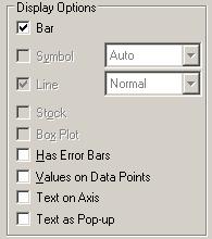
SUM({<Year = {"2011"}>}Sales)The Sales 2012 expression has the following display options:
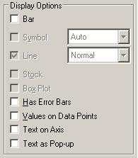
The Sales 2011 expression has the following display options:
It is my intention to get a bar chart which only shows the sales of 2012. But when the user clicks a fast change the user would get a table which shows the sales of 2012 and 2011.
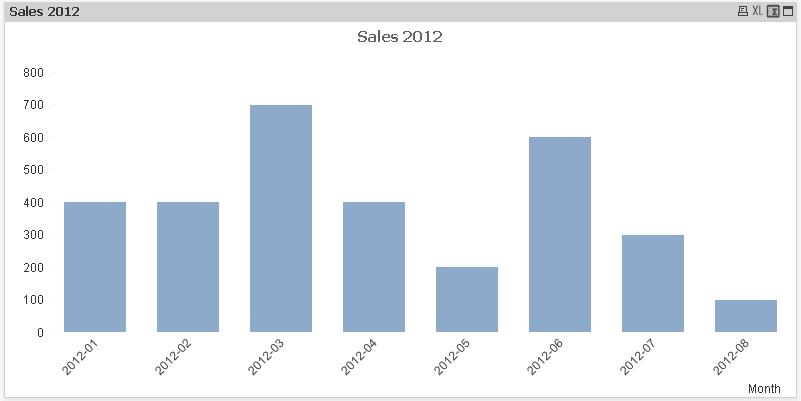
This is what I would like to have my chart to look like:
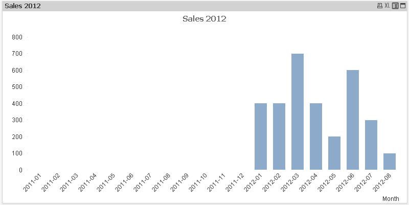
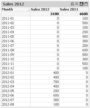
But it actually looks like this:
When I do the fast change the straight table looks like this:
How can I remove the 2011 months from my bar chart, but still get the straight table as displayed above when I do a fast change?
The Suppress When Value Is Null option in the Dimensions tab does not work in this case. Is there another option that I have overlooked that can hide the 2011 months from the X axes?
I have attached BarChart.qvw which implements the dataset and barchart described above.
Accepted Solutions
- Mark as New
- Bookmark
- Subscribe
- Mute
- Subscribe to RSS Feed
- Permalink
- Report Inappropriate Content
Nessinot
Your data structure is not ideal for this analysis. It certainly can be done with a correction to your structure.The problem is that you are using a single combined year/month field. So to get this to work:
- Add a month field to your first inline
Month:
LOAD Year,
YearMonth,
Month(Date#(YearMonth, 'YYYY-MM')) As Month
INLINE [
    Year, YearMonth
    2011, 2011-01
    2011, 2011-02
    2011, 2011-03
...
- Now create the chart using the new Month field as a dimension, with the same expressions and display logic as you are already using.
That should do the trick.
Jonathan
PS: as an aside, this may not be the best way to load the dates, but that is a subject of another thread.
- Mark as New
- Bookmark
- Subscribe
- Mute
- Subscribe to RSS Feed
- Permalink
- Report Inappropriate Content
Might be easier to use a container object with two separate charts, than use a fast change..?
- Mark as New
- Bookmark
- Subscribe
- Mute
- Subscribe to RSS Feed
- Permalink
- Report Inappropriate Content
Sorry but i dont think this can be achieved u have to create two different charts for this puprose one showing data for 2012 only and other showing comparison of both 2011 and 2012...
- Mark as New
- Bookmark
- Subscribe
- Mute
- Subscribe to RSS Feed
- Permalink
- Report Inappropriate Content
Yeah I kind of thought I was asking something that could not be done.
I think it is strange that when I set a measure not to display anything in the Display Option, it still effects the dimension. To my opinion that expression should not effect the chart since it is not used there. But I understand that it doesn't work that way...
- Mark as New
- Bookmark
- Subscribe
- Mute
- Subscribe to RSS Feed
- Permalink
- Report Inappropriate Content
Nessinot
Your data structure is not ideal for this analysis. It certainly can be done with a correction to your structure.The problem is that you are using a single combined year/month field. So to get this to work:
- Add a month field to your first inline
Month:
LOAD Year,
YearMonth,
Month(Date#(YearMonth, 'YYYY-MM')) As Month
INLINE [
    Year, YearMonth
    2011, 2011-01
    2011, 2011-02
    2011, 2011-03
...
- Now create the chart using the new Month field as a dimension, with the same expressions and display logic as you are already using.
That should do the trick.
Jonathan
PS: as an aside, this may not be the best way to load the dates, but that is a subject of another thread.
- Mark as New
- Bookmark
- Subscribe
- Mute
- Subscribe to RSS Feed
- Permalink
- Report Inappropriate Content
You are right Jonathan. I guess it is better to do it that way. I wanted to visually show what year the months belongs to, but I can also do that in another way.
Thanks!