Unlock a world of possibilities! Login now and discover the exclusive benefits awaiting you.
- Qlik Community
- :
- All Forums
- :
- QlikView App Dev
- :
- Re: Is it possible to conditionally colour the dif...
- Subscribe to RSS Feed
- Mark Topic as New
- Mark Topic as Read
- Float this Topic for Current User
- Bookmark
- Subscribe
- Mute
- Printer Friendly Page
- Mark as New
- Bookmark
- Subscribe
- Mute
- Subscribe to RSS Feed
- Permalink
- Report Inappropriate Content
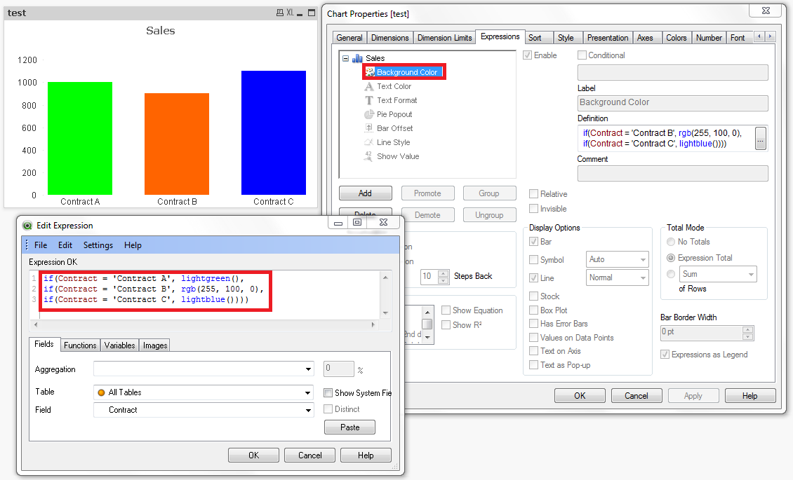
Is it possible to conditionally colour the different parts of a clustered bar chart depending on what each of their field names are?
Hello,
I've started work on a report that shows the performance of a number of different contracts against their set values. Each contract has traditionally had a different colour, eg Contract A is green, contract B is orange, contract C is blue, etc. I've got a list box that controls which of these contracts is visible in my clustered bar chart - is it possible to set the colours for these bars depending on the contract that they represent?
I've tried a bunch of different formulae already, including some pretty ill-advised adventues with ApplyMap, but to no avail. I could set the bars to static colours, so the contract appear correctly if they are all selected, but if you, for example, remove Contract A then B will take on the orange colour, which isn't want I want.
Also - I wasn't sure what the correct name for what the bars represent was - field names? Series points?
Thanks for any help 
Accepted Solutions
- Mark as New
- Bookmark
- Subscribe
- Mute
- Subscribe to RSS Feed
- Permalink
- Report Inappropriate Content
- Mark as New
- Bookmark
- Subscribe
- Mute
- Subscribe to RSS Feed
- Permalink
- Report Inappropriate Content
You need to put a background color on your expression(s):
- Mark as New
- Bookmark
- Subscribe
- Mute
- Subscribe to RSS Feed
- Permalink
- Report Inappropriate Content
Thanks, that looks like it should work - except I can't seem to turn off the bar colours in Data Appearance under Colors, so the bars are still set to their defaults rather than the colours in my shiny new expression defintion. Am I missing something? Sorry, I've only been doing Qlikview for a week or two...
Thanks again
- Mark as New
- Bookmark
- Subscribe
- Mute
- Subscribe to RSS Feed
- Permalink
- Report Inappropriate Content
Here is an example of what Nicole is suggesting.
- Mark as New
- Bookmark
- Subscribe
- Mute
- Subscribe to RSS Feed
- Permalink
- Report Inappropriate Content
No need to turn anything off, just make sure you are using the correct subexpression "Background Color".
- Mark as New
- Bookmark
- Subscribe
- Mute
- Subscribe to RSS Feed
- Permalink
- Report Inappropriate Content
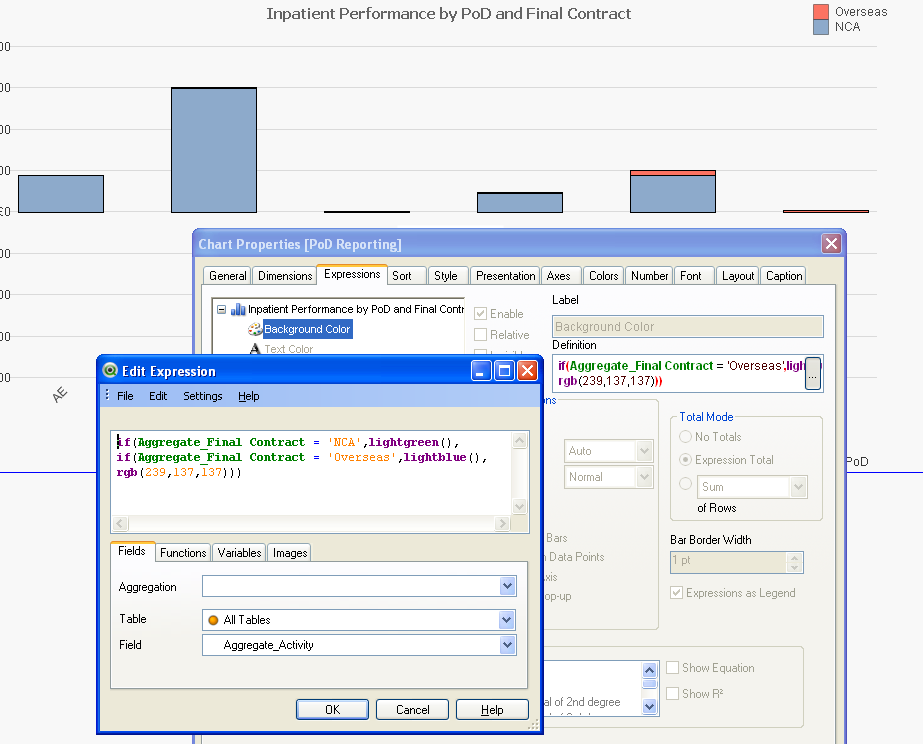
It still doesn't seem to be working 
I'm using Background Color under Expressions within Chart Properties.
It's a stacked chart instead of grouped if that makes a difference?
As you can see below, the actual chart colours are still at their default but the expression should be turning them green and (light) blue.
Again, thanks for the help and patience.
- Mark as New
- Bookmark
- Subscribe
- Mute
- Subscribe to RSS Feed
- Permalink
- Report Inappropriate Content
The "Background Color" expression should overwrite the colors on the "Colors" tab, so if it isn't working, your expression must be written incorrectly.
It looks like you may need brackets around your field names since they have a space in them, such as [Aggregate_Final Contract].
Can you post a sample .qvw?
- Mark as New
- Bookmark
- Subscribe
- Mute
- Subscribe to RSS Feed
- Permalink
- Report Inappropriate Content
Hmm, I thought as much. I've attached a sample - I've just had a bit of a late thought that it might make a difference that I'm using two dimensions, would that complicate matters?
- Mark as New
- Bookmark
- Subscribe
- Mute
- Subscribe to RSS Feed
- Permalink
- Report Inappropriate Content
Hold the phone! I put some square brackets around Final Contract as you suggested and it's working a treat now. How odd - the field name was coming up green, as if it were working properly.
That's awesome, thanks so much everyone for your help!