Unlock a world of possibilities! Login now and discover the exclusive benefits awaiting you.
- Qlik Community
- :
- All Forums
- :
- QlikView App Dev
- :
- Re: How to create multiple text values on Bar Char...
- Subscribe to RSS Feed
- Mark Topic as New
- Mark Topic as Read
- Float this Topic for Current User
- Bookmark
- Subscribe
- Mute
- Printer Friendly Page
- Mark as New
- Bookmark
- Subscribe
- Mute
- Subscribe to RSS Feed
- Permalink
- Report Inappropriate Content
How to create multiple text values on Bar Chart
I keep getting asked this question and have been unable to find an acceptable working solution.
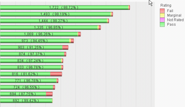
We have a bar chart that has two dimensions (entity and rating). We have one expression for the count. The bar charts are stacked. I've attached a picture for reference.
The question we keep getting asked is can we have the percentage relative to one of the ratings along with the total number. In other words, if entity "ABC" has 100 Pass ratings and 5 Marginal Rating and 10 Fail Ratings, the user would like to see the total count and the percentage of fails next to each bar on the chart. So the display for this entity would show for example "115 / 8.70%".
Obviously, we can create tables of numbers that show this information, but the users want the visual appeal of the chart with the number right there and not have to look around or try to associate line 1 with line 1 from a text grid, etc...
- Mark as New
- Bookmark
- Subscribe
- Mute
- Subscribe to RSS Feed
- Permalink
- Report Inappropriate Content
And now I'm thinking I can get there by putting total in the first sum that give me my total now I just need to figure out how to get the expression right for getting the Fail ratings. Thoughts?
dual(Sum(total<[Supplier Group 1]> [Sample Count]) & ' (' & num(Sum({<Rating = {"Fail"}>} [Sample Count])/Sum(total<[Supplier Group 1]> [Sample Count]), '0.00%') & ')', Sum ([Sample Count]
))
- Mark as New
- Bookmark
- Subscribe
- Mute
- Subscribe to RSS Feed
- Permalink
- Report Inappropriate Content
Thanks for your example, but you are not using a stacked bar chart and thus I do not believe what you are doing will work for us.
jonbroughavone wrote:
A bit like receccad suggested, I do aging bar charts with percentages appearing at the bottom and values along the top of the bars, using two expressions, one relative and one absolute. By setting the two expressiong to have different axis, the bar distance to 0 and the bar clustering to 8 it just about passes (see attached).
Can override the grey text by changing the Text Colour behind expression that is on the axis.
Jonathan
- Mark as New
- Bookmark
- Subscribe
- Mute
- Subscribe to RSS Feed
- Permalink
- Report Inappropriate Content
So here is where we are at. The solution we are trying will not work for us.
Here is the expression that I have at the moment. Please keeping in mind my goal is for the Fail % number and not the individual rating percentages.
dual(num(Sum(total<[Supplier Group 1]> [Sample Count]), '###,##0')
& ' ( ' & num(Sum([Sample Count])/Sum(total<[Supplier Group 1]> [Sample Count]), '0.00%')
& ' )', Sum ([Sample Count]))
That produces the following
You might think this is acceptable, but it is not. Why? Well you see the one with the largest fail percentage, when I select that entity I get the following
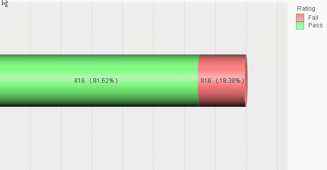
I hope you can see the issue here. So, I am back to the system should be fixed to allow dual use on the expression values when they are displayed outside of the segment but still within the chart. Looking at it from a view outside my current requirement, it would be beneficial for the system to allow me to select which segments (or combinations thereof) to display the ratio/percentage for. And I'm sure someone, somewhere will want to display something other than ratios or percentages so that should be considered as well.
- Mark as New
- Bookmark
- Subscribe
- Mute
- Subscribe to RSS Feed
- Permalink
- Report Inappropriate Content
You created this issue:
Sum(total<[Supplier Group 1]> [Sample Count]) << returns 816 for both segments.
I guess, you want something like this:
=dual(num(Sum([Sample Count]), '###,##0') & ' of ' &
num(Sum(total<[Supplier Group 1]> [Sample Count]), '###,##0')
& ' ( ' & num(Sum([Sample Count])/Sum(total<[Supplier Group 1]> [Sample Count]), '0.00%')
& ' )', Sum ([Sample Count]))
- Mark as New
- Bookmark
- Subscribe
- Mute
- Subscribe to RSS Feed
- Permalink
- Report Inappropriate Content
Or this:
=dual(if(rowno()=1, num(Sum(total<[Supplier Group 1]> [Sample Count]), '###,##0'), null())
& ' ( ' & num(Sum([Sample Count])/Sum(total<[Supplier Group 1]> [Sample Count]), '0.00%')
& ' )', Sum ([Sample Count]))
- Mark as New
- Bookmark
- Subscribe
- Mute
- Subscribe to RSS Feed
- Permalink
- Report Inappropriate Content
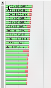
So I liked the second option the best that you just mentioned, but the text really needs to be off the bar. Why? Well, I started scrolling down the long list of entities and here is what happens.
- Mark as New
- Bookmark
- Subscribe
- Mute
- Subscribe to RSS Feed
- Permalink
- Report Inappropriate Content

You can go further, check the length of bar and if it's too small drop percentage for example.
Add another if with a condition Sum([Sample Count])< Alpha*Max(aggr(Sum(total<[Supplier Group 1]> [Sample Count]), [Supplier Group 1]).
The alpha is experimentally determined.
- Mark as New
- Bookmark
- Subscribe
- Mute
- Subscribe to RSS Feed
- Permalink
- Report Inappropriate Content
You can also make the font smaller using ='<h5>' as text Format expression.
- Mark as New
- Bookmark
- Subscribe
- Mute
- Subscribe to RSS Feed
- Permalink
- Report Inappropriate Content
I think you miss my point. The bars will continue to get smaller and smaller and smaller till no room to display any number of any kind. The text outside the bar would always display no matter bar size. The system needs to allow dual to work for the text outside the bar on the chart. Additionally, the bars in the charts are built with a ratio/percentage I would assume and thus the system already has the ratio/percentage and we should not need to recalculate it - the system should expose in some way.
Finally font size is already to small as it is on a desktop screen, now take that to an iPad and start hearing the complaints.
- Mark as New
- Bookmark
- Subscribe
- Mute
- Subscribe to RSS Feed
- Permalink
- Report Inappropriate Content
Indeed. I share my knowledge with you.
You are focused on technical problem, not the problem of analysis.
Bar chart with huge scrolling loosing zoom is a poor technic whether there is text or no.
You can't solve your problem this way.
Even if the text would drawn outside the bars, could you imagine how the user would see it ?
The right answer on your original question is 'you just cann't'.
But there are always extension objects...