Unlock a world of possibilities! Login now and discover the exclusive benefits awaiting you.
- Qlik Community
- :
- All Forums
- :
- QlikView App Dev
- :
- Re: Bar graph out of place
- Subscribe to RSS Feed
- Mark Topic as New
- Mark Topic as Read
- Float this Topic for Current User
- Bookmark
- Subscribe
- Mute
- Printer Friendly Page
- Mark as New
- Bookmark
- Subscribe
- Mute
- Subscribe to RSS Feed
- Permalink
- Report Inappropriate Content
Bar graph out of place
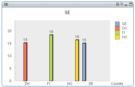
Hi, I have a regular bar chart with dimension Country containing values: {DK, FI, NO, SE}
The values for each country are calculated in variables.
My question is why my graph looks all out of sync? Why is for example the yellow bar way to the right and the blue one is too much to the left.
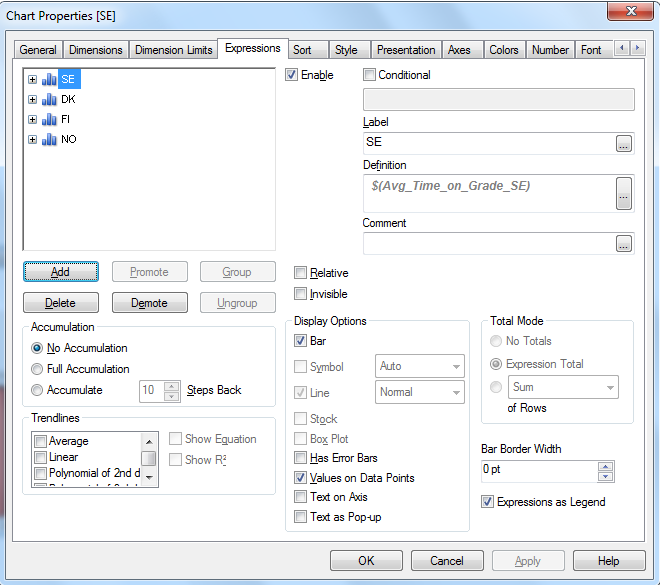
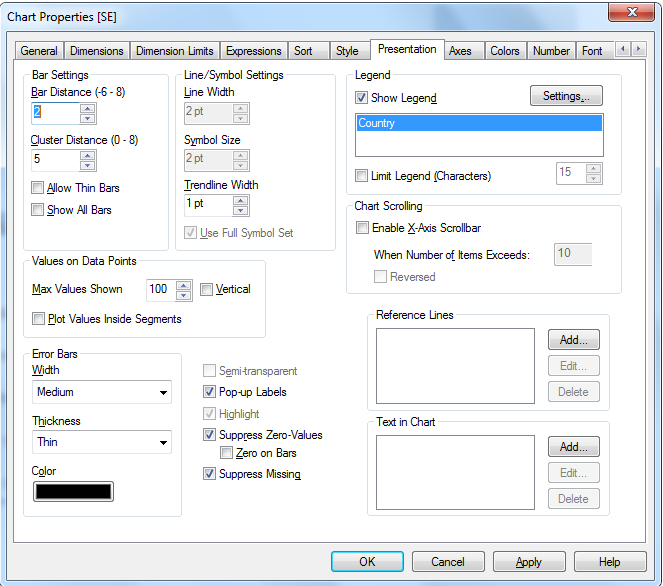
Im attaching some pics of my settings...
Thank you for any kind of help!
BR
Mikael
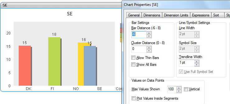
If I change Bar distance to -6 I get it like this:
- Mark as New
- Bookmark
- Subscribe
- Mute
- Subscribe to RSS Feed
- Permalink
- Report Inappropriate Content
It looks like you are also using a dimension Country, is this correct? [edit: I see, that's what you posted in your first line]
Since your 4 expressions will only produce output for 1 dimension value each, you'll get an effect like above (i.e. the gaps are due to 'missing bars' for the other 3 expression per country dimension value).
Try removing the dimension completely (or change your 4 expression to 1).