Unlock a world of possibilities! Login now and discover the exclusive benefits awaiting you.
- Qlik Community
- :
- All Forums
- :
- QlikView Integrations
- :
- Re: Influence network
- Subscribe to RSS Feed
- Mark Topic as New
- Mark Topic as Read
- Float this Topic for Current User
- Bookmark
- Subscribe
- Mute
- Printer Friendly Page
- Mark as New
- Bookmark
- Subscribe
- Mute
- Subscribe to RSS Feed
- Permalink
- Report Inappropriate Content
Influence network
Hi,
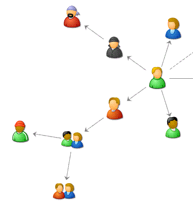
Does anyone know if there is an extension to display and represent in Qlikview an inflluence network? I have the relations between my customers, and I'd like to find a way to display it graphically. Something like the chart below
Thanks in advance
laura
Accepted Solutions
- Mark as New
- Bookmark
- Subscribe
- Mute
- Subscribe to RSS Feed
- Permalink
- Report Inappropriate Content
Hi Laura,
I just finished a graph visualization extension object:
http://community.qlik.com/message/307001#307001
Maybe you can use this in your case..
- Ralf
- Mark as New
- Bookmark
- Subscribe
- Mute
- Subscribe to RSS Feed
- Permalink
- Report Inappropriate Content
Hi Laura,
I started to work with graph data from Neo4j: http://community.qlik.com/docs/DOC-3115
For visualisation I used Google chart API as you can see in the example application. I also work on an extension for graph display using d3.js and/or raphael lib, but still have some issues.
How have you build the graph chart above? Can you also post some data?
- Ralf
- Mark as New
- Bookmark
- Subscribe
- Mute
- Subscribe to RSS Feed
- Permalink
- Report Inappropriate Content
Hi Ralf,
Thanks for your answer. I took the graph above from Google  I just wanted to show what I am looking for. I will have a look to Neo4j, but I am afraid I will not get what I want.
Best Regards
Laura
- Mark as New
- Bookmark
- Subscribe
- Mute
- Subscribe to RSS Feed
- Permalink
- Report Inappropriate Content
Hi Laura,
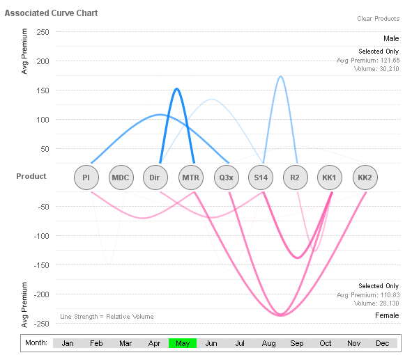
If you think about relationships among customers could be like among products, I think you could consider these two approaches: an Associated Curve chart or a Parallel Coordinates chart.
The Associated Curve chart in this example from QV Design (http://qvdesign.wordpress.com/2012/09/21/informative-curvy-never-before-seen-by-me-at-least-the-asso...) shows relationships among products (sure it could be changed to customers), but the number of elements is fixed. I liked it very much, uses the color intensity to show the relation strength, the buttons (the circles) to select the product in the chart axis, and the associations are created in the script:
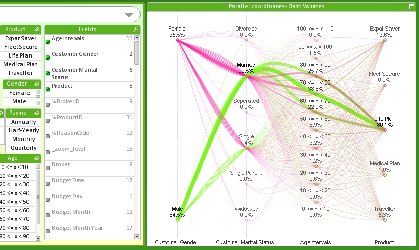
The other option is the Parallel Coordinates chart (an example here: http://qvdesign.wordpress.com/2012/01/31/brilliant-qlikview-parallel-co-ordinates-chart/). This option also uses a standard line chart, but the expressions used are complex. I think it would be possible if you could have a Source Customer and a Destination Customer fields:
Hope this helps,
Juan Gerardo
- Mark as New
- Bookmark
- Subscribe
- Mute
- Subscribe to RSS Feed
- Permalink
- Report Inappropriate Content
Hi Laura,
I just finished a graph visualization extension object:
http://community.qlik.com/message/307001#307001
Maybe you can use this in your case..
- Ralf
- Mark as New
- Bookmark
- Subscribe
- Mute
- Subscribe to RSS Feed
- Permalink
- Report Inappropriate Content
Hi Raf,
You've done an incredible job! Congratulations! I have downloaded and I will check how it meets my requirements.
Thanks for your help!
Laura
- Mark as New
- Bookmark
- Subscribe
- Mute
- Subscribe to RSS Feed
- Permalink
- Report Inappropriate Content
Hi Laura,
could you use my extension on your case? I would be interested to get to know more about your data source and how the influence is represented. Can you use a relations table which is the base of this graph visualization?
- Ralf