Unlock a world of possibilities! Login now and discover the exclusive benefits awaiting you.
- Qlik Community
- :
- All Forums
- :
- QlikView App Dev
- :
- Re: Labels on Chart table
- Subscribe to RSS Feed
- Mark Topic as New
- Mark Topic as Read
- Float this Topic for Current User
- Bookmark
- Subscribe
- Mute
- Printer Friendly Page
- Mark as New
- Bookmark
- Subscribe
- Mute
- Subscribe to RSS Feed
- Permalink
- Report Inappropriate Content
Labels on Chart table
Hi Guys,
Need some good advice to solve the issue below.
Thanks in advance,
Aldo.
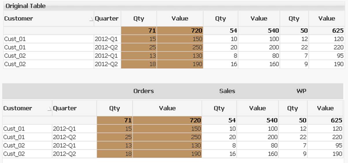
We have a chart (table) with several dimension and 6 expressions. (see first table).
Please note that since expressions are 6 different columns, each pair belongs to the same "set" (category).
I need to add a "label" to each category (as shown in the bottom table).
i.e. the first set of two expressions (Qty & Value) will have the "Orders" label, the second "Sales" label and so on.
Need to take into consideration that the table is dynamically created in the GUI (following user's selections).
The Set (Orders, Sales, etc) can appear or not (as selected by user).
The user will be changing the width of the columns (so adding a text box is not a good idea).
The user needs to export the whole table to excel.
Any good idea?
- Mark as New
- Bookmark
- Subscribe
- Mute
- Subscribe to RSS Feed
- Permalink
- Report Inappropriate Content
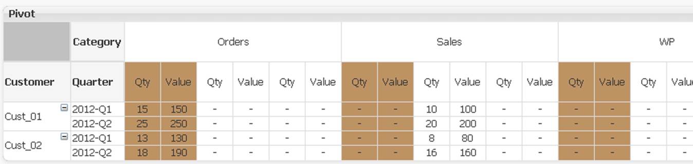
If category is a field in one of your tables then you can add it as a dimension and pivot it into the right place. I don't think there's an easy way to hide/show it then though.
If category isn't a field you should consider creating it in the load script. With a mapping table and applymap this is easily done.
talk is cheap, supply exceeds demand
- Mark as New
- Bookmark
- Subscribe
- Mute
- Subscribe to RSS Feed
- Permalink
- Report Inappropriate Content
Hi there,
I have been thinging on that approach, but looking for a most simple solution, because:
One problem is that sort is not allow in PT. (can make some workaround...)
The second one, is that each "Category" will be showing all expressions, even if setting non-related to null() and setting "Category" dimension to "Supress null values" in "Dimensions" tab.
Any suggestion?
Aldo.
- Mark as New
- Bookmark
- Subscribe
- Mute
- Subscribe to RSS Feed
- Permalink
- Report Inappropriate Content
Can you share a qvw file we can work on?
talk is cheap, supply exceeds demand
- Mark as New
- Bookmark
- Subscribe
- Mute
- Subscribe to RSS Feed
- Permalink
- Report Inappropriate Content
Sure 🙂
Take a look at tab Pivot Table.
- Mark as New
- Bookmark
- Subscribe
- Mute
- Subscribe to RSS Feed
- Permalink
- Report Inappropriate Content
See attached qvw. I've simplyfied the expressions somewhat. You only need two and they are simpler too.
talk is cheap, supply exceeds demand
- Mark as New
- Bookmark
- Subscribe
- Mute
- Subscribe to RSS Feed
- Permalink
- Report Inappropriate Content
Yeap, you are right.
I will be very glad I you have some idea to implement a solution without using PT.
Otherwise, lots of work to create "Category" Dimension (which does not exists in the real model).
Thanks!
Aldo.
- Mark as New
- Bookmark
- Subscribe
- Mute
- Subscribe to RSS Feed
- Permalink
- Report Inappropriate Content
In this case you have only three categories so you can transform the crosstable like this:
Data2:
LOAD * INLINE [
Customer, Quarter, Qty -Orders, Value -Orders, Qty -Sales, Value -Sales, Qty -WP, Value -WP
Cust_01, 2012-Q1, 15, 150, 10, 100, 12, 120
Cust_01, 2012-Q2, 25, 250, 20, 200, 22, 220
Cust_02, 2012-Q1, 13, 130, 8, 80, 7, 95
Cust_02, 2012-Q2, 18, 190, 16, 160, 9, 190
];
Data3:
load
Customer,
Quarter,
[Qty -Orders] as Qty,
[Value -Orders] as Value,
'Orders' as Category
Resident Data2;
load
Customer,
Quarter,
[Qty -WP] as Qty,
[Value -WP] as Value,
'WP' as Category
Resident Data2;
load
Customer,
Quarter,
[Qty -Sales] as Qty,
[Value -Sales] as Value,
'Sales' as Category
Resident Data2;
drop table Data2;
talk is cheap, supply exceeds demand
- Mark as New
- Bookmark
- Subscribe
- Mute
- Subscribe to RSS Feed
- Permalink
- Report Inappropriate Content
The real one is pretty complicated.
I will do some work and let know if succedded to implement with PT.
Thanks 🙂
Aldo.