Unlock a world of possibilities! Login now and discover the exclusive benefits awaiting you.
- Qlik Community
- :
- All Forums
- :
- QlikView App Dev
- :
- Re: pie chart does not give correct proportion
- Subscribe to RSS Feed
- Mark Topic as New
- Mark Topic as Read
- Float this Topic for Current User
- Bookmark
- Subscribe
- Mute
- Printer Friendly Page
- Mark as New
- Bookmark
- Subscribe
- Mute
- Subscribe to RSS Feed
- Permalink
- Report Inappropriate Content
pie chart does not give correct proportion
I posted a discussion previously, with subject "how to make pie chart show proportion of selected values in total including unselected", however, i think my description wasn't clear that I was not able to get an answer.
Let me try again, one more time  I am attaching two images for reference. Image water1.png, shows 3 objects namely WATER, WATER_DESC, and Access to Safe Water. I wish to show the proportion of households with access to safe water. Values in the field list "WATER_DESC" are possible sources of water in a community/area (while those under "WATER" are internal codes of the water sources) . Image water2.png shows selected items which are "safe" sources of water. When I highlight or select the "safe" sources of water, the pie chart shows the proportion of each value to the total count of respondents that have access to safe water and NOT to the total number of households/respondents.
Sorry, I am really stuck here. I would really appreciate assistance as I do not know what to do next and how to get the proportion of selected values to the total count/respondents. And we have a bunch of similar reports that we wish to generate prior to purchasing licenses, and if this type of report cannot be generated, maybe this is not the app for us.. 
Thanks and cheers.
- Tags:
- new_to_qlikview
- Mark as New
- Bookmark
- Subscribe
- Mute
- Subscribe to RSS Feed
- Permalink
- Report Inappropriate Content
What is your expression? It looks like you need a TOTAL in there.
- Mark as New
- Bookmark
- Subscribe
- Mute
- Subscribe to RSS Feed
- Permalink
- Report Inappropriate Content
Hi! thanks for your reply.
It's Count(RESPONDENT). When I change it to Count (total RESPONDENT) this is what I get (please check pic)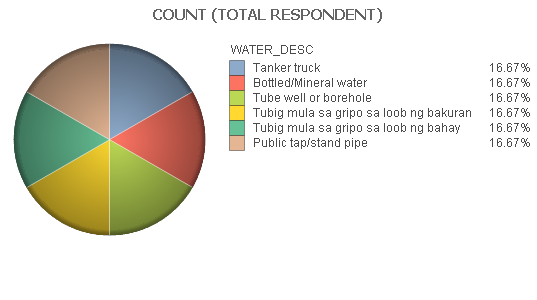
- Mark as New
- Bookmark
- Subscribe
- Mute
- Subscribe to RSS Feed
- Permalink
- Report Inappropriate Content
What kind of values do you have in the field RESPONDENT? It looks like if you have a count you would want something like Count(RESPONDENT)/Count(TOTAL RESPONDENT).
- Mark as New
- Bookmark
- Subscribe
- Mute
- Subscribe to RSS Feed
- Permalink
- Report Inappropriate Content
Values in the RESPONDENT field are household IDs/codes. They're unique values of each household/respondent. I tried to change the expression to what you suggested but it showed the same figures as in image water2.png The problem is the pie always totals to 100% where the subdivisions are those that are selected. What we wish to achieve is that the pie or whatever chart is applicable would show the total count of selected over total count of selected and unselected. s/s+u in percent.
- Mark as New
- Bookmark
- Subscribe
- Mute
- Subscribe to RSS Feed
- Permalink
- Report Inappropriate Content
You can use set analysis:
Count(RESPONDENT)/Count({1}TOTAL RESPONDENT).