Unlock a world of possibilities! Login now and discover the exclusive benefits awaiting you.
- Qlik Community
- :
- All Forums
- :
- QlikView App Dev
- :
- Re: Ignoring dimension in a chart
- Subscribe to RSS Feed
- Mark Topic as New
- Mark Topic as Read
- Float this Topic for Current User
- Bookmark
- Subscribe
- Mute
- Printer Friendly Page
- Mark as New
- Bookmark
- Subscribe
- Mute
- Subscribe to RSS Feed
- Permalink
- Report Inappropriate Content
Ignoring dimension in a chart
I have a problem with a chart that i build.
The chart has a line which monitors usage per day and accumalates this, so it is a (mostly) linear line upwards.
I also have a formula which calculates the expected endpoint of this line so usage this month till today, defided by the amount of days this month till today, multiplied by the number of days in the month.
third I have a formula which calculates the amount of data which is available to use. This is amount of users times the amount the user can use.
These last two formulas are not within the dimension (not linked to days) and therefore does not display correctly. I would like to know if there is a adject for the expression which calculates the formula and uses only the result in the chart.
If i use just a number as the expression, for instance 1203, it creates astraight line in the chart. So i want the expression to do just that, calculate the number and place it as a straight line.
Kind regards,
- « Previous Replies
-
- 1
- 2
- Next Replies »
Accepted Solutions
- Mark as New
- Bookmark
- Subscribe
- Mute
- Subscribe to RSS Feed
- Permalink
- Report Inappropriate Content
So as you've used DataServiceType as dimmension use it in your expressions for line chart:
=sum(total<DataServiceType> Cdr_DataKB)/1024/count(DISTINCT total<DataServiceType> Cdr_StartDay)
=sum(total<DataServiceType> Cdr_DataKB)/1024/count(DISTINCT total<DataServiceType> Cdr_StartDay)*avg(total<DataServiceType> monthdays)
- Mark as New
- Bookmark
- Subscribe
- Mute
- Subscribe to RSS Feed
- Permalink
- Report Inappropriate Content
Hi,
can you post a .qvw sample of problem?
- Mark as New
- Bookmark
- Subscribe
- Mute
- Subscribe to RSS Feed
- Permalink
- Report Inappropriate Content
Yes just give a sample copy....it will be good.
- Mark as New
- Bookmark
- Subscribe
- Mute
- Subscribe to RSS Feed
- Permalink
- Report Inappropriate Content
Is there a quick How-to to make an example? My dataset is huge and on a remote secure server. I would not know how to recreate something like it in excell and make a qvw out of it...
So there is no quick set expression trick like: "UseNumericValue()" or anything like that?
- Mark as New
- Bookmark
- Subscribe
- Mute
- Subscribe to RSS Feed
- Permalink
- Report Inappropriate Content
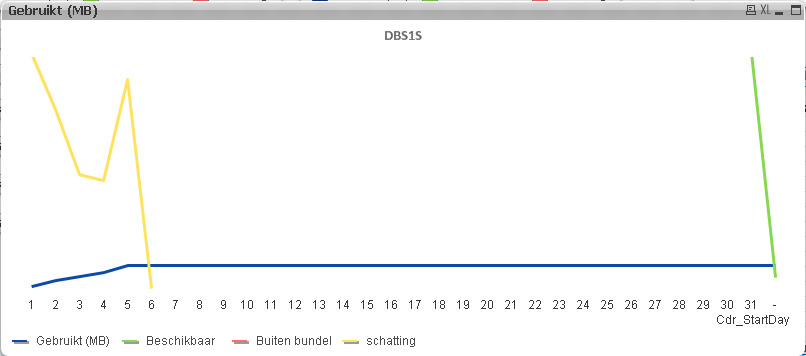
The yellow and the green line have to become straight horizontal lines. The formula from yellow is ([usage till today] / [days till today]) * [days of the month]
The problem is that it uses the dimension when i do not want it to. Normally the expression would return one value, now it returns values for each different day..
- Mark as New
- Bookmark
- Subscribe
- Mute
- Subscribe to RSS Feed
- Permalink
- Report Inappropriate Content
You can try with Set Analysis:
Yellow Expression:
=(sum({$<Cdr_StartDay=>}[usage till today]) / sum({$<Cdr_StartDay=>}[days till today])) * sum({$<Cdr_StartDay=>}[days of the month])
Hope this helps
Regards
Mc
- Mark as New
- Bookmark
- Subscribe
- Mute
- Subscribe to RSS Feed
- Permalink
- Report Inappropriate Content
Thank you mario,
but this doesn't work, using "cdr_startday=" causes to ignore selections in the cdr_startday, not the dimension of the graph.
Can it be so difficult? if i calculate the value in a table without dimension cdr_startday I get a value. If i type this value in the chart expressions there is a straight line...
- Mark as New
- Bookmark
- Subscribe
- Mute
- Subscribe to RSS Feed
- Permalink
- Report Inappropriate Content
Try to create 2 graphs and overlay them , with transparent background for the second
Fisrt graph=Dimension,Blue Line Expression
Second Graph = without dimension,Yellow Line Expression,Green Line Expression
All with your formulas,without Set Analysis
MC
- Mark as New
- Bookmark
- Subscribe
- Mute
- Subscribe to RSS Feed
- Permalink
- Report Inappropriate Content
Thanks Mario,
I tried to avoid that because at some point it will be messed up (selections, dragging, changing axis). But i guess i could try it..
Still a other solution is welcome!
- Mark as New
- Bookmark
- Subscribe
- Mute
- Subscribe to RSS Feed
- Permalink
- Report Inappropriate Content
Hi,
Try
Suppose if you have Dimension1, Dimension2 then you can ignore Dimension2 by using
=Sum(TOTAL<Dimension2> Sales)
Regards,
Jagan.
- « Previous Replies
-
- 1
- 2
- Next Replies »