Unlock a world of possibilities! Login now and discover the exclusive benefits awaiting you.
- Qlik Community
- :
- All Forums
- :
- QlikView App Dev
- :
- Re: Visibility chart
- Subscribe to RSS Feed
- Mark Topic as New
- Mark Topic as Read
- Float this Topic for Current User
- Bookmark
- Subscribe
- Mute
- Printer Friendly Page
- Mark as New
- Bookmark
- Subscribe
- Mute
- Subscribe to RSS Feed
- Permalink
- Report Inappropriate Content
Visibility chart
Hi guys and girls,
i have a very special case to solve,pls help me...
I have a container box with imported pivot tables (a pivot tables are similar in structure dimensions,only conditionals in expressions are direrent).
Above it i need to create bar chart with dimensions common to all tables ---> Than i need to do some adjustment for changing a expressions values in chart,when i´m switching between tables in the container box.
Than as a bonus you could tell me,how put some chosen dimension to secondary axes (as in Excel),i cannot find it in options
Thx so much:-)
Jerry
Accepted Solutions
- Mark as New
- Bookmark
- Subscribe
- Mute
- Subscribe to RSS Feed
- Permalink
- Report Inappropriate Content
Jerry,
See chart properies, tab Axes. Select the % expression, and in the Position section, choose Right. Keep the $ expressions Left, which is the default.
Is it what you need?
Regards,
Michael
- Mark as New
- Bookmark
- Subscribe
- Mute
- Subscribe to RSS Feed
- Permalink
- Report Inappropriate Content
Jerry,
I think that using container here is not the best idea. I'd rather use only one pivot table and only one bar chart, and make expression (in both) conditional. To switch between conditions, you can use a variable or a field.
Regards,
Michael
- Mark as New
- Bookmark
- Subscribe
- Mute
- Subscribe to RSS Feed
- Permalink
- Report Inappropriate Content
Ok,i´ll try it....could you pls tell me an answer to point nb.2 - secondary axis ?!
Thx a lot
J.
- Mark as New
- Bookmark
- Subscribe
- Mute
- Subscribe to RSS Feed
- Permalink
- Report Inappropriate Content
I'm not sure I understand exactly what you want. Here is what I use for "selected dimension".
Created a field %Dimension (as logical island) which contains the list of the field names which I allow to use as chart dimensions (e.g. City, Client, SalesRep...)
The chart (bar or line) itself has two dimensions. The first one is time, e.g. Month. The second is calculated:
=$(=%Dimension)
List box %Dimension allows only one selected value. User selects 'City' - and City is the chart dimension.
Hope it may give you a hint, even if it's not what you're looking for.
Regards,
Michael
- Mark as New
- Bookmark
- Subscribe
- Mute
- Subscribe to RSS Feed
- Permalink
- Report Inappropriate Content
Dear Michael,
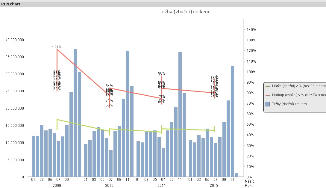
i´ll try explain it by concrete case.
I have a chart with 2 dimensions (year,month) and then 3 expressions (one value in milions and next two in %).When i want to display all expressions in one chart,so i need to take expressions in % and put them to secondary axes to the right, because if i wouldn´t do it i´ll see only bars with milions of first expression and % not. In excel is a function "series options"- secondary axes (when you select menu for one of columns).
If i could put a chosen expressions to secondary axes on the right site of a chart i´ll see all three expressions in one chart.
Thank you for an advice
have i nice day
J.
- Mark as New
- Bookmark
- Subscribe
- Mute
- Subscribe to RSS Feed
- Permalink
- Report Inappropriate Content
Jerry,
See chart properies, tab Axes. Select the % expression, and in the Position section, choose Right. Keep the $ expressions Left, which is the default.
Is it what you need?
Regards,
Michael
- Mark as New
- Bookmark
- Subscribe
- Mute
- Subscribe to RSS Feed
- Permalink
- Report Inappropriate Content
Yeah,it´s strange...i tried it before and it doesn´t work,now it works
Thank you so much,have a nice day
J.
- Mark as New
- Bookmark
- Subscribe
- Mute
- Subscribe to RSS Feed
- Permalink
- Report Inappropriate Content
Michael just one more stuff - please:
I did what you adviced to me and i have next problem - a percentage aren´t in one line,they grow up and both lines look very strange. Maybe is it what your wrote to me and i diďn´t understand it - "Keep the $ expressions Left, which is the default"
Thx for help onemore time
J.
- Mark as New
- Bookmark
- Subscribe
- Mute
- Subscribe to RSS Feed
- Permalink
- Report Inappropriate Content
Sorry, don't have time to try. I suspect it is because of two dimensions, year and month. Try with one dimension.
Regards,
Michael