Unlock a world of possibilities! Login now and discover the exclusive benefits awaiting you.
- Qlik Community
- :
- All Forums
- :
- QlikView App Dev
- :
- Re: New to Qlik
- Subscribe to RSS Feed
- Mark Topic as New
- Mark Topic as Read
- Float this Topic for Current User
- Bookmark
- Subscribe
- Mute
- Printer Friendly Page
- Mark as New
- Bookmark
- Subscribe
- Mute
- Subscribe to RSS Feed
- Permalink
- Report Inappropriate Content
New to Qlik
Hi,
I just discovered Qlikview and wondered if I could use it to display a nuber of graphs on one page, based on excel spreadsheet data.
I've tried to create a chart based on an excel spreadsheet using the wizard but I can't get it to display how I need it.
The spreadsheet has three col's, the first with frequency (radio) and then the second and third have measurements taken at a frequency points.
I need the x axis to be frequency and then 2 data series plotted against the frequency but I can't get it to work.
Any suggestions?
Cheers,
Phil
- Tags:
- new_to_qlikview
- Mark as New
- Bookmark
- Subscribe
- Mute
- Subscribe to RSS Feed
- Permalink
- Report Inappropriate Content
Please post a screenshot of your current graph, and include the expressions you're using for plotting both series.
Are you using aggregation functions, even though there may be only one Y-value for each frequency?
Peter
- Mark as New
- Bookmark
- Subscribe
- Mute
- Subscribe to RSS Feed
- Permalink
- Report Inappropriate Content
Sounds pretty straightforward. Do you have a sample file and we can help you out?
- Mark as New
- Bookmark
- Subscribe
- Mute
- Subscribe to RSS Feed
- Permalink
- Report Inappropriate Content
Thanks,
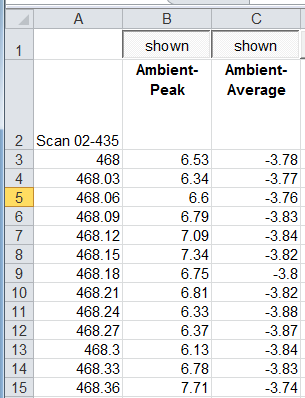
I thought it would be straight forward, I'm probably missing something pretty obvious.
images below.
Spreadsheet layout
Graph

- Mark as New
- Bookmark
- Subscribe
- Mute
- Subscribe to RSS Feed
- Permalink
- Report Inappropriate Content
Here is an example. Obviously it doesn't look like your graph above since I only plotted a few data points.
- Mark as New
- Bookmark
- Subscribe
- Mute
- Subscribe to RSS Feed
- Permalink
- Report Inappropriate Content
rebeccad,
Thanks for the sample file but I can't open it because I'm running the personal version, is there any training info/video of how to go about creating the graph?
Using the wizard it doesn't seem to offer the options to create a graph with the data aligned to the right axis.
- Mark as New
- Bookmark
- Subscribe
- Mute
- Subscribe to RSS Feed
- Permalink
- Report Inappropriate Content
See attached. If you search YouTube you will find a lot of good demos. Honestly, the biggest help is probably the Community. Between asking a lot of questions and playing around on your own, you will get the hang of it pretty quickly.
- Mark as New
- Bookmark
- Subscribe
- Mute
- Subscribe to RSS Feed
- Permalink
- Report Inappropriate Content
Thanks,
I'll carry on figuring it out, I only downloaded it a couple of hours ago.
- Mark as New
- Bookmark
- Subscribe
- Mute
- Subscribe to RSS Feed
- Permalink
- Report Inappropriate Content
rebeccad,
Brilliant, that document helped me to sort out the problem, a bit of a way to go yet but at least I can get the data into a graph.
Thanks.