Unlock a world of possibilities! Login now and discover the exclusive benefits awaiting you.
- Qlik Community
- :
- All Forums
- :
- QlikView App Dev
- :
- Re: Pie chart shows incorrect item as majority
- Subscribe to RSS Feed
- Mark Topic as New
- Mark Topic as Read
- Float this Topic for Current User
- Bookmark
- Subscribe
- Mute
- Printer Friendly Page
- Mark as New
- Bookmark
- Subscribe
- Mute
- Subscribe to RSS Feed
- Permalink
- Report Inappropriate Content
Pie chart shows incorrect item as majority
No matter what selections are made, my pie charts will always show the 12th highest (pink) item as the majority. Often it takes up 3/4ths of the pie when the numbers on the right clearly show that there are items higher than it. My expression is a simple count(distinct ID).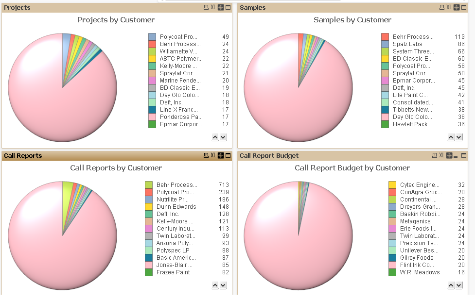
it doesn't do this for other charts and the name that is the majority customer isn't consistent but it is always the pink one (or if less than 12 items are in the pie than it is the lowest one). Any input would be appreciated.
-Thanks
- Mark as New
- Bookmark
- Subscribe
- Mute
- Subscribe to RSS Feed
- Permalink
- Report Inappropriate Content
The pink looks like a combination of all "Others" to me. There is a small pink sliver in all charts that I think represents the item listed on the right. It seems you have a lot of dimension values so you might want to limit the number of items shown.
(In my personal opinion, the pie charst themselves add no value here since I would only look at the tables on the right with the names and numbers to figure out which Customers had the most projects/samples/call reports etc.)
- Mark as New
- Bookmark
- Subscribe
- Mute
- Subscribe to RSS Feed
- Permalink
- Report Inappropriate Content
Dear Cam,
I think you are taking top 10 or top 20 values of the pie. Rest are showing as others. Pls check that.
Regards,
Nandha
- Mark as New
- Bookmark
- Subscribe
- Mute
- Subscribe to RSS Feed
- Permalink
- Report Inappropriate Content
This does seem to be the case. Is there a way to label the slice of the pie as others?
- Mark as New
- Bookmark
- Subscribe
- Mute
- Subscribe to RSS Feed
- Permalink
- Report Inappropriate Content
Hi,
Sure. If you go in under your chart properties > Dimension Limits > Check the restriction box and set to X values to be shown this should limit the number of slices. Then check the "Show Others" checkbox at the bottom of the dialog.
- Mark as New
- Bookmark
- Subscribe
- Mute
- Subscribe to RSS Feed
- Permalink
- Report Inappropriate Content
Is there any way to not have an 'others' slice? currently I have no dimension limit and it still is taking anything after the tenth item and showing it as one big slice. The numbers are still correct, the legend on the side shows more items after the tenth one but it still is showing a majority of the items as one giant slice
thanks
- Mark as New
- Bookmark
- Subscribe
- Mute
- Subscribe to RSS Feed
- Permalink
- Report Inappropriate Content
Hi Cam,
If you are using QV11 go to Dimension Limits you will find the check box for "Show Others" just uncheck it and you will not find the ohers slice in the chart.
Regards,
Nandha
- Mark as New
- Bookmark
- Subscribe
- Mute
- Subscribe to RSS Feed
- Permalink
- Report Inappropriate Content
It is unchecked, nothing in Dimension Limits is cheched/active. When I switch to bar graph all the dimensions show fine, it's only with pie chart that it shows the large pink slices as the tenth highest name
- Mark as New
- Bookmark
- Subscribe
- Mute
- Subscribe to RSS Feed
- Permalink
- Report Inappropriate Content
Also check the setting for the 'Lower Limit on Slice Area' in the Properties -> Presentation tab
- Mark as New
- Bookmark
- Subscribe
- Mute
- Subscribe to RSS Feed
- Permalink
- Report Inappropriate Content
I couldn't find this option. I found the problem but don't know if there is a solution to it: Because I have fast change enabled set to switch to a bar graph I have the bar graph set to 'Enable X-axis Scrolling' when the items exceed a limit . This limit is effecting the pie chart.
Is there any way around this? I noticed that the limit can be set to an expression, but I don't see how that could be utilized to know what type of graph is being displayed.
Thanks for the tips