Unlock a world of possibilities! Login now and discover the exclusive benefits awaiting you.
- Qlik Community
- :
- All Forums
- :
- QlikView App Dev
- :
- Re: How to make a coloured monthchart/pivot for ab...
- Subscribe to RSS Feed
- Mark Topic as New
- Mark Topic as Read
- Float this Topic for Current User
- Bookmark
- Subscribe
- Mute
- Printer Friendly Page
- Mark as New
- Bookmark
- Subscribe
- Mute
- Subscribe to RSS Feed
- Permalink
- Report Inappropriate Content
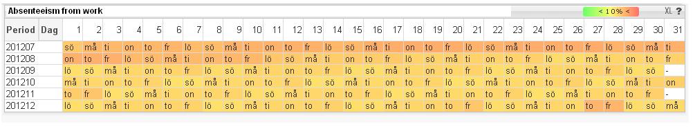
How to make a coloured monthchart/pivot for absence from work
Hi
A time ago I came across a picture that shows a chart with abcence from work in a PA-app in qv. I have now been trying to do the same but don´t succed. I have uniq personID and hours of absence. Also start and stop date for the absence.
Can someone help me, or maybe someone have a demo with something similar. I guess it also can be used to show days a frontend-support are most busy, or when there are most customers bying stuff and so on. But I can´t find any demo, maybe i don´t know what terms I should search for.
The chart use dimensions YearMonth and on the top it´s Day of the month, in the colured coulmns it´s the dayname that are shown (swedish in this pic)
Any suggestion?
- Tags:
- new_to_qlikview
- Mark as New
- Bookmark
- Subscribe
- Mute
- Subscribe to RSS Feed
- Permalink
- Report Inappropriate Content
Hi,
Perhaps, you can try this:
Create a straight table/pivot table and add the expression for Absent hours, expand it and add something like the following as background color.
=if(sum(Abs_WeekHrs)>0,LightRed(),Green())
Please check the attachment for a sample.
Hope it helps.
Regards,
-Khaled