Unlock a world of possibilities! Login now and discover the exclusive benefits awaiting you.
- Qlik Community
- :
- All Forums
- :
- QlikView App Dev
- :
- Re: Chart Issue - Dimensions & Expressions
- Subscribe to RSS Feed
- Mark Topic as New
- Mark Topic as Read
- Float this Topic for Current User
- Bookmark
- Subscribe
- Mute
- Printer Friendly Page
- Mark as New
- Bookmark
- Subscribe
- Mute
- Subscribe to RSS Feed
- Permalink
- Report Inappropriate Content
Chart Issue - Dimensions & Expressions
Hi all,
I'm still a very new QlikView user and I have an issue that I could use some help with. I'm working on a test chart at the moment. Basically there are 4 STATEMENTS which people have scored 0-10 on. There are 4 SEGMENTS, which for the purposes of this example I have called Segment 1 Segment 2 etc - although in reality this will be something like "London", "Glasgow" etc. The segment defines where the user is from.
I've made the chart below:
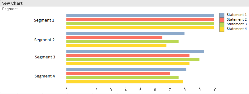
This is all well and good, however I need the Statements to be on the left hand side, and the Segments to be the legend (at the top right hand corner). Is there a way to do this? In other words, I want every segment to be represented by a different coloured bar, not the other way around.
Expressions used:
=avg(Statement1)
=avg(Statement2)
=avg(Statement3)
=avg(Statement4)
Dimension used:
Segment
- Mark as New
- Bookmark
- Subscribe
- Mute
- Subscribe to RSS Feed
- Permalink
- Report Inappropriate Content
Hi,
if I well understand you want to move the legend on the left side.
To do that, press "CTRL" & "SHIFT" then you can move wherever you want the legend using the mouse.
Hope it helps
Giampiero
- Mark as New
- Bookmark
- Subscribe
- Mute
- Subscribe to RSS Feed
- Permalink
- Report Inappropriate Content
Sorry,
press "CTRL" + "ALT" + "SHIFT"
regards
Giampiero
- Mark as New
- Bookmark
- Subscribe
- Mute
- Subscribe to RSS Feed
- Permalink
- Report Inappropriate Content
Not quite! I actually need to change the way the data is broken down. So that rather than showing scores of 0-10 per segment, I show scores of 0-10 per statement
- Mark as New
- Bookmark
- Subscribe
- Mute
- Subscribe to RSS Feed
- Permalink
- Report Inappropriate Content
Bump!