Unlock a world of possibilities! Login now and discover the exclusive benefits awaiting you.
- Qlik Community
- :
- All Forums
- :
- QlikView App Dev
- :
- How to plot multiple y-values as dots against x-ax...
- Subscribe to RSS Feed
- Mark Topic as New
- Mark Topic as Read
- Float this Topic for Current User
- Bookmark
- Subscribe
- Mute
- Printer Friendly Page
- Mark as New
- Bookmark
- Subscribe
- Mute
- Subscribe to RSS Feed
- Permalink
- Report Inappropriate Content
How to plot multiple y-values as dots against x-axis?
Dear Qlikview users,
I have a excelsheet with temperature and gas data. I need to create a chart where the temperature is on the x-axis. And every gas-value which belongs to that temperature value must be plotted as an individual dot. This is a excerpt from my excel sheet:
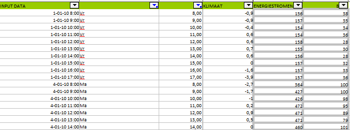
The column "KLIMAAT" stands for the temperature. the last column represents the gas-values.
As you can see in the sheet there is a temperature-value of -0.9. The gasvalues 38 and 35. So when a chart is plotted.
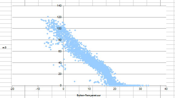
Under the value -0.9 two dots must be plotted, representing the value 35 and 38. For example:
How can I achieve this?
My first thought was to use the scatter plot chart, but I did not get the right result. Maybe I did something wrong?
Accepted Solutions
- Mark as New
- Bookmark
- Subscribe
- Mute
- Subscribe to RSS Feed
- Permalink
- Report Inappropriate Content
Yes, you should use a scatter chart.
You need one dot per data point/record so you should use the record id as dimension. If you don't have a record id, you should create one in the script:
recno() as RecordID,
In the scatter plot, you should switch to "Advanced mode" and use the following two expressions:
Avg(KLIMAAT)
Avg([Gas value])
Good luck!
HIC