Unlock a world of possibilities! Login now and discover the exclusive benefits awaiting you.
- Qlik Community
- :
- All Forums
- :
- QlikView App Dev
- :
- Re: How to calculate statistic data from alternate...
- Subscribe to RSS Feed
- Mark Topic as New
- Mark Topic as Read
- Float this Topic for Current User
- Bookmark
- Subscribe
- Mute
- Printer Friendly Page
- Mark as New
- Bookmark
- Subscribe
- Mute
- Subscribe to RSS Feed
- Permalink
- Report Inappropriate Content
How to calculate statistic data from alternate states?
Dear Qlikview users,
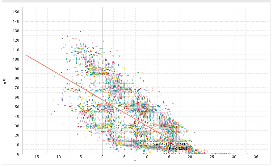
I'm developing a dashboard which visualizes temperature and gasconsumption of a building. I've build an scatter plot which shows the temperature-values on the x-axis and all gasvalues for a temperature on the y-axis. This applies for the whole dataset.
Below is an example of the scatter-plot:
However, the Dashboard-user must be able to refine the whole dataset to smaller datasets with certain parameters, such as the hours of the day and days in the year. The filtering of the whole dataset is accomplished with slider objects and charts which makes it visual. To differentiate between different states I made use of comparative analysis, to create two states: "TW1" and "TW2". Below is an example of 'state TW2'.

The left chart shows the years of the day against the gasconsumption. The blue plot shows the whole dataset (it's independent of the selection). The red plot shows a selected dataset, based on the range selected with the slider. The right charts shows the gasconsumption on every selected range of hours of the day. Every chart represents a day (mon - fri). The selection of TW2 consists of the selected range of the days of years and range of hours of the day. The same applies to TW1.
These two datasets must be compared to eachother and I need to accomplish te following:
- Make a scatter plot for each set in one graph
- Make tables with basic and statistic data
Table with basic data:
| Time Window | Total Gas | Average Gas | Max Gas |
|---|---|---|---|
| All Data | |||
| TW1 | |||
| TW2 |
Table with statistic characteristics
| Time Window | Alpha |
|---|---|
| TW1 | |
| TW2 |
However, I didn't succeed in creating the structure for the table as described above. I tried it with the straight table and tablebox. They allow you to select data-fields as columns/row, but "All Data" isn't a field, neither the state-groups "TW1" and "TW2". Is there any way to accomplish the above?
So, to summarize everything:
- I need to make a scatter-plot for every state-group (TW1, TW2) in one chart
- I need to make 'custom' tables with calculated values of the state-groups.
I added my QlikView-file as attachment to look into the details!
ps; The container with it's objects reacts kind of buggy, the slider sometimes disappears. Even the chart. When this occurs, just use the clear-button several times.
Accepted Solutions
- Mark as New
- Bookmark
- Subscribe
- Mute
- Subscribe to RSS Feed
- Permalink
- Report Inappropriate Content
I've added a table on the GAS sheet with some data using the two states. I've also added two listboxes to make some selections for the states. And I've overlayed a second scatter chart over the first one. The bottom one uses state TW1, the one on top uses state TW2. On the tab Sheet2 is another scatter chart that sets the background color of expression T depending on the value of Cofely.Hour. These are now hardcoded, but that could be changed to using variables. I hope this helps you on the way to solving your challenges.
talk is cheap, supply exceeds demand
- Mark as New
- Bookmark
- Subscribe
- Mute
- Subscribe to RSS Feed
- Permalink
- Report Inappropriate Content
Thank you for your help. I appreciate it!
I'm currently editing my dashboard to exactly fit my needs, with your feedback