Unlock a world of possibilities! Login now and discover the exclusive benefits awaiting you.
- Qlik Community
- :
- All Forums
- :
- QlikView App Dev
- :
- Re: Named Area in a Scattered Chart
- Subscribe to RSS Feed
- Mark Topic as New
- Mark Topic as Read
- Float this Topic for Current User
- Bookmark
- Subscribe
- Mute
- Printer Friendly Page
- Mark as New
- Bookmark
- Subscribe
- Mute
- Subscribe to RSS Feed
- Permalink
- Report Inappropriate Content
Named Area in a Scattered Chart
Hi guys!
I have this scattered chart like you can see below:
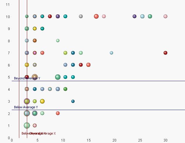
In the scattered chart above I devided the area into 9 as follows:
AREA 1: Beyond Average (Y) AND Beyond Average (X)
AREA 2: Average (Y) AND Beyond Average (X)
AREA 3: Below Average (Y) AND Beyond Average (X)
.... and so on.
Using 2 lines on each X and Y with formula:
Below Average X = Avg([Final Value 1]) * 0.659
Beyond Average X = Avg([Final Value 1]) * 1.341
Beyond Average Y = Avg([Final Value 2]) * 1.341
Below Average Y = Avg([Final Value 2]) * 0.659
So that I will have a scattered chart like this one below:
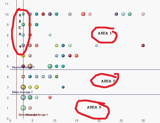
The question is: Could you please help me on how to put text "Area 1" "Area 2"... in those specific area?
Thanks in advance!
A
Accepted Solutions
- Mark as New
- Bookmark
- Subscribe
- Mute
- Subscribe to RSS Feed
- Permalink
- Report Inappropriate Content
There is no way to automatically label areas so you'll have to manually add text-in-chart objects on the Presentation tab of the properties window. After adding these you'll need to position them correctly. If you keep the Shift and Ctrl keys pressed down you'll see red outlines. You can then pick up the the text-in-chart objects and drag them to the right places.
talk is cheap, supply exceeds demand