Unlock a world of possibilities! Login now and discover the exclusive benefits awaiting you.
- Qlik Community
- :
- All Forums
- :
- QlikView App Dev
- :
- Re: Adding marks to the axis of a graph
- Subscribe to RSS Feed
- Mark Topic as New
- Mark Topic as Read
- Float this Topic for Current User
- Bookmark
- Subscribe
- Mute
- Printer Friendly Page
- Mark as New
- Bookmark
- Subscribe
- Mute
- Subscribe to RSS Feed
- Permalink
- Report Inappropriate Content
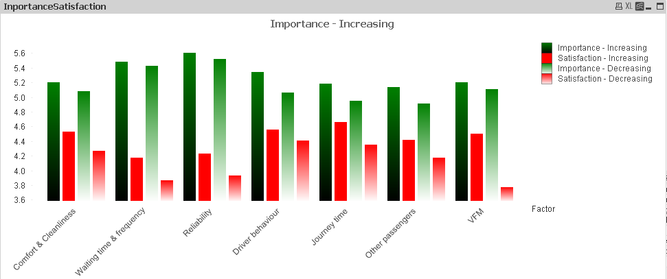
Adding marks to the axis of a graph
I'm relatively new to Qlikview, a really simple question
I have produced a graph with four expressions (how people rate varoious aspects of public transport in terms of importance and satisfaction, further split into those whose use of public is increasing against those whose use is decreasing).
I'd like to make it a bit clearer that each group of four columns "goes together"
Is there some way I can put a division/ shading etc of some type after every fourth bar to make it clearer which label each bar is for?
Many thanks
Steve 🙂
PS Please don't point out it's a bit garish - red and green are our corporate colours!
Accepted Solutions
- Mark as New
- Bookmark
- Subscribe
- Mute
- Subscribe to RSS Feed
- Permalink
- Report Inappropriate Content


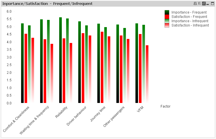
Thanks to all who responded.
Jonathan's response has allowed me to put a space between the groups of bars and given a result which looks a lot better.
Regards
Steve
- Mark as New
- Bookmark
- Subscribe
- Mute
- Subscribe to RSS Feed
- Permalink
- Report Inappropriate Content
How about spacing it out by putting two blank expressions in, set to be just 0, and set those to be your 1st and 6th expressions.
The spacing and clustering settings on the Presentation properties also try to do this, but don't give much spacing.
Jonathan
- Mark as New
- Bookmark
- Subscribe
- Mute
- Subscribe to RSS Feed
- Permalink
- Report Inappropriate Content
Hi Stefen,
Seems i am not able to get what you want .
Do you want all the expressions in one or something else.
- Mark as New
- Bookmark
- Subscribe
- Mute
- Subscribe to RSS Feed
- Permalink
- Report Inappropriate Content
Thanks to all who responded.
Jonathan's response has allowed me to put a space between the groups of bars and given a result which looks a lot better.
Regards
Steve
- Mark as New
- Bookmark
- Subscribe
- Mute
- Subscribe to RSS Feed
- Permalink
- Report Inappropriate Content

Thanks to all who responded.
Jonathan's response has allowed me to put a space between the groups of bars and given a result which looks a lot better.
Regards
Steve
- Mark as New
- Bookmark
- Subscribe
- Mute
- Subscribe to RSS Feed
- Permalink
- Report Inappropriate Content
Thanks to all who responded.
Jonathan's response has allowed me to put a space between the groups of bars and given a result which looks a lot better.
Regards
Steve
- Mark as New
- Bookmark
- Subscribe
- Mute
- Subscribe to RSS Feed
- Permalink
- Report Inappropriate Content
Thanks to all who responded.
Jonathan's response has allowed me to put a space between the groups of bars and given a result which looks a lot better.
Regards
Steve
- Mark as New
- Bookmark
- Subscribe
- Mute
- Subscribe to RSS Feed
- Permalink
- Report Inappropriate Content
Thanks to all who responded.
Jonathan's response has allowed me to put a space between the groups of bars and given a result which looks a lot better.
Regards
Steve