Unlock a world of possibilities! Login now and discover the exclusive benefits awaiting you.
- Qlik Community
- :
- All Forums
- :
- QlikView App Dev
- :
- Re: Stacked Bar Chart
- Subscribe to RSS Feed
- Mark Topic as New
- Mark Topic as Read
- Float this Topic for Current User
- Bookmark
- Subscribe
- Mute
- Printer Friendly Page
- Mark as New
- Bookmark
- Subscribe
- Mute
- Subscribe to RSS Feed
- Permalink
- Report Inappropriate Content
Stacked Bar Chart
Hi,
I have the following field data that load from excel:
Initiative Category, Project Status, Opex Total
I want to display the data in a stacked bar chart as something like the following:
1. Y axis as the sum of opex total
2. X axis to create a group "Opex FY13" that contains all the Initiative Category and Project Status
3. Legends that display different colors for Intiative Category and Project Status
How should I construct the script and create the bar chart?
Thank you
- « Previous Replies
-
- 1
- 2
- Next Replies »
- Mark as New
- Bookmark
- Subscribe
- Mute
- Subscribe to RSS Feed
- Permalink
- Report Inappropriate Content
Request you to create some dummy data and post sample qvw to help you.
Vikas
If the issue is solved please mark the answer with Accept as Solution & like it.
If you want to go quickly, go alone. If you want to go far, go together.
- Mark as New
- Bookmark
- Subscribe
- Mute
- Subscribe to RSS Feed
- Permalink
- Report Inappropriate Content
Hi,
I've attached sample data and the output of the barchart.
Currently i'm still using Personal Edition and have used up all my recovery quota.
Please take screen shot of the dimension and expresion. Thanks a lot. 
- Mark as New
- Bookmark
- Subscribe
- Mute
- Subscribe to RSS Feed
- Permalink
- Report Inappropriate Content
Hi,
I didn't understand your requirement.
Could you explaint little more?
From where you want to pick "Inv 2013" and "Ownershipt 2013".?
Karthik
- Mark as New
- Bookmark
- Subscribe
- Mute
- Subscribe to RSS Feed
- Permalink
- Report Inappropriate Content
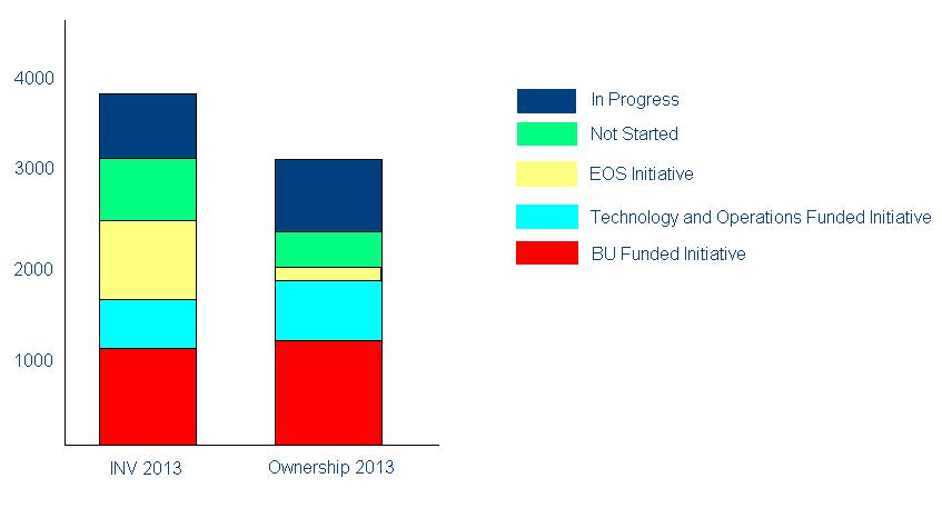
Inv 2013 = Sum of Capex and Opex
Ownership 2013 = Sum of Ownership
Currently, in my Dimension, i've place "T&O Functional Unit" and "Project Status".
Then in i have 2 expression, "Sum(Capex + Opex)" and "Sum(Onwership)".
But that's not the result i wan. I want the Legend on the right as "Business Case Preparation, Completed, In Progress...". Then for the X axis, i want to create 2 new label, "Inv 2013" for the Capex + Opex and "Ownership" for the ownership sum.
So this should be the result that i want:
- Mark as New
- Bookmark
- Subscribe
- Mute
- Subscribe to RSS Feed
- Permalink
- Report Inappropriate Content
Hope this might help you please see the sample.
- Mark as New
- Bookmark
- Subscribe
- Mute
- Subscribe to RSS Feed
- Permalink
- Report Inappropriate Content
Sorry, that sample is not the result i want. What i want is the Legend as the City and the Exp1, Exp2 and Exp3 as Dimension label.
Or how do I tranpose the chart?
- Mark as New
- Bookmark
- Subscribe
- Mute
- Subscribe to RSS Feed
- Permalink
- Report Inappropriate Content
Genie i dont think that logically this is right .
- Mark as New
- Bookmark
- Subscribe
- Mute
- Subscribe to RSS Feed
- Permalink
- Report Inappropriate Content
i understand it's not the normal way to create bar chart. but this was the requirement from my user. so hoping someone can help me with this as i'm new to qlikview.
maybe probably i have to do some crosstable or pivoting in the script? i'm not really very sure
- Mark as New
- Bookmark
- Subscribe
- Mute
- Subscribe to RSS Feed
- Permalink
- Report Inappropriate Content
can you post a sample of just 5 opr 10 ecords ...
just create it with INLINE code
...
- « Previous Replies
-
- 1
- 2
- Next Replies »