Unlock a world of possibilities! Login now and discover the exclusive benefits awaiting you.
- Qlik Community
- :
- All Forums
- :
- QlikView App Dev
- :
- Basic Bar Chart Help please
- Subscribe to RSS Feed
- Mark Topic as New
- Mark Topic as Read
- Float this Topic for Current User
- Bookmark
- Subscribe
- Mute
- Printer Friendly Page
- Mark as New
- Bookmark
- Subscribe
- Mute
- Subscribe to RSS Feed
- Permalink
- Report Inappropriate Content
Basic Bar Chart Help please
Hi,
I am a newcomer to Qlikview and have just started to build my first proper report. I'm stumped with a bar chart I'm trying to create.
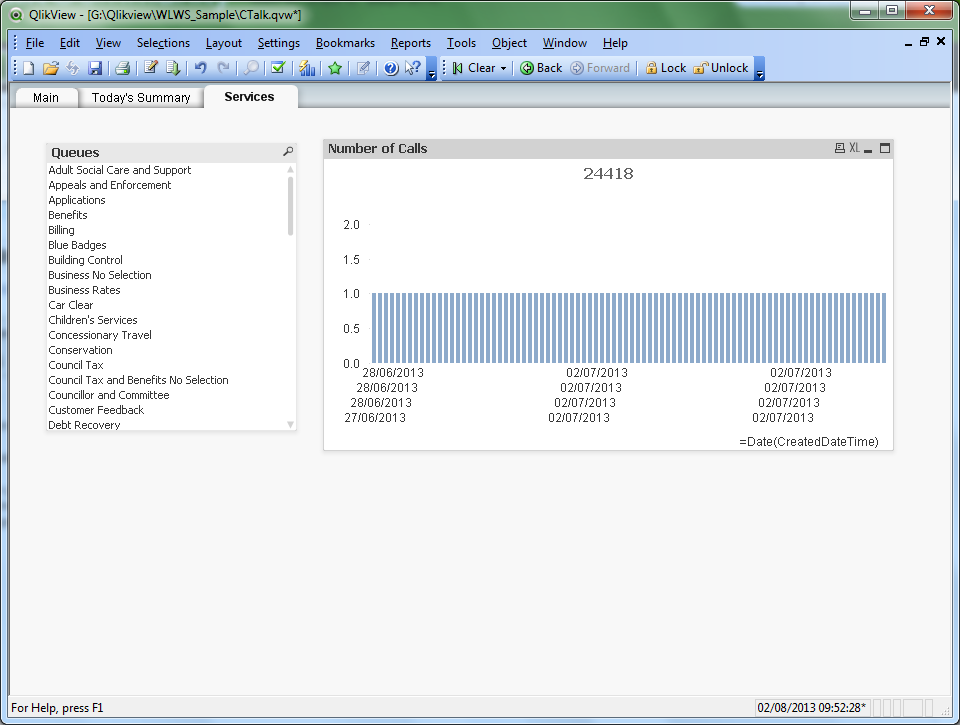
what I want to show is how many calls we receive per day, so on the x axis, I want the date, and the y axis is the number of calls.
I've got my chart set up as so:
Dimensions =Date(CreatedDateTime)
Expression =Count(ContactID)
Yet I still end up with a series of '1's in my chart (as shown in attached screenshot).
CreatedDateTime is a DateTime field in my database, and I only want to track calls by day at the moment, not by the time of the call.
How can I group these by the date?
Many apologies that this is probably such a simple question, feeling like a right dunce and I can't find anything sensible in the Developer or Designer course documentation.
Thanks for any hints or tips.
Accepted Solutions
- Mark as New
- Bookmark
- Subscribe
- Mute
- Subscribe to RSS Feed
- Permalink
- Report Inappropriate Content
The date function merely changes the formatting of the timestamp. It doesn't get the date part from it. Try as dimension =Date(floor(CreatedDateTime)).
Note, it's probably better to create a date and a time field separately in the script. See this blog post: The Master Time Table
talk is cheap, supply exceeds demand
- Mark as New
- Bookmark
- Subscribe
- Mute
- Subscribe to RSS Feed
- Permalink
- Report Inappropriate Content
Thanks Gysbert, I've managed to do it with the floor function.
- Mark as New
- Bookmark
- Subscribe
- Mute
- Subscribe to RSS Feed
- Permalink
- Report Inappropriate Content
Thanks Gysbert, I've managed to do it with the floor function.