Unlock a world of possibilities! Login now and discover the exclusive benefits awaiting you.
- Qlik Community
- :
- All Forums
- :
- QlikView App Dev
- :
- Re: Additional info - not stacked - in a barchart
- Subscribe to RSS Feed
- Mark Topic as New
- Mark Topic as Read
- Float this Topic for Current User
- Bookmark
- Subscribe
- Mute
- Printer Friendly Page
- Mark as New
- Bookmark
- Subscribe
- Mute
- Subscribe to RSS Feed
- Permalink
- Report Inappropriate Content
Additional info - not stacked - in a barchart
Hi,
for my latest diagram, I have chosen the "pure" barchart instead of the multi-diagram which I normally use.
That way I could stack columns on top of each other.
The structure of the data is as follows:
- In one or more out of five areas, a report might or might not have been generated - so each has a 1 or a 0
=> By stacking all of them, I get the total number of reports as well as the info where they come from.
Now I'd like to display another piece of info in that diagram:
-> How many of those reports have been processed? (often 0, always equal/ less than the nr. of reports generated)
Obviously, I would not like that number to be stacked on top of the others
=> Rather, it should appear in front (thus covering) the nr. of reports generated (it doesn't matter which segment gets covered)
OR
maybe I could make the columns appear shaded in case one/more reports have been processed.
Currently, I have that as a separate formula, but without any column for it - just the number on the axis.
Can anyone here give me a hint how I could achie
- Mark as New
- Bookmark
- Subscribe
- Mute
- Subscribe to RSS Feed
- Permalink
- Report Inappropriate Content
Hi,
do you want something like this?

You select bar and value on data points on the display options of the expression tab.
Then you could work with the dual function
- Mark as New
- Bookmark
- Subscribe
- Mute
- Subscribe to RSS Feed
- Permalink
- Report Inappropriate Content
Hi BBI_MBA_76,
I don't know what you are displaying in this diagram - but to me that looks like just several expressions stacked on top of each other with the whole thing being horizontal?
Currently I have the chart like this
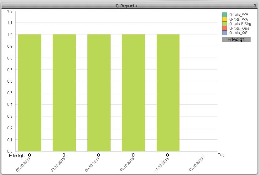
You see there are 5 expressions stacked - only 4 are 0 in value, so you see only the one.
There on the x-axis I have my "invisible" expression - just the number is visible - representing the nr. of processed reports. The text "Erledigt:" is a free_text_box.
What I would like (to replace those numbers on the axis) is another expression (column), but NOT stacked on top of the others - which seems to happen automatically in that diagram_type? - but rather in_front_of/ covering the other columns with a dark_green or black column or so.
Can I do that at all in this one diagram or would I have to create another diagram on top of this one with just the one expression?
=> That way I'm sure I could do it
<=> It would be quite time-consuming probably to make sure the new diagram does show exactly the same dimensions etc. as the old one.
P.S: I have tried this out, now - I can make the second diagram transparent, but not so the dimension_labels; These still show, and strangely enough, they are in different places than they are in the first diagram, so they appear like double.
P.P.S.: This does not seem a good idea after all - I tried editing the base file for just one day so I would have something to display in the "foreground-diagram" - and guess what, the column appeared to the right of the original column...
- Mark as New
- Bookmark
- Subscribe
- Mute
- Subscribe to RSS Feed
- Permalink
- Report Inappropriate Content
Hi,
I think it is not possible to have mixed stacked and not stacked expressions in a chart.
With dual you could have a numeric value for the bar and a text(you could concatenate more values) over it.
- Mark as New
- Bookmark
- Subscribe
- Mute
- Subscribe to RSS Feed
- Permalink
- Report Inappropriate Content
Hi BBI_MBA_76,,
I guess you're right. I've tried combining the two before, but that is obviously not supposed to be done, so it doesn't really work.
I will try with DUAL.
Free_text_boxes in the diagram_area are also a possibility - that way I could also cover the column by using an opaque white background, for instance - only the positioning is a bit of a problem with those, especially when the dimensions can be switched.