Unlock a world of possibilities! Login now and discover the exclusive benefits awaiting you.
- Qlik Community
- :
- All Forums
- :
- QlikView App Dev
- :
- Re: Partial coloring of bars in a chart?
- Subscribe to RSS Feed
- Mark Topic as New
- Mark Topic as Read
- Float this Topic for Current User
- Bookmark
- Subscribe
- Mute
- Printer Friendly Page
- Mark as New
- Bookmark
- Subscribe
- Mute
- Subscribe to RSS Feed
- Permalink
- Report Inappropriate Content
Partial coloring of bars in a chart?
Hi,
I have a simple bar chart.
Dimension is OrderID, and expression is only(LT). Values for LT(=LeadTime) are like 100, 150,54... days.
Assume the normal color of the bar is blue. I was wondering if it is possible to add a 2nd color.via Background Color
So that the part from 50 - 150 is colored green(). Is this possible? With every condition I tried I was only able to change the color of the whole bar.
I know how to do this with a stacked bars , but this is not what I want.
Thank you in advance..
Peter
PS: Is it possible, in a grouped bar chart, to define the "padding" between the groups without a separate expression? In std. layout the bars are very close.
- « Previous Replies
-
- 1
- 2
- Next Replies »
- Mark as New
- Bookmark
- Subscribe
- Mute
- Subscribe to RSS Feed
- Permalink
- Report Inappropriate Content
Hi Bill,
thank you for your reply.
I have to struggle enough with "plain qlikview", so an extension has to be postponed a bit. 
I already suspected that in my last question.
- Mark as New
- Bookmark
- Subscribe
- Mute
- Subscribe to RSS Feed
- Permalink
- Report Inappropriate Content
Hi
Can you explain why you not preferring stacked bar?
Please close the thread by marking correct answer & give likes if you like the post.
- Mark as New
- Bookmark
- Subscribe
- Mute
- Subscribe to RSS Feed
- Permalink
- Report Inappropriate Content
Ok..I'll try
I try to show the lead time of orders.
In script I calculate from a suborders table the total lead time (LT) (for every order) and some partial values (LTA,LTP...)
So i have fields in my order table like LT=100 LTA=40, LTP=60 this looks in my chart like this picture(using offset):
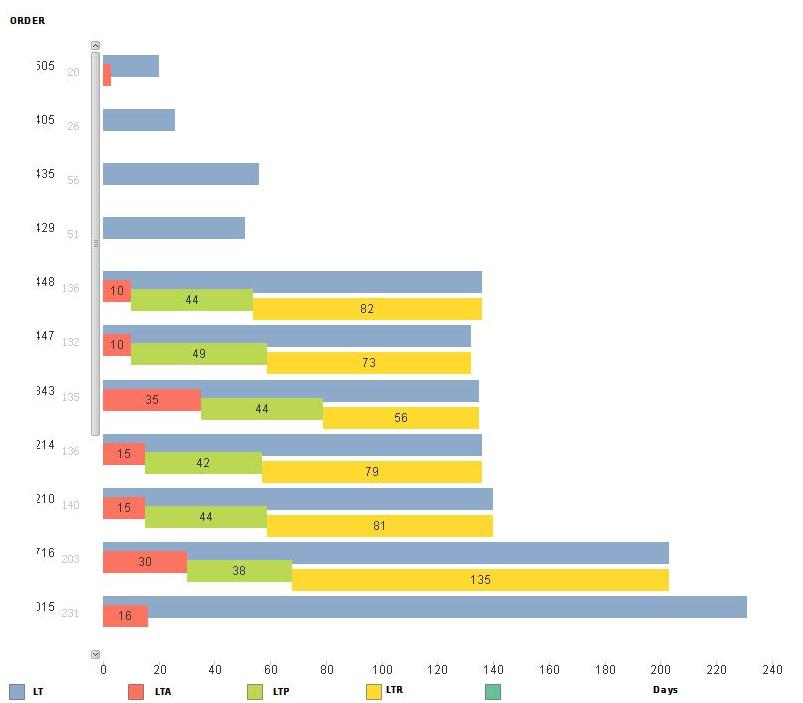
Ok. I think its clear and quite easy so far. In real life the lead time is further devided in value added and wasted time.
I wanted to use some expression to calculate the wasted time and show it inside the corresponding bar.
On Problem is that I have to calculate the LT with a start and a enddate, because as you can see, not every order has all subsegments available. But every Order definetly has a start and an end. So that I can show at least the full LT even if some segments are missing.
When I use stacked, I see no way to show the full LT and the 3 segments at the same time for every order...I would have to use groups or something.
Perhaps I missed something.. I appreciate, if you or somebody has an idea how to show the wasted time inside thos segments.
Is it possible to use color gradient as background for bar chart? Perhaps there is a way to trick around with it?
- Mark as New
- Bookmark
- Subscribe
- Mute
- Subscribe to RSS Feed
- Permalink
- Report Inappropriate Content
Hello,
I have the same need. Was this ever answered?
Cheers
- « Previous Replies
-
- 1
- 2
- Next Replies »